The logic of hypothesis testing, data types and importing data
Emma Rand

 Emma Rand. (2022). Data Analysis in R (BIO00017C) 2020: 2022 (v1.1). Zenodo. https://doi.org/10.5281/zenodo.6359475
Introduction
Session overview
In this session you will read in data files of various formats, data types, summarising and plotting data. We also cover saving figures and laying out a report in word.
Learning Outcomes
By actively following the materials and carrying out the independent study before and after the contact hours the successful student will be able to:
- distinguish between data types (MLO 2)
- demonstrate the process of hypothesis testing with an example (MLO 1)
- Explain type 1 and type 2 errors (MLO 4)
- read in data in to RStudio, create simple summaries and plots using manual pages where necessary (MLO 3)
- save figures to file (MLO 4)
- create neat reports in Word which include text and figures (MLO 4)
Philosophy
Workshops are not a test. It is expected that you often don’t know how to start, make a lot of mistakes and need help. Do not be put off and don’t let what you can not do interfere with what you can do. You will benefit from collaborating with others and/or discussing your results. It is expected that you are familiar with independent study content before the workshop. However, you need not remember or understand every detail as the workshop should build and consolidate your understanding. You may wish to refer to the independent study materials for reference.
Materials are indexed here: https://3mmarand.github.io/BIO00017C-Data-Analysis-in-R-2020/
Key
These four symbols are used at the beginning of each instruction so you know where to carry out the instruction.
 is something you need to do on your computer. It may be opening programs or documents or locating a file.
 is something you should do in RStudio. It will often be typing a command or using the menus but might also be creating folders, locating or moving files.
 is something you should do in your browser on the internet. It may be searching for information, going to the VLE or downloading a file.
 is question for you to think about an answer. You will usually want to record your answers in your script for future reference.

Artwork by @allison_horst
Getting started
Start RStudio from the Start menu.
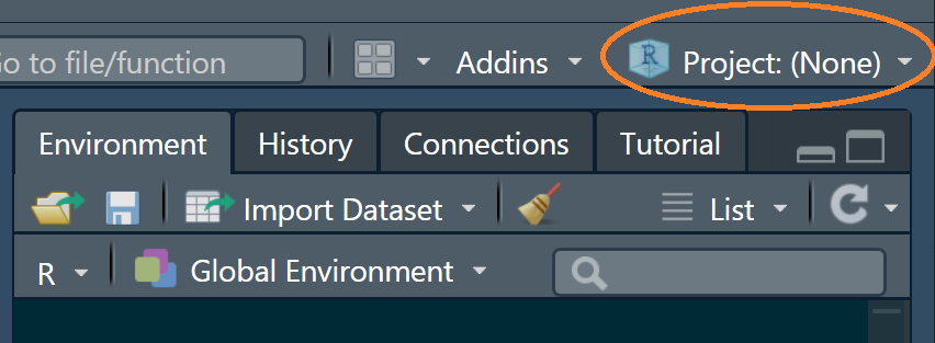
Make an RStudio project for this workshop by clicking on the drop-down menu on top right where it says Project: (None) and choosing New Project and then New Directory, then New Project. Navigate to the “data-analysis-in-r” folder. Name the RStudio Project ’workshop2.
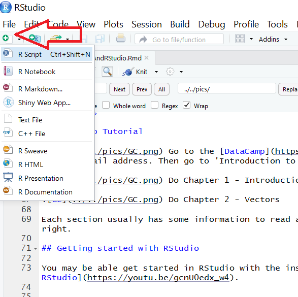
Make a new script then save it with a name like analysis.R to carry out the rest of the work.
Load the tidyverse:
library(tidyverse)Exercises
Import Data
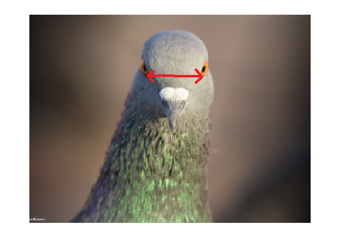
The data in pigeon.txt are 40 measurements of interorbital width (in mm) in a sample of domestic pigeons measured to the nearest 0.1mm
Save a copy of the data file (right click and Save) to your working directory (which will be ‘workshop2’)
Read the data in to R by using the read_table() command:
pigeon <- read_table("pigeon.txt")You should find dataframe object called pigeon can be seen in the Environment window. Click on it to open a spreadsheet-like view of the dataframe.
Use str() to see what data structure is created
## spec_tbl_df [40 x 1] (S3: spec_tbl_df/tbl_df/tbl/data.frame)
## $ distance: num [1:40] 12.2 12.9 11.8 11.9 11.6 11.1 12.3 12.2 11.8 11.8 ...
## - attr(*, "spec")=
## .. cols(
## .. distance = col_double()
## .. )A ‘tibble’ (‘table’ with a New Zealand accent!) is a dataframe.
What is the R data type of distance? What sort of variable is it?
Summarise single group data
A column is referred to using the dollar notation pigeon$distance.
Find the mean of the column using the function mean()
R provides many functions to allow you to make calculations on your data.
Find out which functions will calculate the standard deviation and the number of cases, i.e., the length of the vector. Google or make intelligent guesses and verify with the manual.
Visualise Data
A histogram is a useful way to visualise the distribution of a continuous variable. We can use ggplot() to make histograms. A histogram has the variable on the x-axis divided into ‘bins’ or intervals and on the y-axis is the count of the number of values that fall within that interval. The geom_histogram() ‘geom’ will automatically ‘bin’ and count the values - you don’t need to create intervals and count values that fall within them.
For a histogram, we do not need to specify what goes on the vertical axis - geom_histogram() takes care of it.
Create a ggplot() histogram:
ggplot(data = pigeon, aes(x = distance)) +
geom_histogram()
The default number of bins is 30 and that is too many for the number of values we have - it looks a bit ‘steppy’.
We can improve the appearance by changing the number of bins:
ggplot(data = pigeon, aes(x = distance)) +
geom_histogram(bins = 10)
Alter the axis titles appropriately and remove the gap between the data and the axes. You may need to open your script from last week. You are aiming for something like this:

Important Were you confused because you expected to use scale_y_discrete()? In statistical theory there are discrete and continuous variables. Counts are discrete. However, the phrase ‘data type’ means something a bit different in programming and it is to do with the way the value is stored in computer memory. In R, scale_x_continuous() and scale_y_continuous() apply to any variable that is a number and scale_x_discrete() and scale_y_discrete() to any variable that is a character (or factor).
Add a black border to the bars and change the fill colour. You may need to look at your script from last week. You are aiming for something like this:

Finally, we can use theme_classic() to take care of the background and axis lines to create something more suitable for a report:
ggplot(data = pigeon, aes(x = distance)) +
geom_histogram(bins = 10,
colour = "black",
fill = "#d8e39f") +
scale_x_continuous(name = "Interorbital distance (mm)",
expand = c(0, 0)) +
scale_y_continuous(name = "Frequency",
expand = c(0, 0)) +
theme_classic()
Import Data 2
This section will introduce you to three concepts:
- ‘working directories’, ‘paths’ and ‘relative paths’. This a threshold concept in computing.
- Tidy data
- summarising data in more than group
The data in pigeon2.txt are similar data of interorbital distances in two columns rather than just one. They are from two different populations, A and B.
On the Files tab click on New Folder. In the box that appears type “data”. This will be the folder that we save pigeon2.txt to.
Save a copy of pigeon2.txt to the ‘data’ folder
To read the data in to R you need to use the relative path to the file in the read_table() command:
pigeon2 <- read_table("data/pigeon2.txt")The data/ part is the ‘relative path’ to the file. It says where the file is relative to your working directory: pigeon2.txt is inside a folder (directory) called ‘data’ which is in your working directory.
Find the mean for each population. Remember, to refer to a single column of the data we need to use the dollar notation
Tidy format
Instead of having a population in each column, we very often have, and want, data organised so the measurements are all in one column and a second column gives the group. This format is described as ‘tidy’ (Wickham, 2014): it has a variable in each column and only one observation (case) per row. This format captures the structure of data and allows you to specify the role of variables in analyses and visualisations.
Suppose we had just 3 individuals in each of two populations:
NOT TIDY!| A | B |
|---|---|
| 12.4 | 12.6 |
| 11.2 | 11.3 |
| 11.6 | 12.1 |
| population | distance |
|---|---|
| A | 12.4 |
| B | 12.6 |
| A | 11.2 |
| A | 11.5 |
| B | 12.9 |
| A | 11.8 |
We can put this data in such a format with the pivot_longer() function from the tidyverse:
pivot_longer() collects the values from specified columns (cols) into a single column (values_to) and creates a column to indicate the group (names_to).
Put the data in tidy format in a dataframe called pigeon3:
pigeon3 <- pivot_longer(data = pigeon2,
cols = everything(),
names_to = "population",
values_to = "distance")Now we have a dataframe in tidy format which will make it easier to summarise, analyse and visualise.
To summarise data in this format we use the group_by() and summarise() functions. We will also use the pipe operator: %>%
To calculate the means for each group in tidy data:
pigeon3 %>%
group_by(population) %>%
summarise(mean = mean(distance))## # A tibble: 2 x 2
## population mean
## <chr> <dbl>
## 1 A 11.2
## 2 B 11.7%>% is called the pipe. It is a special operator that is relatively new in R and makes code easier to read and write. Usually, when you want to give data to a function you pass it as an argument inside the brackets. The pipe allows you to have the data on the left, then a pipe then the function with and additional arguments. This especially useful when you want to apply one function after another. The independent study following this workshop covers the pipe further.
The code can be read as:
- take pigeon3 and then
- group it by population and then
- summarise it by calculating the mean
i.e., the mean is done for each population.
The mean before the = is just a name which could be x or bob (it’s sensible to use a name that says what it is though!).
We can get additional summary information for each group by adding code in to the summarise() function.
Find the number of pigeons in each group using the length() function.
pigeon3 %>%
group_by(population) %>%
summarise(mean = mean(distance),
n = length(distance))## # A tibble: 2 x 3
## population mean n
## <chr> <dbl> <int>
## 1 A 11.2 40
## 2 B 11.7 40 Add a column for the standard deviation
Add a column for the standard error given by \(\frac{s.d.}{\sqrt{n}}\)
Word reports with figures
Now we will create a word document with some text and figures. I find the best way to include figures in a word document is to use a table with the borders turned off. This can make it easier to control the layout. This is what you are aiming for: pdf of word doc (should open in your browser.)
open a word document
add some text
insert a 2 row x 1 column table
Add a figure legend to the second row.
Create a histogram of the whole dataset:
ggplot(data = pigeon3, aes(x = distance)) +
geom_histogram()
Add ‘facets’ to put each population of a separate figure:
ggplot(data = pigeon3, aes(x = distance)) +
geom_histogram() +
facet_grid(.~population)
Note:.~ population means everything (.) separately for each (~) value in population.
Can you format the graph like this:

Note: theme(strip.background = element_blank()) will remove the border around the facet labels.
Save the figure using:
ggsave("fig1.png",
width = 5,
height = 4,
units = "in") In Word, put your cursor in the top cell of the table and choose Insert | Pictures
select the table and give it No borders.
🎉 Well Done! 🎂
