install.packages("ggrepel")Independent Study to prepare for workshop
Transcriptomics 3: Visualising
3 December, 2025
PCA
- To understand the logic of PCA, imagine we might plot the expression of one gene against that of another
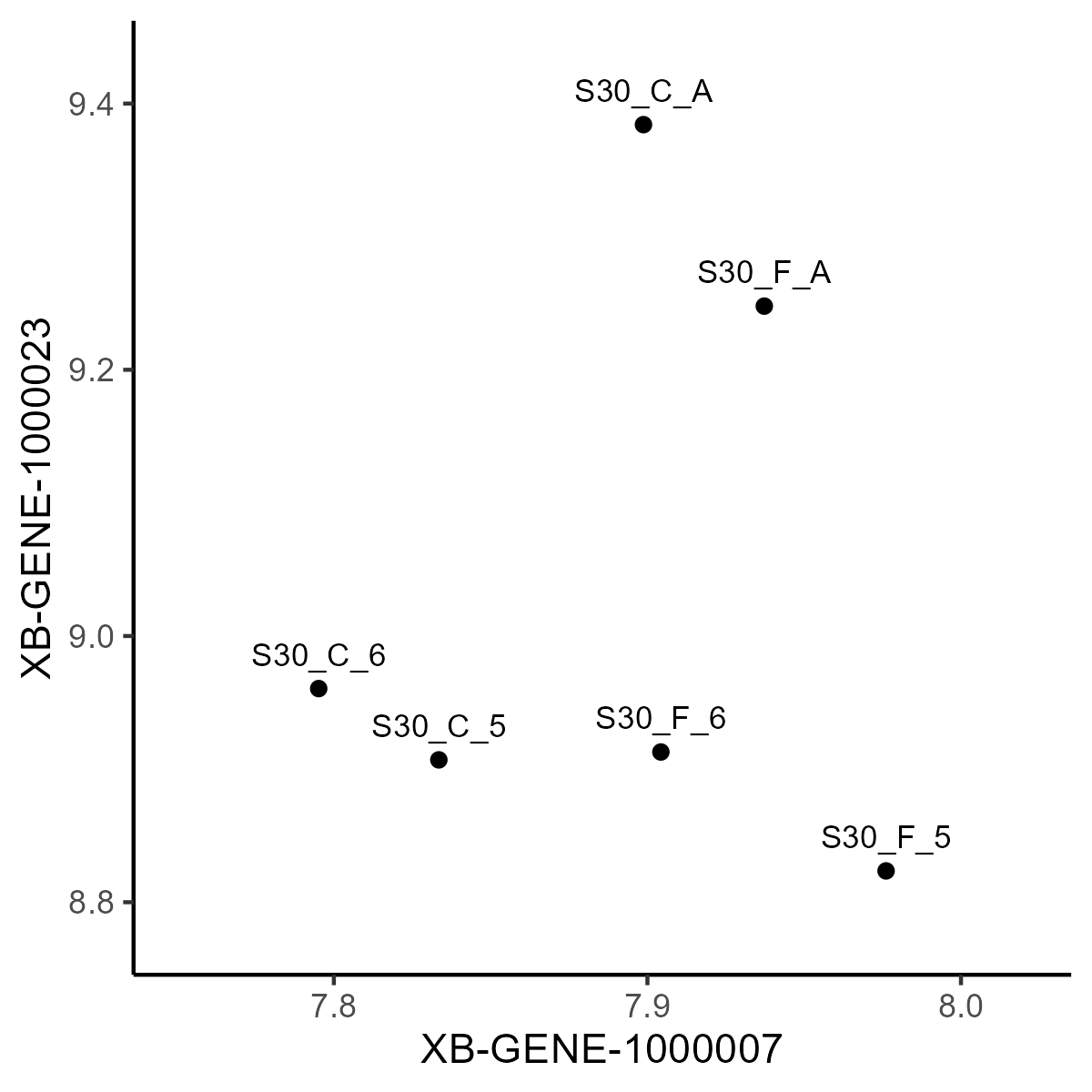

This gives us some in insight in how the sample/cells cluster. But we have a lot of genes (even for the stem cells) to consider. How do we know if the pair we use is typical? How can we consider all the genes at once?
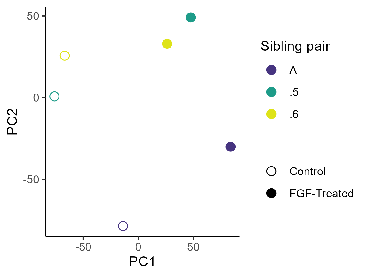
PCA
- PCA is a solution for this - It takes a large number of continuous variables (like gene expression) and reduces them to a smaller number of “principal components” that explain most of the variation in the data.
Volcano plots
It is because small probabilities are important, large ones are not which means the axis is counter intuitive because small p-values (i.e., significant values) are at the bottom of the axis)
And since p-values range from 1 to very tiny the important points are all squashed at the bottom of the axis
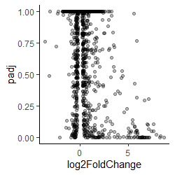
Volcano plot padj against fold change
Volcano plots
- By plotting the negative log of the adjusted p-value the values are spread out, and the most significant are at the top of the axis
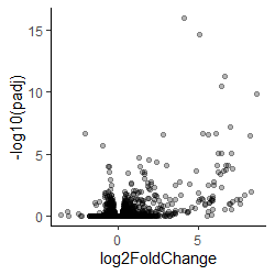
Volcano plot -log(adjusted p) against fold change