Workshop
Summarising data in with several variables and the role of variables in analysis
Exercises
Data already tidy: Cognitive behavioural therapy (CBT) and stress scores
The stress scores of individuals undertaking cognitive behavioural therapy were determined at three time points: baseline, immediately post therapy and at a follow-up assessment. The data are given in cbt_intervention.csv. Each row represents an individual. The first column gives the time point and the second column gives the stress score.
Import
 Save cbt_intervention.csv to your
 data-raw folder.
In the next step you will import the days and I suggest you look up data import from last week. There are two ways you could do that.
Open your own script from last week. You do not need to open the
week-3RStudio Project itself - you can open the script you used by navigating to through the File pane. After you have found it and clicked on it to open, I suggest showing your working directory in your File Pane again. You can do that by clicking on the little arrow at the end of the path printed on the Console window.Go the the workshop page from last week.
 Read the data into a dataframe called
 cbt.
 What types of variables do you have in the
 cbt dataframe? What role would you expect them to play in analysis?
The key point here is that the fundamental structure of:
the adipocytes example from the book which had a continuous response and one nominal explanatory variable with two groups , and
this example, one continuous response and one nominal explanatory variable with three groups cbts
is the same! The only thing that differs is the number of groups (the number of values in the nominal variable). This means the code for summarising and plotting is identical except for the variable names!
When two datasets have the same number of columns and the response variable and the explanatory variables have the same data types then the code you need is the same.
Summarise
Summarising the data for each time is the next sensible step. The most useful summary statistics for a continuous variable like stress are:
- mean
- standard deviation
- sample size
- standard error
We can get those for the whole stress column, like we did for the FSA column in the cells dataset last week. However, it is likely to be more useful to summarise stress separately for each cbt time. We can achieve this using group_by() before summarise().
 Create a data frame called
 cbt_summary1 that contains the means, standard deviations, sample sizes and standard errors for each of the cbt time:
You should get the following numbers:
| time | mean | std | n | se |
|---|---|---|---|---|
| Baseline | 71.816 | 10.35198 | 50 | 1.463990 |
| FollowUp | 52.790 | 13.74405 | 50 | 1.943702 |
| Post | 47.652 | 13.47218 | 50 | 1.905254 |
Visualise
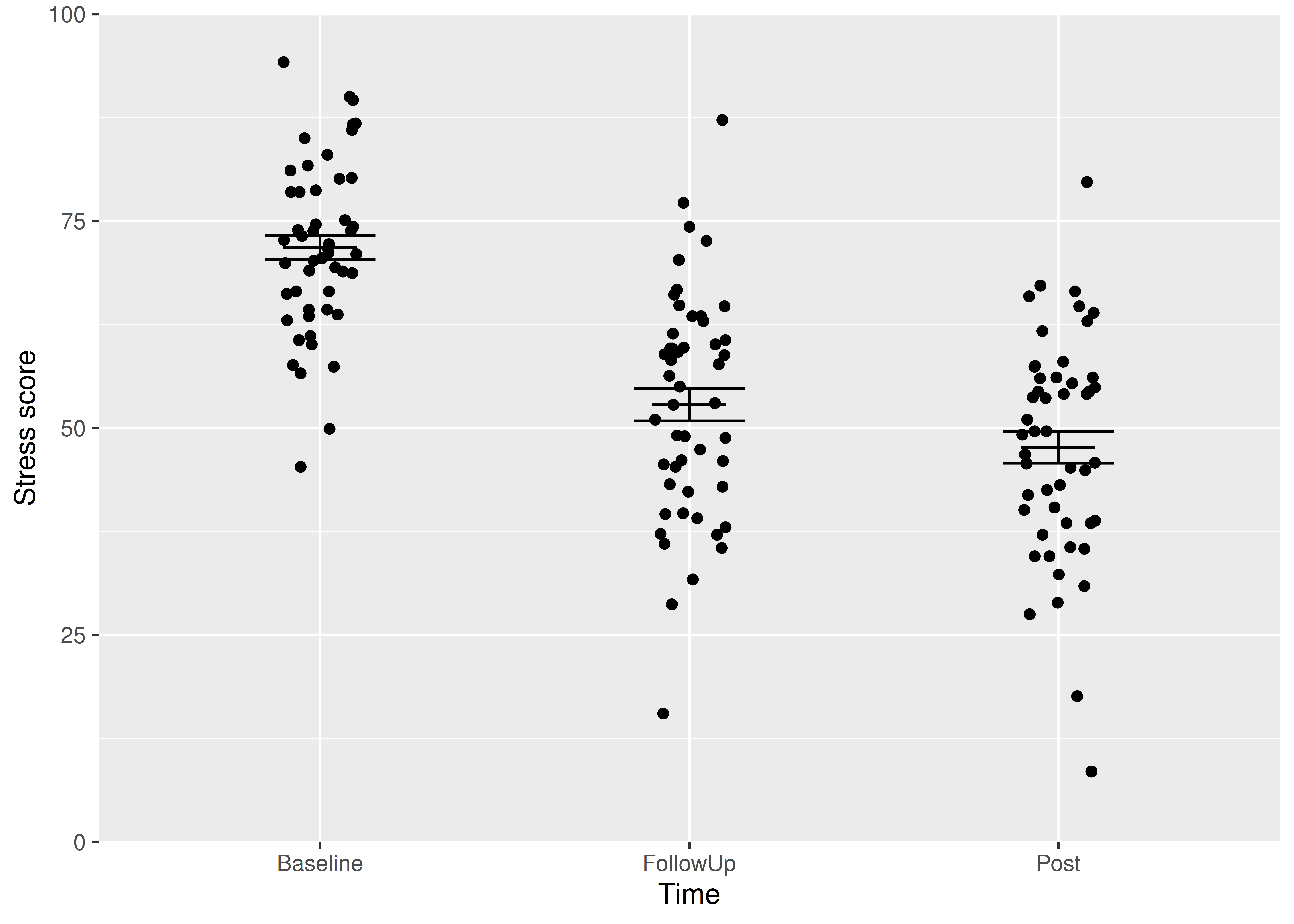
Most commonly, we put the explanatory variable on the x axis and the response variable on the y axis. A continuous response, particularly one that follows the normal distribution, is best summarised with the mean and the standard error. In my opinion, you should also show all the raw data points wherever possible.
We are going to create a figure like this:
In this figure, we have two dataframes:
- the
cbtdataframe which contains the raw data points - the
cbt_summarydataframe which contains the means and standard errors.
So far we have plotted just one dataframe on a figure and we have specified the dataframe to be plotted and the columns to plot inside the ggplot() command. For examples:
# YOU DO NOT NEED TO RUN THIS CODE
# It is here to remind you that so far we have specified a single dataframe
# to be plotted and did this by specifying the dataframe to be plotted and
# the columns to plot INSIDE the `ggplot()` command
# For a boxplot ...
ggplot(data = strategy_data,
       aes(x = reorder(strategy, freq, decreasing = TRUE),
           y = freq)) +
  geom_col(width = 1,
           colour = "black",
           fill = "lightblue") +
  scale_x_discrete(expand = c(0, 0),
                   name = "strategy ") +
  scale_y_continuous(expand = c(0, 0),
                     name = "Number of students",
                     limits = c(0, 25)) +
  theme_classic()
Or
# YOU DO NOT NEED TO RUN THIS CODE
# ... and for a histogram
ggplot(fly_bristles_means, aes(x = mean_count)) +
  geom_histogram(bins = 10,
                 colour = "black",
                 fill = "skyblue") +
  scale_x_continuous(name = "Number of bristles",
                     expand = c(0, 0)) +
  scale_y_continuous(name = "Frequency",
                     expand = c(0, 0),
                     limits = c(0, 35)) +
  theme_classic()
Here you will learn that dataframes and aesthetics can be specified within a geom_xxxx rather than within ggplot(). This is very useful if the geom only applies to some of the data you want to plot.
ggplot()
You put the data argument and aes() inside ggplot() if you want all the geoms to use that dataframe and variables. If you want a different dataframe for a geom, put the data argument and aes() inside the geom_xxxx()
I will build the plot up in small steps but you should edit your existingggplot() command as we go.
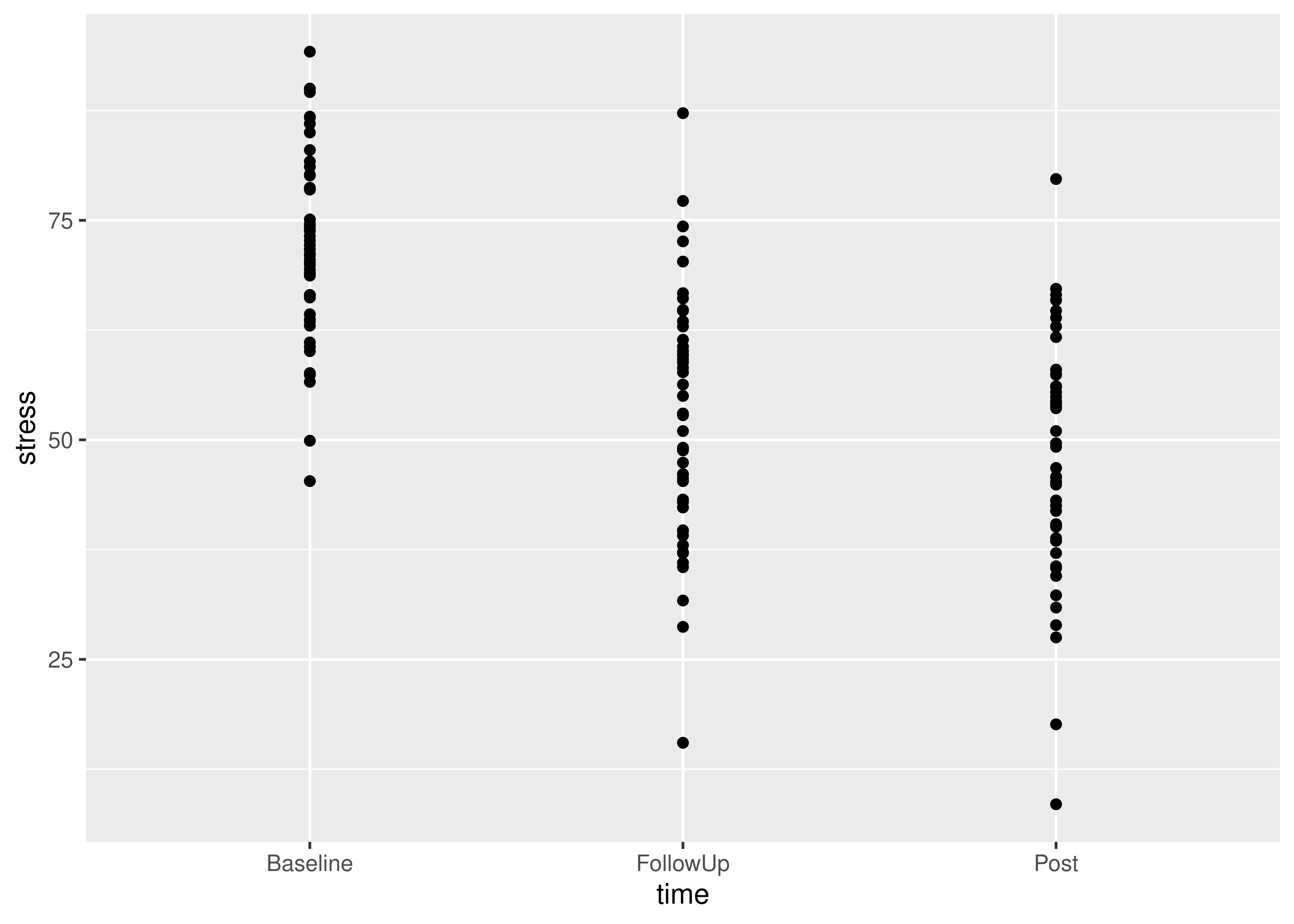
 Plot the raw data points first:
Notice:
geom_point()is the geom to plot pointswe have given the data argument and the aesthetics inside the geom.
the variables given in the aes(),
timeandstress, are columns in the dataframe,cbt, given in the data argument.
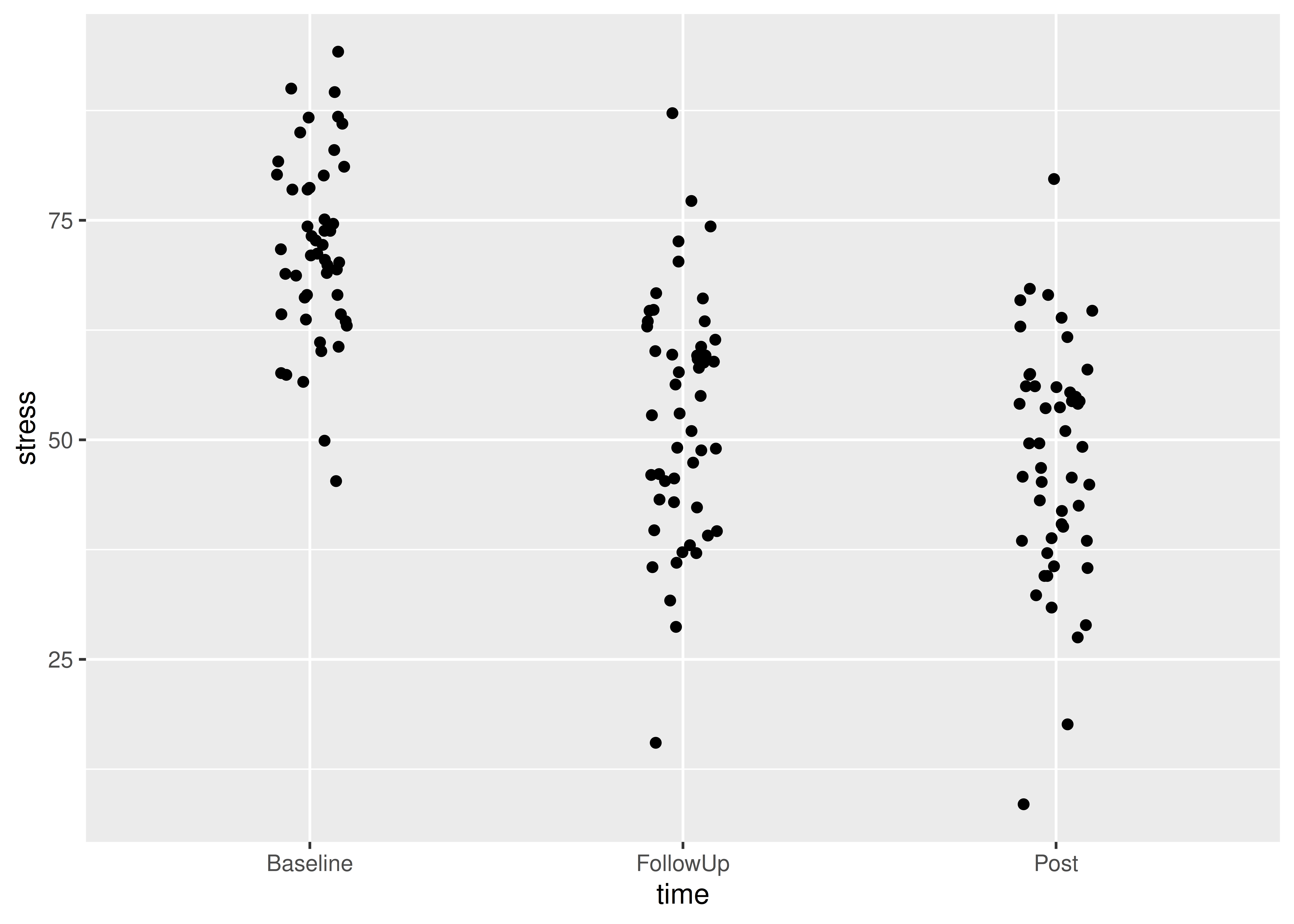
 We can ensure the points do not overlap, by adding some random jitter in the x direction (edit your existing code):
ggplot() +
  geom_point(data = cbt,
             aes(x = time, y = stress),
             position = position_jitter(width = 0.1, height = 0))
Notice:
position = position_jitter(width = 0.1, height = 0)is inside thegeom_point()parentheses, after theaes()and a comma.We’ve set the vertical jitter to 0 because, in contrast to the categorical x-axis, movement on the y-axis has meaning (the stress levels).
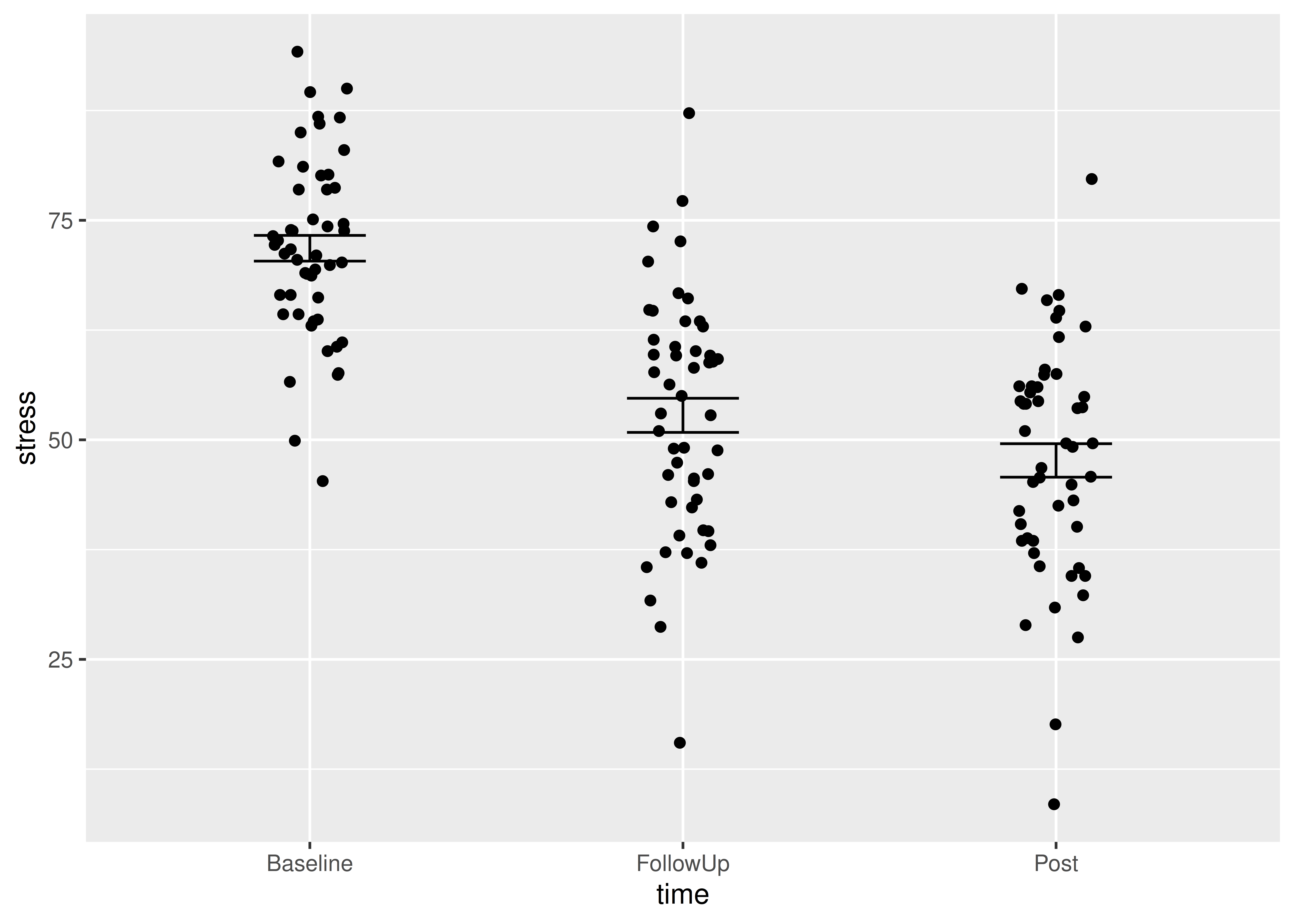
Now to add the errorbars. These go from one standard error below the mean to one standard error above the mean.
 Add a
Add a geom_errorbar() for errorbars (edit your existing code):
ggplot() +
  geom_point(data = cbt, aes(x = time, y = stress),
             position = position_jitter(width = 0.1, height = 0)) +
  geom_errorbar(data = cbt_summary,
                aes(x = time, ymin = mean - se, ymax = mean + se),
                width = 0.3)
Notice:
geom_errorbar()is the geom to plot error barswe have given the data argument and the aesthetics inside the geom.
the variables given in the aes(),
time,meanandse, are columns in the dataframe,cbt_summary, given in the data argument.
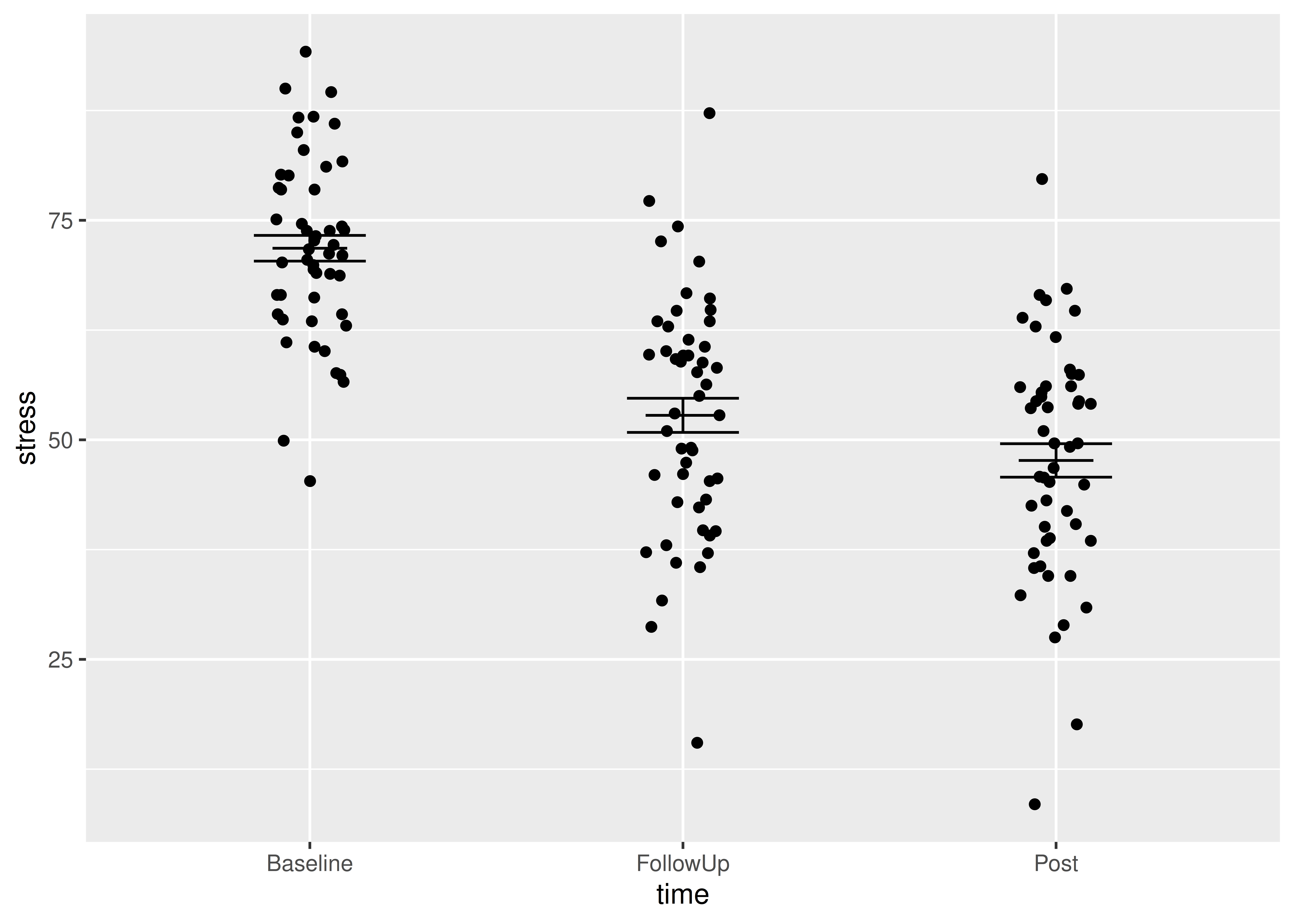
We would like to add the mean. You could use geom_point() but I like to use another geom_errorbar() to get a line by setting ymin and ymax to the mean.
 Add a
Add a geom_errorbar() for the mean (edit your existing code):
ggplot() +
  # raw data
  geom_point(data = cbt, aes(x = time, y = stress),
             position = position_jitter(width = 0.1, height = 0)) +
  # error bars
  geom_errorbar(data = cbt_summary,
                aes(x = time, ymin = mean - se, ymax = mean + se),
                width = 0.3) +
  # line for the mean
  geom_errorbar(data = cbt_summary,
                aes(x = time, ymin = mean, ymax = mean),
                width = 0.2)
Alter the axis labels and limits using
 scale_y_continuous() and scale_x_discrete() (edit your existing code):
ggplot() +
  # raw data
  geom_point(data = cbt, aes(x = time, y = stress),
             position = position_jitter(width = 0.1, height = 0)) +
  # error bars
  geom_errorbar(data = cbt_summary,
                aes(x = time, ymin = mean - se, ymax = mean + se),
                width = 0.3) +
  # line for the mean
  geom_errorbar(data = cbt_summary,
                aes(x = time, ymin = mean, ymax = mean),
                width = 0.2) +
  scale_y_continuous(name = "Stress score",
                     limits = c(0, 100),
                     expand = c(0, 0)) +
  scale_x_discrete(name = "Time")
You only need to use name in scale_y_continuous() and scale_x_discrete() to use labels that are different from those in the dataset. Often this is to use proper terminology and capitalisation.
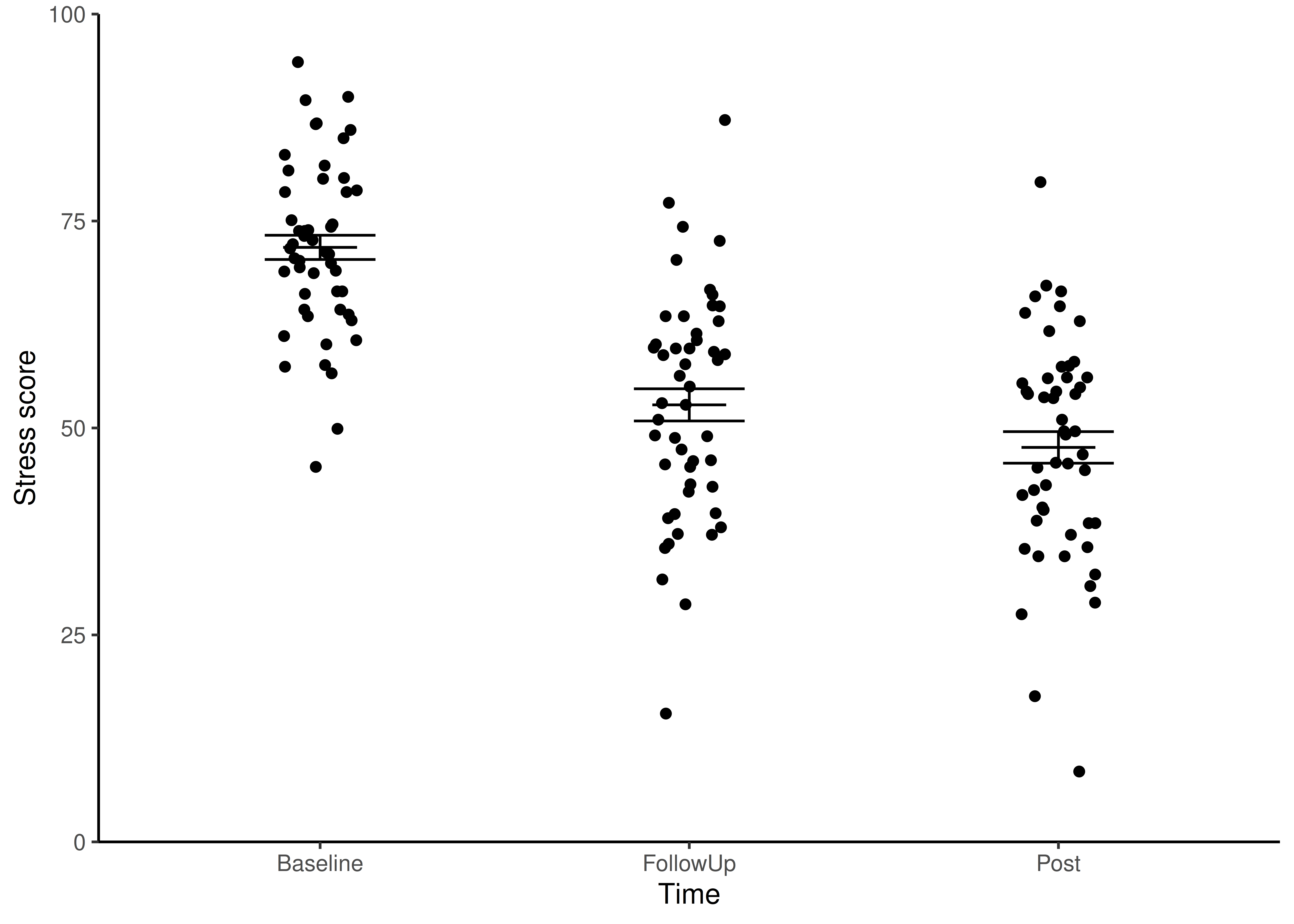
 Format the figure in a way that is more suitable for including in a report using
 theme_classic() (edit your existing code):
ggplot() +
  # raw data
  geom_point(data = cbt, aes(x = time, y = stress),
             position = position_jitter(width = 0.1, height = 0)) +
  # error bars
  geom_errorbar(data = cbt_summary,
                aes(x = time, ymin = mean - se, ymax = mean + se),
                width = 0.3) +
  # line for the mean
  geom_errorbar(data = cbt_summary,
                aes(x = time, ymin = mean, ymax = mean),
                width = 0.2) +
  scale_y_continuous(name = "Stress score",
                     limits = c(0, 100),
                     expand = c(0, 0)) +
   scale_x_discrete(name = "Time") +
  theme_classic()
Writing figures to file
It is a good idea to save figures to files so that you can include them in reports. By scripting figures saving you can ensure your work is reproducible. It means you can regenerate the figures identically if you change the data or exactly match figures in size. Aim to save figures the size they will appear in a report - that way the fonts and line widths will be appropriate. If you need a high resolution figure, you can save it larger than needed then scale it down in the report. Doing that will require you to make changes to font sizes and line widths to make them appropriate when scaled down.
 First make a new folder called
 figures.
 Now edit your ggplot code so that you assign the figure to a variable which you use use in the
 ggsave() command next.
cbtfig <- ggplot() +
  # raw data
  geom_point(data = cbt, aes(x = time, y = stress),
             position = position_jitter(width = 0.1, height = 0)) +
  # error bars
  geom_errorbar(data = cbt_summary,
                aes(x = time, ymin = mean - se, ymax = mean + se),
                width = 0.3) +
  # line for the mean
  geom_errorbar(data = cbt_summary,
                aes(x = time, ymin = mean, ymax = mean),
                width = 0.2) +
  scale_y_continuous(name = "Stress score",
                     limits = c(0, 100),
                     expand = c(0, 0)) +
  scale_x_discrete(name = "Time") +
  theme_classic()
The figure won’t be shown in the Plots tab - the output has gone into cbtfig rather than to the Plots tab. To make it appear in the Plots tab type cbtfig.
 The
The ggsave() command will write a ggplot figure to a file:
ggsave("figures/cbt-stress.png",
       plot = cbtfig,
       device = "png",
       width = 4,
       height = 3,
       units = "in",
       dpi = 300)
figures/cbt-muscle.png is the name of the file, including the relative path.
 Look up
 ggsave() in the manual to understand the arguments. You can do this by putting your cursor on the command and pressing F1
Return to the workshop page.
References
Footnotes
“Create a dataframe called
cbt_summary” means assign the output of thegroup_by()andsummarise()code to something calledcbt_summary.↩︎

