[1] "ECOLIGreen_ISOTYPE.fcs" "ECOLIGreen_TNFAPC.fcs" "LPS_ISOTYPE.fcs"
[4] "LPS_TNFAPC.fcs" "MEDIA_ISOTYPE.fcs" "MEDIA_TNFAPC.fcs" Workshop
Data Analysis 1: Core
Introduction
Session overview
In the first part of the workshop I will talk about Project organisation for reproducible analysis and data that has many variables and observations. In the second part of the workshop you will practice getting an overview of such data with summaries and distribution plots, filtering rows and columns.
Reproducibility
Why does it matter?
Five selfish reasons to work reproducibly (Markowetz 2015). Alternatively, see the very entertaining talk which covers the “Duke Scandal”.
Many high profile cases of work which did not reproduce e.g. Anil Potti’s work unravelled by Baggerly and Coombes (2009) in the “Duke Scandal”
Will become standard in Science and publishing e.g OECD Global Science Forum Building digital workforce capacity and skills for data-intensive science (OECD Global Science Forum 2020)
How to achieve reproducibility
Scripting
Organisation: Project-oriented workflows with file and folder structure, naming things
Documentation: Comment your code.
Critical curation of your project and code
Project-oriented workflow
use folders to organise your work
you are aiming for structured, systematic and repeatable.
inputs and outputs should be clearly identifiable from structure and/or naming
Example
-- stem-cells
   |__stem-cells.Rproj
   |__analysis.R
   |__data-raw
      |__2019-03-21_donor_1.csv
      |__2019-03-21_donor_2.csv
      |__2019-03-21_donor_3.csv
   |__figures
      |__01_volcano_donor_1_vs_donor_2.png
      |__02_volcano_donor_1_vs_donor_3.png
Naming things
systematic and consistent
informative
use same character (e.g.,
_or-) for separating parts of the informationmachine readable
human readable
play nicely with sorting
I suggest
no spaces in names
use snake_case or kebab-case rather than CamelCase or dot.case
use all lower case
ordering: use left-padded numbers e.g., 01, 02….99 or 001, 002….999
dates ISO 8601 format: 2020-10-16
Example
Critical Curation
- Regularly review your project
- Remove unnecessary files
- Ensure your code is clear and well commented
You might need to:
- collect together library statements at the top of the script
- edit your comments for clarity
- rename variables for consistency or clarity
- remove house keeping or exploratory code or mark it for later removal
- restyle code, add code section headers etc
Generative AI for the RStudio Project
Google Gemini is the University’s preferred generative AI, but Claude AI is also good.
Each time you use a generative AI tool, you should consider whether generative AI is the right tool.
- You want to avoid false authorship or anything else that is against the University’s guidelines on using AI tools (student guidance on using AI and translation tools)
- You might be able to do the task quicker without generative AI by reading workshop materials because you won’t have to evaluate and edit so much.
| This is OK | This is NOT ok |
|---|---|
|
It is OK to ask an AI to explain code and coding concepts. It is OK to use an AI to modify your code but you must understand the inputs, the outputs and what the code does. This is important because AIs like to add things you don’t need and the marking scheme takes account relevance. Do Acknowledge and reference generative AI (you should also acknowledge and reference other sources of code such as workshop, text books, online tutorials) |
Do not use an AI to generate code Do not uncritically accept code modifications without evaluating their accuracy or relevance. Do not use an AI to generate comments. |
Big data
People argue about what quantity of data constitutes big data. In my view, it is relative to what you are used to and it is not just about the size of the data but also the complexity and the approach to analysis.
You have been used to working with data that has a few explanatory variables, one or two response variables 10 to 100 observations. Typically your approach has been to test one or two specific hypotheses. There is usually a very direct relationship between the experiment you design, the data you collect and the hypotheses you test.
Example: You want to know the effect of an antimicrobial agent on the growth of a bacterium. You design an experiment to measure the growth of the bacterium in the presence and absence of the antimicrobial agent. You collect the data and test the hypothesis that the growth of the bacterium is different in the presence and absence of the antimicrobial agent. You have a dataset with one response variable (growth) and one explanatory variable (presence or absence of the antimicrobial agent) and n observations (replicates of the experiment).
When working with big data we often mean:
having many variables (100s or 1000s), many observations or both
visualising patterns in the data such as the relationship between variables or observations using “data reduction” techniques such as Principle Components Analysis (PCA)
applying hundreds or thousands to tests to identify patterns or relationships amongst the significant results rather than drawing conclusions from individual tests
Example: You want to know the effect of a drug on the expression of genes in a cell. You design an experiment to measure the expression of all the genes in the cell in the presence and absence of the drug. You collect the data and test the hypothesis that the expression of any gene is different in the presence and absence of the drug. You then look for patterns in the data such as groups of genes that are co-expressed and the relationship between the expression of genes and the effect of the drug. You have a dataset with many response variables (expression of genes) and one explanatory variable (presence or absence of the drug) and n observations (replicates of the experiment).
Exercises
Set up a Project
🎬 Start RStudio from the Start menu
🎬 Make an RStudio project. Be deliberate about where you create it so that it is a good place for you
🎬 Use the Files pane to make a folder for the data. I suggest data-raw/
🎬 Make a new script called core-data-analysis.R to carry out the rest of the work.
Load packages
We need the following packages for this workshop:
-
tidyverse(Wickham et al. 2019): importing the meta data which is in a text file, working with the data once it is in a dataframe to filter, summarise and plot.
🎬 Load tidyverse
Look at the data!
It is almost always useful to take a look at your data (or at least think about its format) before you attempt to read it in.
We will be working with the following data files in this workshop
biotech-cts.txt. These are RNA-Seq data from three replicates for each of two of wheat varieties (Susceptible and Tolerant) grown at two potassium conditions (Control K and Low K). The data are counts of the number of reads.
cell-bio.tsv. These are measurements from a Livecyte microscope, which performs live cell imaging, tracking individual cells, and measuring cell shape and size parameters for thousands of cells as they grow and divide. Measurements are taken for three replicates from each of two cell lines A and B.
immuno.csv. These are flow cytometry data for three treatments with each of two antibodies. The measures are Forward scatter, side scatter, red fluorescence and green fluorescence.
xlaevis_counts_S20.csv. These are RNA-Seq data from frogs. There are 2 siblings from each of three fertilisations and one sibling was treated with FGF and the other was a control. The data are counts of the number of reads.
🎬 Save these data files to the data-raw/ folder:
🎬 Consider the file extensions. What you do think the extensions indicate?
🎬 Go to the Files pane click on the xlaevis_counts_S20.csv file and choose View File1
Any plain text file will open in the top left pane. Note that this is NOT importing the data, it’s just viewing the file.
🎬 Does it seem to be a csv file?
🎬 Try opening the other files from the Files pane. What happens?
🎬 Open each file in Excel. For the .txt and .tsv files you will need to show “All files (.)” in the file type dropdown to see them and you will need to work through the “Text Import Wizard” to open them.
We are opening them each in Excel to see what they look like and to get a sense of the structure of the data. We are not going to use Excel to do anything.
🎬 What do you notice? Does it look like this data will be easy to import and work with?
Import the data
🎬 Import each of the data files into R:
biotech <- read_tsv("data-raw/biotech-cts.txt")cell_bio <- read_tsv("data-raw/cell-bio.tsv")immuno <- read_csv("data-raw/immuno.csv")frogs <- read_csv("data-raw/xlaevis_counts_S20.csv")🎬 Click on each of the dataframes in the Environment pane to see what they look like. An alternative to clicking is to use the View() function:
View(cell_bio)🎬 In each case, describe what is in the rows and the columns of the dataframe. Where are the replicates/samples and where are the variables? Are there any things you’d like to fix/change?
🎬 Name of the first column in the biotech dataframe:
names(biotech)[1] <- "transcript"🎬 Column names in the cell_bio dataframe:
cell_bio <- janitor::clean_names(cell_bio)Getting an overview 1
summary()
R’s summary() function is a quick way to get an overview of datasets. It gives you a six number summary for every numeric variable (the minimum, lower quartile, median, mean, upper quartile, and maximum). It also gives you a count of the number of missing values.
🎬 Use the summary() function to get an overview of each dataframe. It works well for these datasets. What types of dataset might this be less useful for? Which dataframes and columns have missing values? Which dataframes and variables seem very skewed? Which dataframe has more than one character variable?
Quality Control
Filtering rows
The filter function selects/drops a whole row on a condition. The condition can be based on the value in one, or a combination, of columns. We specify what we want to keep with the filter() function. This means you might often want to negate a condition with !.
🎬 To remove the rows in cell_bio with missing values in the perimeter column:
is.na(perimeter) returns a logical vector (a vector of TRUEs and FALSEs) of the same length as the column. The ! negates the logical vector so the TRUEs become FALSEs and the FALSEs become TRUE. This means that the filter() function keeps the rows where the perimeter column is not missing.
🎬 There’s actually a tidyverse function that does the same thing as filter(!is.na())
cell_bio <- cell_bio |> drop_na(perimeter)Sometimes you might want to work with a subset of data. For example, you might want to examine just the Media treated cells in the immuno dataset.
🎬 Create a new dataframe called immuno_media that contains only the rows where treatment is “MEDIA”
immuno_media <- immuno |>
  filter(treatment == "MEDIA")
Or just the Media treated cells with a FS_Lin between two values. You can apply two filters and the between() function to achieve this:
🎬 Create a new dataframe called immuno_media_live that contains only the rows where treatment is “MEDIA” and FS_Lin is between 7500 and 28000:
🎬 Now you try. Create a dataframe called immuno_live that contains only the rows where FS_Lin is between 7500 and 28000 and SS_Lin is between 15000 and 35000:
Selecting columns
Whilst we can always specify the columns we want to use when working with data, sometimes we find it less overwhelming to create a new dataframe with only the columns we want. The select() function helps us here.
🎬 Suppose we only want to work with the Susceptible varieties of wheat in the biotech dataframe. We can create a new dataframe with only the columns we want:
biotech_susceptible <- biotech |>
  select(SCK14_1,
         SCK14_2,
         SCK14_3,
         SLK14_1,
         SLK14_2,
         SLK14_3)
In fact, there are a couple of alternatives to this. We can use the starts_with() function to select all the columns that start with a certain string:
🎬 Select columns starting with S
biotech_susceptible <- biotech |>
  select(starts_with("S"))
There is an ends_with() function too!
🎬 The colon notation allows us to select a range of columns. Select columns from SCK14_1 to SLK14_3
biotech_susceptible <- biotech |>
  select(SCK14_1:SLK14_3)
Note that you need to pay attention to the order of the columns in your dataframe to use this.
🎬 You can use select and filter together. Try creating a dataframe from frogs which has only the columns from sibling “_A” and only the rows where S20_C_5 is above 20.
Visualisation
Histograms and density plots are useful for visualising the distribution of variables when we have many observations. They allow you to see features in the data that are not obvious from the summary statistics.
A histogram shows the number of values in each range (bin), it is composed of touching bars. How a histogram looks depends on the number of bins used.
A density plot shows the proportions of values in a range. The appearance of the distribution is not affected by the number of bins.
🎬 To plot a histogram of S20_C_5 in the frogs dataframe:
frogs |>
  ggplot(aes(x = S20_C_5)) +
geom_histogram() 
This data is very skewed - there are so many low values that we can’t see the tiny bars for the higher values. Logging the counts is a way to make the distribution more visible.
🎬 To plot the distribution of log S20_C_5 in the frogs dataframe as a histogram:
frogs |>
  ggplot(aes(x = log10(S20_C_5))) +
geom_histogram() 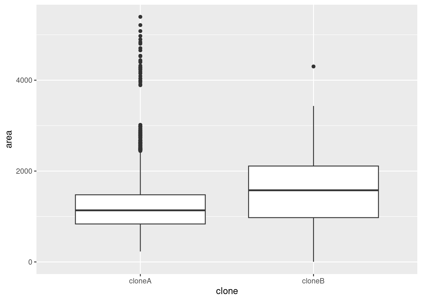
🎬 Or a density plot:
frogs |>
  ggplot(aes(x = log10(S20_C_5))) +
  geom_density()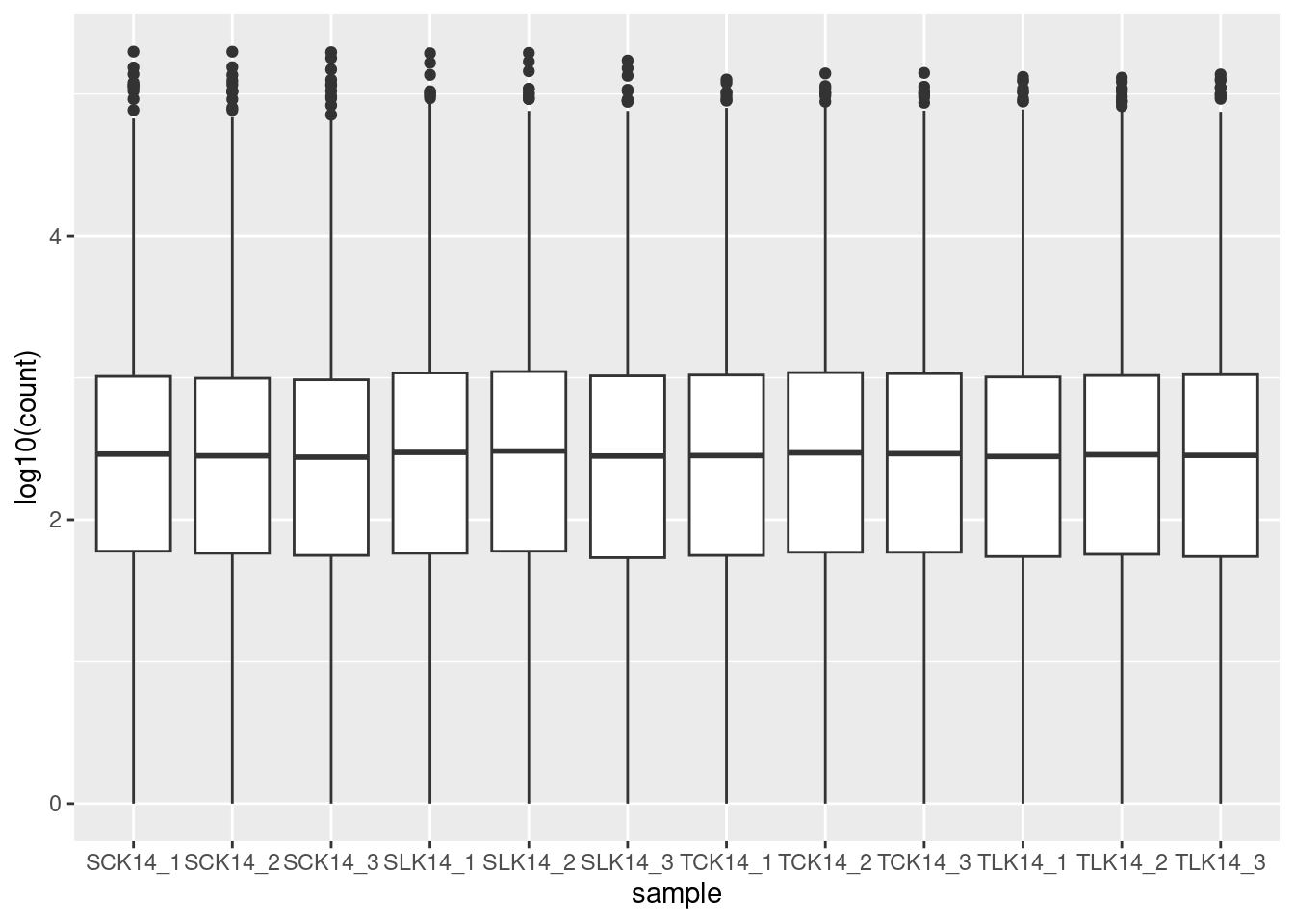
I’ve used base 10 only because it is easy to convert to the original scale (1 is 10, 2 is 100, 3 is 1000 etc). The warning about rows being removed is expected - these are the counts of 0 since you can’t log a value of 0. The peak at zero suggests quite a few counts of 1. We would expect the distribution of counts to be roughly log normal because this is expression of all the genes in the genome2. That peak near the low end is not expected for this distribution and suggests that these lower counts might be anomalies.
The excess number of low counts indicates we might want to create a cut off for quality control. The removal of low counts is a common processing step in ’omic data.
If you have two groups of data, you can compare their distributions on the same plot using the fill aesthetic and making the fill transparent with the alpha argument.
🎬 To plot the distribution of area in the cell_bio dataframe as a density plot, with the clone variable as the fill:
cell_bio |>
  ggplot(aes(x = area, fill = clone)) +
  geom_density(alpha = 0.5)
Boxplots and violin plots are also useful for visualising the distribution of a variable, especially when there are more than about 5 groups.
🎬 To plot the distribution of area in the cell_bio dataframe as a boxplot, with the clone variable on the x-axis:
cell_bio |>
  ggplot(aes(x = clone, y = area)) +
  geom_boxplot()
Suppose you want to see the distribution of many similar variables such as we have in biotech. You cannot map a variable to x or fill as we did in the two previous cases because the values are in separate columns rather than than in one column with a second column giving a group. However, we can use the pivot_longer() function to reformat the data and then pipe it into ggplot.
🎬 Plot the distribution of the logged counts in the biotech dataframe as a boxplot, the samples on the x axis:
biotech |>
  pivot_longer(cols = -transcript,
               names_to = "sample",
               values_to = "count") |>
  ggplot(aes(x = sample, y = log10(count))) +
  geom_boxplot()
This code takes the biotech dataframe and transforms it dataset from wide format to long format. It takes all columns except transcript (cols = -transcript) and gathers them into two new columns:
-
"sample"→ Stores the original column names (SCK14_1,SCK14_2, etc.). -
"count"→ Stores the values from those columns.
Now, instead of multiple sample columns, we have a table like this:
| transcript | sample | count |
|---|---|---|
| MSTRG.1 | SCK14_1 | 560 |
| MSTRG.1 | SCK14_2 | 1526 |
| MSTRG.1 | SCK14_3 | 4168 |
| MSTRG.10 | SCK14_1 | 0 |
which is piped straight into ggplot. The nice thing about the pipe, is that you need not create a new dataframe to do this. You can pipe the output of pivot_longer() directly into ggplot(). This is very useful when you are exploring the data and want to try out different visualisations.
You’re finished!
🥳 Well Done! 🎉
Independent study following the workshop
The Code file
All the answers (coding and thinking) are in the source code for the workshop. You can view it using the </> Code button at the top of the page. Coding and thinking answers are marked with #---CODING ANSWER--- and #---THINKING ANSWER---
Pages made with R (R Core Team 2024), Quarto (Allaire et al. 2022), knitr (Xie 2024, 2015, 2014), kableExtra (Zhu 2024)
References
Allaire, J. J., Charles Teague, Carlos Scheidegger, Yihui Xie, and Christophe Dervieux. 2022. Quarto. https://doi.org/10.5281/zenodo.5960048.
Baggerly, Keith A, and Kevin R Coombes. 2009. “DERIVING CHEMOSENSITIVITY FROM CELL LINES: FORENSIC BIOINFORMATICS AND REPRODUCIBLE RESEARCH IN HIGH-THROUGHPUT BIOLOGY.” Ann. Appl. Stat. 3 (4): 1309–34. https://doi.org/10.2307/27801549.
Markowetz, Florian. 2015. “Five Selfish Reasons to Work Reproducibly.” Genome Biol. 16 (December): 274. https://doi.org/10.1186/s13059-015-0850-7.
OECD Global Science Forum. 2020. “Building Digital Workforce Capacity and Skills for Data-Intensive Science.” http://www.oecd.org/officialdocuments/publicdisplaydocumentpdf/?cote=DSTI/STP/GSF(2020)6/FINAL&docLanguage=En.
R Core Team. 2024. R: A Language and Environment for Statistical Computing. Vienna, Austria: R Foundation for Statistical Computing. https://www.R-project.org/.
Wickham, Hadley, Mara Averick, Jennifer Bryan, Winston Chang, Lucy D’Agostino McGowan, Romain François, Garrett Grolemund, et al. 2019. “Welcome to the Tidyverse” 4: 1686. https://doi.org/10.21105/joss.01686.
Xie, Yihui. 2014. “Knitr: A Comprehensive Tool for Reproducible Research in R.” In Implementing Reproducible Computational Research, edited by Victoria Stodden, Friedrich Leisch, and Roger D. Peng. Chapman; Hall/CRC.
———. 2015. Dynamic Documents with R and Knitr. 2nd ed. Boca Raton, Florida: Chapman; Hall/CRC. https://yihui.org/knitr/.
———. 2024. Knitr: A General-Purpose Package for Dynamic Report Generation in r. https://yihui.org/knitr/.
Zhu, Hao. 2024. kableExtra: Construct Complex Table with ’Kable’ and Pipe Syntax. https://CRAN.R-project.org/package=kableExtra.
Footnotes
Do not be tempted to import data this way. Unless you are careful, your data import will not be scripted or will not be scripted correctly. This means your work will not be reproducible.↩︎
This a result of the Central limit theorem, one consequence of which is that adding together lots of distributions - whatever distributions they are - will tend to a normal distribution.↩︎
Comment your code
Effective commenting is crucial for making your analysis reproducible and understandable. Good commenting is about quality, not quantity. You do not need to teach a person to program in the comments, but you should explain the logic of the code and the decisions you make based on what you see in your analysis. If you remove the code, the comments should still make sense. You need not interpret the results in any depth, but you should comment on interpretation where it impacts what you do in the code.
Comments should
Give an overview of the work and analysis. This should give enough information for someone to understand what the analysis is about. It should be concise and only give information needed to understand the data and analysis - you don’t need biological information unless it is essential to understand the analysis. - Structure the code into sections with section headers
Say what was done where it is not obvious
Explain the reasoning behind analytical and technical decisions relevant to the direction of the analysis.
Example comments
Bad example No structure. Comments are self-explanatory or try to explain R (variable names are also meaningless).
Good example Structure. We say why we do things and what the code is for.