Workshop
Data Analysis 4: Biomedical sciences - Your data presentation
In this workshop you will learn how to:
- create density plots to visualise the distribution and gating of the signals
- create a quadrant gated plot of TNFa_APC_Lin signal against the E_coli_FITC_Lin signal.
- calculate the percentage of cells in each quadrant
- annotate plots
- import from a googlesheet.
You will learn how to make a variety of plots but not which plots you should include in your report. You should select plots to match your narrative and you may need to apply your understanding of picking data for, faceting and annotating plots to get the plot you want.
You should have the processed data files listed below for your own data/the model data. However, if you do not, you can use the linked files prepared from the sample data
-
clean_trans_live_tfna_pos.csv: Each row is a sample (a treatment-antibody combination). For each sample there is: the number of cells after AI cleaning, the number of live cells after gating, the percentage of live cells, the number TNF-α positive cells, the percentage of TNF-α positive cells and the mean APC signal in the live cells and TNF-α positive cells -
live_labelled.csv: Each row is a cell. These are the AI cleaned, live cells with logicle-transformed TNFa_APC_Lin and E_coli_FITC_Lin signals. Each cell is labelled with the sample (filename) it came from, its treatment and antibody, and whether it is TNF-α positive (i.e. has a TNFa_APC_Lin level above the APC cut off used) or negative and whether it is FITC positive (i.e. E_coli_FITC_Lin level above the FITC cut off used) or negative. - you may also have the FITC equivalent of
clean_trans_live_tfna_pos.csv
Exercises
Set up
🎬 Open the RStudio project you created in the Data Analysis 2: Biomedical sciences - Sample data analysis workshop.
🎬 Create a new script called data-presentation.R
🎬 Load the tidyverse:
🎬 Import the labelled live cell data and the sample summary data
It can be helpful to select only the columns we need, especially for the clean_trans_live data. These are: FS_Lin, SS_Lin, E_coli_FITC_Lin, TNFa_APC_Lin, treatment, antibody, tnfa and fitc
🎬 Select columns of interest:
clean_trans_live <- clean_trans_live |>
  select(FS_Lin, SS_Lin,
         E_coli_FITC_Lin,
         TNFa_APC_Lin,
         treatment,
         antibody,
         tnfa,
         fitc)
🎬 View each of the resulting dataframes (click on the name in the environment or use View()) to ensure you understand what they contain.
| FS_Lin | SS_Lin | E_coli_FITC_Lin | TNFa_APC_Lin | treatment | antibody | tnfa | fitc |
|---|---|---|---|---|---|---|---|
| 26469 | 20599 | 3.655921 | 3.412723 | ECOLIGreen | ISOTYPE | TNF-α -'ve | FITC +'ve |
| 26934 | 23787 | 3.272194 | 3.593459 | ECOLIGreen | ISOTYPE | TNF-α -'ve | FITC +'ve |
| 29254 | 21543 | 1.801447 | 3.452840 | ECOLIGreen | ISOTYPE | TNF-α -'ve | FITC -'ve |
| 22195 | 12821 | 1.616435 | 3.439875 | ECOLIGreen | ISOTYPE | TNF-α -'ve | FITC -'ve |
| 22039 | 19032 | 1.691861 | 3.564814 | ECOLIGreen | ISOTYPE | TNF-α -'ve | FITC -'ve |
| 22123 | 11865 | 3.035990 | 3.200115 | ECOLIGreen | ISOTYPE | TNF-α -'ve | FITC +'ve |
| 30587 | 17424 | 1.815565 | 3.574573 | ECOLIGreen | ISOTYPE | TNF-α -'ve | FITC -'ve |
| 28684 | 14202 | 1.663241 | 2.850781 | ECOLIGreen | ISOTYPE | TNF-α -'ve | FITC -'ve |
| 22446 | 11619 | 1.557735 | 2.982059 | ECOLIGreen | ISOTYPE | TNF-α -'ve | FITC -'ve |
| 28379 | 19434 | 1.829238 | 3.523421 | ECOLIGreen | ISOTYPE | TNF-α -'ve | FITC -'ve |
| 20251 | 10645 | 3.265220 | 2.962754 | ECOLIGreen | ISOTYPE | TNF-α -'ve | FITC +'ve |
| 23614 | 20337 | 1.779371 | 3.301572 | ECOLIGreen | ISOTYPE | TNF-α -'ve | FITC -'ve |
| 19158 | 11703 | 1.474916 | 3.426511 | ECOLIGreen | ISOTYPE | TNF-α -'ve | FITC -'ve |
| 24965 | 11188 | 2.900112 | 3.319301 | ECOLIGreen | ISOTYPE | TNF-α -'ve | FITC +'ve |
| 24686 | 14899 | 2.887052 | 3.310527 | ECOLIGreen | ISOTYPE | TNF-α -'ve | FITC +'ve |
| 25099 | 18187 | 2.895513 | 3.405661 | ECOLIGreen | ISOTYPE | TNF-α -'ve | FITC +'ve |
| 29365 | 15384 | 2.691221 | 3.534145 | ECOLIGreen | ISOTYPE | TNF-α -'ve | FITC +'ve |
| 27772 | 23432 | 3.819682 | 3.677236 | ECOLIGreen | ISOTYPE | TNF-α -'ve | FITC +'ve |
| 19748 | 11414 | 2.051026 | 3.211396 | ECOLIGreen | ISOTYPE | TNF-α -'ve | FITC +'ve |
| 26165 | 13617 | 1.538461 | 3.164399 | ECOLIGreen | ISOTYPE | TNF-α -'ve | FITC -'ve |
| 18928 | 13369 | 1.544981 | 3.051695 | ECOLIGreen | ISOTYPE | TNF-α -'ve | FITC -'ve |
| 19445 | 20246 | 3.829446 | 3.319301 | ECOLIGreen | ISOTYPE | TNF-α -'ve | FITC +'ve |
| 24822 | 17783 | 3.604818 | 3.661723 | ECOLIGreen | ISOTYPE | TNF-α -'ve | FITC +'ve |
| 24683 | 15608 | 1.544981 | 3.405661 | ECOLIGreen | ISOTYPE | TNF-α -'ve | FITC -'ve |
| 27893 | 13294 | 2.611207 | 3.327901 | ECOLIGreen | ISOTYPE | TNF-α -'ve | FITC +'ve |
| 25050 | 16932 | 1.731540 | 3.164399 | ECOLIGreen | ISOTYPE | TNF-α -'ve | FITC -'ve |
| 26180 | 16349 | 3.118054 | 3.501144 | ECOLIGreen | ISOTYPE | TNF-α -'ve | FITC +'ve |
| 25565 | 13621 | 1.829238 | 3.164399 | ECOLIGreen | ISOTYPE | TNF-α -'ve | FITC -'ve |
| 22046 | 16315 | 2.677597 | 3.344607 | ECOLIGreen | ISOTYPE | TNF-α -'ve | FITC +'ve |
| 25447 | 18034 | 1.648192 | 3.501144 | ECOLIGreen | ISOTYPE | TNF-α -'ve | FITC -'ve |
| 18282 | 12319 | 3.627092 | 3.283089 | ECOLIGreen | ISOTYPE | TNF-α -'ve | FITC +'ve |
| 23363 | 9366 | 1.482452 | 3.097452 | ECOLIGreen | ISOTYPE | TNF-α -'ve | FITC -'ve |
| 30433 | 16879 | 2.754385 | 3.405661 | ECOLIGreen | ISOTYPE | TNF-α -'ve | FITC +'ve |
| 21885 | 11068 | 1.474916 | 3.035305 | ECOLIGreen | ISOTYPE | TNF-α -'ve | FITC -'ve |
| 28801 | 14527 | 1.658282 | 3.465429 | ECOLIGreen | ISOTYPE | TNF-α -'ve | FITC -'ve |
| 26517 | 14248 | 3.426464 | 3.352725 | ECOLIGreen | ISOTYPE | TNF-α -'ve | FITC +'ve |
| 34001 | 23804 | 3.876131 | 3.750665 | ECOLIGreen | ISOTYPE | TNF-α -'ve | FITC +'ve |
| 25280 | 15484 | 1.936096 | 3.446406 | ECOLIGreen | ISOTYPE | TNF-α -'ve | FITC -'ve |
| 26224 | 10978 | 2.554881 | 3.412723 | ECOLIGreen | ISOTYPE | TNF-α -'ve | FITC +'ve |
| 26428 | 19525 | 3.433386 | 3.483654 | ECOLIGreen | ISOTYPE | TNF-α -'ve | FITC +'ve |
| 23265 | 10872 | 1.474916 | 3.292429 | ECOLIGreen | ISOTYPE | TNF-α -'ve | FITC -'ve |
| 27550 | 20423 | 2.892905 | 3.534145 | ECOLIGreen | ISOTYPE | TNF-α -'ve | FITC +'ve |
| 24407 | 19252 | 1.718712 | 3.607103 | ECOLIGreen | ISOTYPE | TNF-α -'ve | FITC -'ve |
| 21299 | 22389 | 3.349083 | 3.459180 | ECOLIGreen | ISOTYPE | TNF-α -'ve | FITC +'ve |
| 28336 | 16448 | 3.648432 | 3.419671 | ECOLIGreen | ISOTYPE | TNF-α -'ve | FITC +'ve |
| 23089 | 14393 | 3.457651 | 3.528816 | ECOLIGreen | ISOTYPE | TNF-α -'ve | FITC +'ve |
| 22139 | 11209 | 1.605312 | 2.982059 | ECOLIGreen | ISOTYPE | TNF-α -'ve | FITC -'ve |
| 27508 | 12098 | 2.642835 | 3.419671 | ECOLIGreen | ISOTYPE | TNF-α -'ve | FITC +'ve |
| 24216 | 14953 | 2.722446 | 3.398482 | ECOLIGreen | ISOTYPE | TNF-α -'ve | FITC +'ve |
| 23216 | 18225 | 3.046321 | 3.360694 | ECOLIGreen | ISOTYPE | TNF-α -'ve | FITC +'ve |
| 27858 | 13568 | 2.437061 | 3.253799 | ECOLIGreen | ISOTYPE | TNF-α -'ve | FITC +'ve |
| 23366 | 12624 | 1.588075 | 3.200115 | ECOLIGreen | ISOTYPE | TNF-α -'ve | FITC -'ve |
| 22465 | 22049 | 3.581519 | 3.477663 | ECOLIGreen | ISOTYPE | TNF-α -'ve | FITC +'ve |
| 29411 | 16536 | 3.115450 | 3.534145 | ECOLIGreen | ISOTYPE | TNF-α -'ve | FITC +'ve |
| 27082 | 11514 | 3.046117 | 3.111693 | ECOLIGreen | ISOTYPE | TNF-α -'ve | FITC +'ve |
| 28336 | 16448 | 3.648432 | 3.419671 | ECOLIGreen | ISOTYPE | TNF-α -'ve | FITC +'ve |
| 23604 | 13708 | 3.306040 | 3.465429 | ECOLIGreen | ISOTYPE | TNF-α -'ve | FITC +'ve |
| 21610 | 10787 | 1.391368 | 3.067489 | ECOLIGreen | ISOTYPE | TNF-α -'ve | FITC -'ve |
| 21962 | 11956 | 1.435143 | 3.327901 | ECOLIGreen | ISOTYPE | TNF-α -'ve | FITC -'ve |
| 25645 | 24063 | 3.326008 | 3.579372 | ECOLIGreen | ISOTYPE | TNF-α -'ve | FITC +'ve |
| 25057 | 12138 | 1.599642 | 3.398482 | ECOLIGreen | ISOTYPE | TNF-α -'ve | FITC -'ve |
| 25688 | 14065 | 1.668144 | 3.164399 | ECOLIGreen | ISOTYPE | TNF-α -'ve | FITC -'ve |
| 21793 | 14611 | 2.385079 | 3.273543 | ECOLIGreen | ISOTYPE | TNF-α -'ve | FITC +'ve |
| 29577 | 17082 | 1.848974 | 3.753870 | ECOLIGreen | ISOTYPE | TNF-α -'ve | FITC -'ve |
| 24205 | 21646 | 1.835917 | 3.292429 | ECOLIGreen | ISOTYPE | TNF-α -'ve | FITC -'ve |
| 22260 | 12806 | 2.591877 | 3.336334 | ECOLIGreen | ISOTYPE | TNF-α -'ve | FITC +'ve |
| 26450 | 12121 | 1.643058 | 3.489563 | ECOLIGreen | ISOTYPE | TNF-α -'ve | FITC -'ve |
| 19163 | 8446 | 1.482452 | 3.310527 | ECOLIGreen | ISOTYPE | TNF-α -'ve | FITC -'ve |
| 23193 | 9937 | 1.593897 | 3.327901 | ECOLIGreen | ISOTYPE | TNF-α -'ve | FITC -'ve |
| 23724 | 15694 | 2.791906 | 3.352725 | ECOLIGreen | ISOTYPE | TNF-α -'ve | FITC +'ve |
| 29743 | 16705 | 1.705494 | 3.681029 | ECOLIGreen | ISOTYPE | TNF-α -'ve | FITC -'ve |
| 24749 | 11695 | 1.504309 | 3.067489 | ECOLIGreen | ISOTYPE | TNF-α -'ve | FITC -'ve |
| 25354 | 22005 | 1.764005 | 3.523421 | ECOLIGreen | ISOTYPE | TNF-α -'ve | FITC -'ve |
| 25840 | 11644 | 1.418157 | 3.125481 | ECOLIGreen | ISOTYPE | TNF-α -'ve | FITC -'ve |
| 26394 | 18609 | 1.928129 | 3.724134 | ECOLIGreen | ISOTYPE | TNF-α -'ve | FITC -'ve |
| 20625 | 12195 | 1.576192 | 3.263784 | ECOLIGreen | ISOTYPE | TNF-α -'ve | FITC -'ve |
| 25173 | 12610 | 1.531842 | 3.151810 | ECOLIGreen | ISOTYPE | TNF-α -'ve | FITC -'ve |
| 21383 | 11286 | 1.653266 | 3.327901 | ECOLIGreen | ISOTYPE | TNF-α -'ve | FITC -'ve |
| 29427 | 18400 | 1.756113 | 3.319301 | ECOLIGreen | ISOTYPE | TNF-α -'ve | FITC -'ve |
| 30092 | 17994 | 3.499950 | 3.805022 | ECOLIGreen | ISOTYPE | TNF-α +'ve | FITC +'ve |
| 23462 | 13486 | 1.551405 | 3.263784 | ECOLIGreen | ISOTYPE | TNF-α -'ve | FITC -'ve |
| 25580 | 14284 | 3.052806 | 3.426511 | ECOLIGreen | ISOTYPE | TNF-α -'ve | FITC +'ve |
| 20115 | 12329 | 1.467247 | 3.336334 | ECOLIGreen | ISOTYPE | TNF-α -'ve | FITC -'ve |
| 20634 | 22645 | 1.714351 | 3.319301 | ECOLIGreen | ISOTYPE | TNF-α -'ve | FITC -'ve |
| 26361 | 11972 | 1.588075 | 3.398482 | ECOLIGreen | ISOTYPE | TNF-α -'ve | FITC -'ve |
| 19723 | 22607 | 1.767898 | 3.477663 | ECOLIGreen | ISOTYPE | TNF-α -'ve | FITC -'ve |
| 28813 | 18622 | 1.735733 | 3.588814 | ECOLIGreen | ISOTYPE | TNF-α -'ve | FITC -'ve |
| 28102 | 26213 | 3.262622 | 3.574573 | ECOLIGreen | ISOTYPE | TNF-α -'ve | FITC +'ve |
| 22582 | 13318 | 3.488595 | 3.426511 | ECOLIGreen | ISOTYPE | TNF-α -'ve | FITC +'ve |
| 22114 | 11226 | 2.817198 | 3.376206 | ECOLIGreen | ISOTYPE | TNF-α -'ve | FITC +'ve |
| 26787 | 15780 | 1.653266 | 3.344607 | ECOLIGreen | ISOTYPE | TNF-α -'ve | FITC -'ve |
| 26708 | 23637 | 4.091778 | 3.544610 | ECOLIGreen | ISOTYPE | TNF-α -'ve | FITC +'ve |
| 29361 | 14572 | 1.643058 | 3.452840 | ECOLIGreen | ISOTYPE | TNF-α -'ve | FITC -'ve |
| 33706 | 17976 | 3.423904 | 3.579372 | ECOLIGreen | ISOTYPE | TNF-α -'ve | FITC +'ve |
| 21198 | 12047 | 1.627280 | 3.391183 | ECOLIGreen | ISOTYPE | TNF-α -'ve | FITC -'ve |
| 19099 | 18118 | 1.764005 | 3.477663 | ECOLIGreen | ISOTYPE | TNF-α -'ve | FITC -'ve |
| 24290 | 10269 | 3.143272 | 3.253799 | ECOLIGreen | ISOTYPE | TNF-α -'ve | FITC +'ve |
| 19958 | 9390 | 2.979102 | 3.164399 | ECOLIGreen | ISOTYPE | TNF-α -'ve | FITC +'ve |
| 31077 | 14751 | 1.739887 | 3.549750 | ECOLIGreen | ISOTYPE | TNF-α -'ve | FITC -'ve |
| 23515 | 11006 | 1.570126 | 3.419671 | ECOLIGreen | ISOTYPE | TNF-α -'ve | FITC -'ve |
| antibody | treatment | n | n_live | perc_live | mean_apc | n_pos_tnfa | perc_pos_tnfa |
|---|---|---|---|---|---|---|---|
| ISOTYPE | MEDIA | 20154 | 17856 | 88.6 | 3.950328 | 38 | 0.2 |
| ISOTYPE | LPS | 31789 | 30675 | 96.5 | 3.968852 | 41 | 0.1 |
| ISOTYPE | ECOLIGreen | 44095 | 41927 | 95.1 | 3.867921 | 278 | 0.7 |
| TNFAPC | MEDIA | 31089 | 28085 | 90.3 | 4.121845 | 20066 | 71.4 |
| TNFAPC | LPS | 31945 | 30536 | 95.6 | 5.075325 | 30481 | 99.8 |
| TNFAPC | ECOLIGreen | 32591 | 30715 | 94.2 | 5.201248 | 30686 | 99.9 |
By default, categorical variables are plotted in alphabetical order. The alphabetical order of the antibody type - ISOTYPE, TNFAPC - makes sense since ISOTYPE is the control. However, that of treatment - ECOLIGreen, LPS, MEDIA - is not. We will put these in a better order with MEDIA first for the live cell data.
🎬 Use fct_relevel() to put treatment groups in order so that our graphs are better to interpret.
clean_trans_live <- clean_trans_live |>
  mutate(treatment = fct_relevel(treatment, c("MEDIA",
                                              "LPS",
                                              "ECOLIGreen")))
Distribution of APC TNF-α signal with APC gate
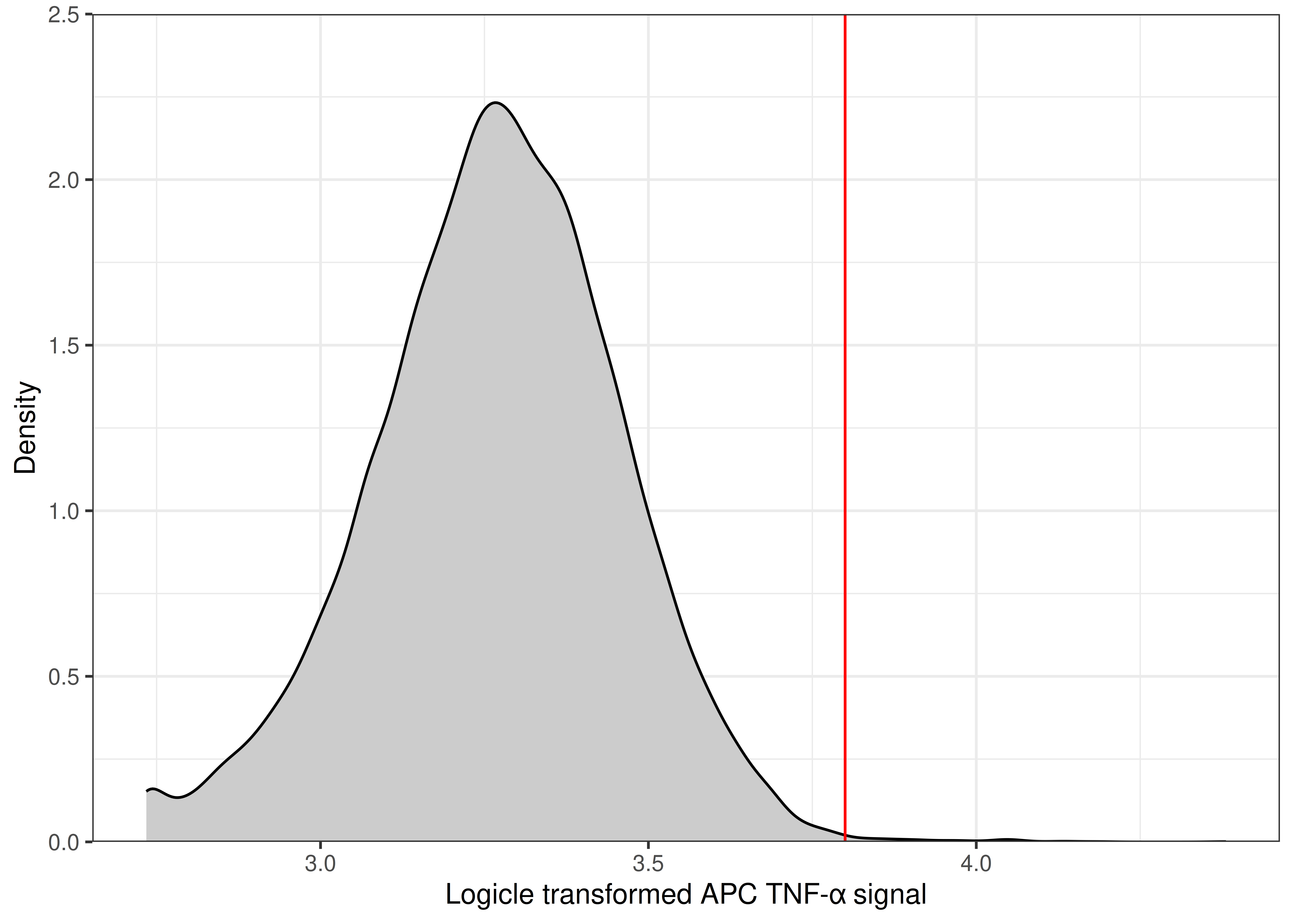
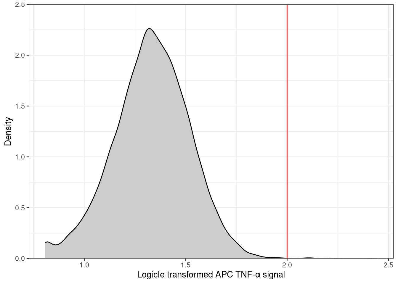
We often want to show the distribution of a signal with the value we used as a threshold (gate) so that readers can evaluate whether the value chosen is appropriate in their opinion. A distribution is best shown with a histogram or density plot. We will annotate the distribution of APC TNF-α signal with the gate used to define whether the cells are positive or negative for TNF-α. it is useful to assign that value to a variable that we can use in our plots1.
🎬 Assign the TNF-α gate value a variable remembering that your number will differ:
apc_cut <- 3.8🎬 Also assign the FITC gate value a variable fitc_cut:
Plotting one sample
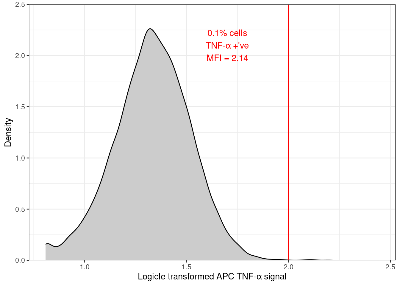
Since the control sample (MEDIA, ISOTYPE) is crucial in determining the APC gating threshold, this is a useful plot.
We first filter the dataframe before plotting it which allows us to pick the sample we want to plot.
🎬 Plot the distribution of the APC TNF-α signal for the MEDIA treatment and the ISOTYPE antibody:
clean_trans_live |>
    filter(treatment == "MEDIA",
           antibody == "ISOTYPE") |>
  ggplot(aes(x = TNFa_APC_Lin)) +
  geom_density(fill = "gray80") +
  geom_vline(xintercept = apc_cut,
             color = "red") +
  scale_y_continuous(expand = c(0, 0),
                     limits = c(0, 2.5),
                     name = "Density") +
  scale_x_continuous(name = "Logicle transformed APC TNF-α signal") +
theme_bw()geom_vline()adds a vertical line to the plot at the value ofapc_cutwhich is the gate value we determined for the APC TNF-α signal.geom_density()is a smoothed version of a histogram2 and shows the distribution of the data. The fill argument sets the colour of the plot to a light grey.the expand argument in a
scale_x_....orscale_y_....sets the axis line at zero rather than being below it.
Plot annotation
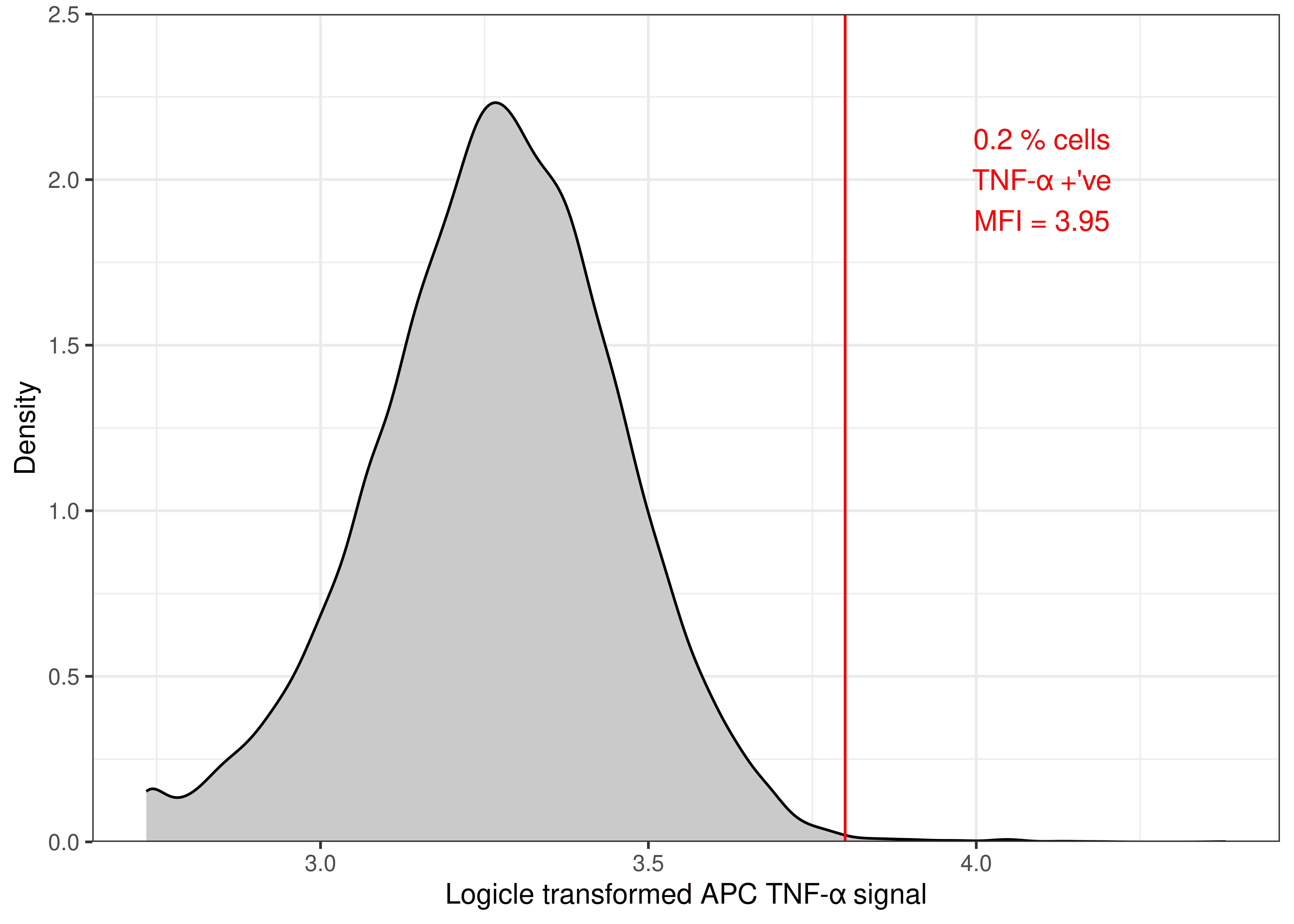
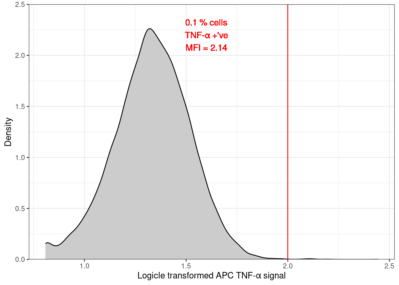
You have (at least) three options for adding the summary statistics to the plot.
-
Most simple: adding in word/googledocs (or whatever you write your report in).
Save the plot using
ggsave(), insert as an image into your report and a text box. In R by hard coding the values in the
annotate()function. The values themselves you have calculated and are in theclean_trans_live_ndataframe
clean_trans_live |>
  filter(treatment == "MEDIA",
         antibody == "ISOTYPE") |>
  ggplot(aes(x = TNFa_APC_Lin)) +
  geom_density(fill = "gray80") +
  geom_vline(xintercept = apc_cut,
             color = "red") +
  annotate(geom = "text",
           label = "0.2 % cells\nTNF-α +'ve\nMFI = 3.95",
           x = 4.1,
           y = 2,
           colour = "red") +
  scale_y_continuous(expand = c(0, 0),
                     limits = c(0, 2.5),
                     name = "Density") +
  scale_x_continuous(name = "Logicle transformed APC TNF-α signal") +
theme_bw()- In R and fully reproducibly by using the
clean_trans_live_ndataframe with the summary statistics ingeom_text(). That dataframe also needs filtering to the sample you are plotting. I have also rounded themean_apcvalue to 2 decimal places.
clean_trans_live |>
  filter(treatment == "MEDIA",
         antibody == "ISOTYPE") |>
  ggplot(aes(x = TNFa_APC_Lin)) +
  geom_density(fill = "gray80") +
  geom_vline(xintercept = apc_cut,
             color = "red") +
  geom_text(data = clean_trans_live_tfna_pos |>
              filter(treatment == "MEDIA",
                     antibody == "ISOTYPE"),
            aes(label = paste0(perc_pos_tnfa,
                               "% cells\nTNF-α +'ve\nMean = ",
                               round(mean_apc, 2))),
           x = 4.1,
           y = 2,
            colour = "red") +
  scale_y_continuous(expand = c(0, 0),
                     limits = c(0, 2.5),
                     name = "Density") +
  scale_x_continuous(name = "Logicle transformed APC TNF-α signal") +
  theme_bw()
This has several advantages:
if the data changes, the plot annotation will update automatically just as the distribution will.
extending to multiple facets requires little extra work.
Write to file
Whatever method you decide to use for annotation, you will need to save your figure as an image.
🎬 Assign the plot to apc_distibution_media_isotype
apc_distibution_media_isotype <- clean_trans_live |>
  filter(treatment == "MEDIA",
         antibody == "ISOTYPE") |>
  ggplot(aes(x = TNFa_APC_Lin)) +
  geom_density(fill = "gray80") +
  geom_vline(xintercept = apc_cut,
             color = "red") +
  geom_text(data = clean_trans_live_tfna_pos |>
              filter(treatment == "MEDIA",
                     antibody == "ISOTYPE"),
            aes(label = paste0(perc_pos_tnfa,
                               "% cells\nTNF-α +'ve\nMean = ",
                               round(mean_apc, 2))),
           x = 4.1,
           y = 2,
            colour = "red") +
  scale_y_continuous(expand = c(0, 0),
                     limits = c(0, 2.5),
                     name = "Density") +
  scale_x_continuous(name = "Logicle transformed APC TNF-α signal") +
  theme_bw()
🎬 Save the plot to a file:
ggsave("figures/apc_distibution_media_isotype.png",
       device = "png",
       plot = apc_distibution_media_isotype,
       width = 4,
       height = 2.5,
       units = "in",
       dpi = 300)
Multiple facets
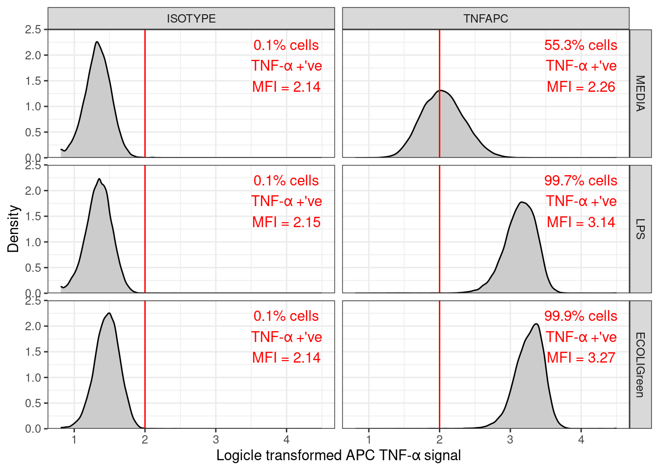
To plot all the samples in one go we can use facet_grid(). treatment ~ antibody puts the treatments in rows and the antibodies in columns. Now do not need to filter the data to a single sample.
🎬 Plot the distribution of the APC TNF-α signal for all samples:
clean_trans_live |>
  ggplot(aes(x = TNFa_APC_Lin)) +
  geom_density(fill = "gray80") +
  geom_vline(xintercept = apc_cut,
             color = "red") +
   geom_text(data = clean_trans_live_tfna_pos,
             aes(label = paste0(perc_pos_tnfa,
                                "% cells\nTNF-α +'ve\nMFI = ",
                                round(mean_apc, 2))),
             x = 6,
             y = 1.7,
             colour = "red") +
  scale_y_continuous(expand = c(0, 0),
                     limits = c(0, 2.5),
                     name = "Density") +
  scale_x_continuous(name = "Logicle transformed APC TNF-α signal") +
  facet_grid(treatment ~ antibody) +
theme_bw()Note that adding plot annotations manually (method 1) and using R fully reproducibly (method 3) are possible on faceted plots but method 2 is not because you need the annotations to change with values in treatment and antibody.
You can combine filtering data and faceted plots to do facet plots of a subset of the samples. For example, you could filter for the ISOTYPE antibody and facet for the treatment.
Overlay instead of facets
Using facets is one way to show multiple samples in one plot. Another is to overlay the plots by mapping the fill aesthetic to the antibody variable. Making the fill semi-transparent with alpha = 0.3 allows you to see the overlap of the distributions.
🎬 Overlay the distribution of the APC TNF-α signals for the media treated samples:
clean_trans_live |>
   filter(treatment == "MEDIA") |>
   ggplot(aes(x = TNFa_APC_Lin, fill = antibody)) +
   geom_density(alpha = 0.3) +
   geom_vline(xintercept = apc_cut,
              color = "red") +
   scale_y_continuous(expand = c(0, 0),
                      limits = c(0, 2.5)) +
   scale_x_continuous(name = "Logicle transformed APC TNF-α signal") +
   theme_bw()
To use colours other than the default, we need to used a scale_fill_... function. These functions can also be used to change the name (name = ...) of the legend and the names (labels = c(...)) of each group. scale_fill_manual() allows to specify the colours (values = c(...)) manually. So you might add:
scale_fill_manual(values = c("green", "blue"))
I like to use the viridis scales. The viridis scales provide colour maps that are perceptually uniform in both colour and black-and-white. They are also designed to be perceived by viewers with common forms of colour blindness. See Introduction to viridis for more information. We do not have to know the names/codes for the colours because ggplot2 provides these in special scale_fill_... functions.
Here I use scale_fill_viridis_d(). The d stands for discrete - antibody, the variable mapped to fill, is discrete. The function scale_fill_viridis_c() would be used for continuous data. I’ve used the default “viridis” (or “D”) option (do ?scale_fill_viridis_d for all the options). I also removed the “antibody” name and moved the legend.
clean_trans_live |>
   filter(treatment == "MEDIA") |>
   ggplot(aes(x = TNFa_APC_Lin, fill = antibody)) +
   geom_density(alpha = 0.3) +
   geom_vline(xintercept = apc_cut,
              color = "red") +
   scale_fill_viridis_d(name = NULL, end = 0.7) +
   scale_y_continuous(expand = c(0, 0),
                      limits = c(0, 2.5)) +
   scale_x_continuous(name = "Logicle transformed APC TNF-α signal") +
   theme_bw() +
   theme(legend.title = element_blank(),
        legend.position = c(0.85, 0.85))
🎬 Can you workout how to annotate this plot?
A figure to report baselines for both signals
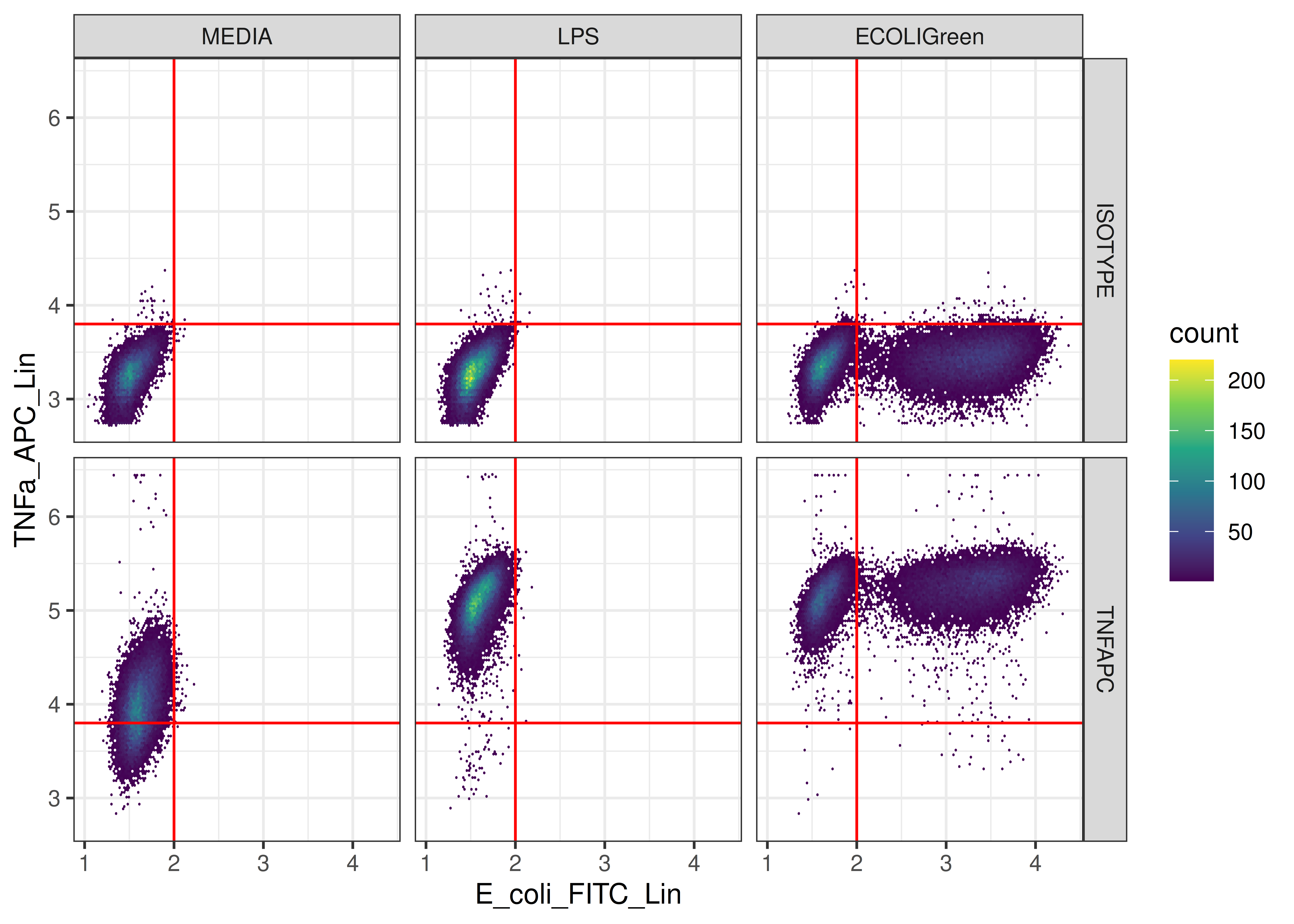
We created the figure below in Week 2
ggplot(clean_trans_live, aes(x = E_coli_FITC_Lin,
                             y = TNFa_APC_Lin)) +
  geom_hex(bins = 128) +
  geom_hline(yintercept = apc_cut,
             color = "red") +
  geom_vline(xintercept = fitc_cut,
             color = "red") +
  scale_fill_viridis_c() +
  facet_grid(antibody ~ treatment) +
  theme_bw()
We might want to annotate this figure with the percentage of cells in each quadrant in each sample. To do that, we need to Calculate the % of cells in each quadrant.
Calculate the % of cells in each quadrant
We want to calculate the percentage of cells in each quadrant of the quadrant gated plot of TNFa_APC_Lin signal against the E_coli_FITC_Lin signal. This means finding the number of cells labelled as:
- TNF-α -’ve and FITC -’ve
- TNF-α -’ve and FITC +’ve
- TNF-α +’ve and FITC -’ve
- TNF-α +’ve and FITC +’ve
🎬 Calculate the number of cells in each quadrant for each sample:
Grouping by antibody and treatment ensures we get values for each sample. The tnfa and fitc columns give whether a cell is positive or negative for that signal.
🎬 Click on the data frame in the environment window to view it and make sure you have an understanding of the data.
| antibody | treatment | tnfa | fitc | n_quad |
|---|---|---|---|---|
| ISOTYPE | MEDIA | TNF-α +'ve | FITC +'ve | 1 |
| ISOTYPE | MEDIA | TNF-α +'ve | FITC -'ve | 37 |
| ISOTYPE | MEDIA | TNF-α -'ve | FITC +'ve | 9 |
| ISOTYPE | MEDIA | TNF-α -'ve | FITC -'ve | 17809 |
| ISOTYPE | LPS | TNF-α +'ve | FITC +'ve | 5 |
| ISOTYPE | LPS | TNF-α +'ve | FITC -'ve | 36 |
| ISOTYPE | LPS | TNF-α -'ve | FITC +'ve | 10 |
| ISOTYPE | LPS | TNF-α -'ve | FITC -'ve | 30624 |
| ISOTYPE | ECOLIGreen | TNF-α +'ve | FITC +'ve | 221 |
| ISOTYPE | ECOLIGreen | TNF-α +'ve | FITC -'ve | 57 |
| ISOTYPE | ECOLIGreen | TNF-α -'ve | FITC +'ve | 23811 |
| ISOTYPE | ECOLIGreen | TNF-α -'ve | FITC -'ve | 17838 |
| TNFAPC | MEDIA | TNF-α +'ve | FITC +'ve | 63 |
| TNFAPC | MEDIA | TNF-α +'ve | FITC -'ve | 20003 |
| TNFAPC | MEDIA | TNF-α -'ve | FITC +'ve | 1 |
| TNFAPC | MEDIA | TNF-α -'ve | FITC -'ve | 8018 |
| TNFAPC | LPS | TNF-α +'ve | FITC +'ve | 40 |
| TNFAPC | LPS | TNF-α +'ve | FITC -'ve | 30441 |
| TNFAPC | LPS | TNF-α -'ve | FITC -'ve | 55 |
| TNFAPC | ECOLIGreen | TNF-α +'ve | FITC +'ve | 17743 |
| TNFAPC | ECOLIGreen | TNF-α +'ve | FITC -'ve | 12943 |
| TNFAPC | ECOLIGreen | TNF-α -'ve | FITC +'ve | 21 |
| TNFAPC | ECOLIGreen | TNF-α -'ve | FITC -'ve | 8 |
As there are four quadrants and six samples, you would expect 24 rows in the data frame. However, there are only 23 rows. This is because for one sample, TNFAPC-LPS, there are no cells in one quadrant, TNF-α -’ve FITC +’ve (the bottom right quadrant). Since we are probably happy not to annotate a figure with 0 %, this is fine.
To calculate the percentage of cells in each quadrant, we need to join this dataframe with the number of non-debris cells for each sample, i.e., clean_trans_live_n
🎬 Calculate the percentage of cells in each quadrant for each sample:
I have additionally filtered out rows where the % cells rounds to 0. This is again because we are probably happy not to annotate a figure with 0 %.
🎬 Click on the data frame in the environment window to view it and make sure you have an understanding of the data.
| antibody | treatment | tnfa | fitc | n_quad | n | n_live | perc_live | mean_apc | n_pos_tnfa | perc_pos_tnfa | perc_quad |
|---|---|---|---|---|---|---|---|---|---|---|---|
| ISOTYPE | MEDIA | TNF-α +'ve | FITC -'ve | 37 | 20154 | 17856 | 88.6 | 3.950328 | 38 | 0.2 | 0.2 |
| ISOTYPE | MEDIA | TNF-α -'ve | FITC +'ve | 9 | 20154 | 17856 | 88.6 | 3.950328 | 38 | 0.2 | 0.1 |
| ISOTYPE | MEDIA | TNF-α -'ve | FITC -'ve | 17809 | 20154 | 17856 | 88.6 | 3.950328 | 38 | 0.2 | 99.7 |
| ISOTYPE | LPS | TNF-α +'ve | FITC -'ve | 36 | 31789 | 30675 | 96.5 | 3.968852 | 41 | 0.1 | 0.1 |
| ISOTYPE | LPS | TNF-α -'ve | FITC -'ve | 30624 | 31789 | 30675 | 96.5 | 3.968852 | 41 | 0.1 | 99.8 |
| ISOTYPE | ECOLIGreen | TNF-α +'ve | FITC +'ve | 221 | 44095 | 41927 | 95.1 | 3.867921 | 278 | 0.7 | 0.5 |
| ISOTYPE | ECOLIGreen | TNF-α +'ve | FITC -'ve | 57 | 44095 | 41927 | 95.1 | 3.867921 | 278 | 0.7 | 0.1 |
| ISOTYPE | ECOLIGreen | TNF-α -'ve | FITC +'ve | 23811 | 44095 | 41927 | 95.1 | 3.867921 | 278 | 0.7 | 56.8 |
| ISOTYPE | ECOLIGreen | TNF-α -'ve | FITC -'ve | 17838 | 44095 | 41927 | 95.1 | 3.867921 | 278 | 0.7 | 42.5 |
| TNFAPC | MEDIA | TNF-α +'ve | FITC +'ve | 63 | 31089 | 28085 | 90.3 | 4.121845 | 20066 | 71.4 | 0.2 |
| TNFAPC | MEDIA | TNF-α +'ve | FITC -'ve | 20003 | 31089 | 28085 | 90.3 | 4.121845 | 20066 | 71.4 | 71.2 |
| TNFAPC | MEDIA | TNF-α -'ve | FITC -'ve | 8018 | 31089 | 28085 | 90.3 | 4.121845 | 20066 | 71.4 | 28.5 |
| TNFAPC | LPS | TNF-α +'ve | FITC +'ve | 40 | 31945 | 30536 | 95.6 | 5.075325 | 30481 | 99.8 | 0.1 |
| TNFAPC | LPS | TNF-α +'ve | FITC -'ve | 30441 | 31945 | 30536 | 95.6 | 5.075325 | 30481 | 99.8 | 99.7 |
| TNFAPC | LPS | TNF-α -'ve | FITC -'ve | 55 | 31945 | 30536 | 95.6 | 5.075325 | 30481 | 99.8 | 0.2 |
| TNFAPC | ECOLIGreen | TNF-α +'ve | FITC +'ve | 17743 | 32591 | 30715 | 94.2 | 5.201248 | 30686 | 99.9 | 57.8 |
| TNFAPC | ECOLIGreen | TNF-α +'ve | FITC -'ve | 12943 | 32591 | 30715 | 94.2 | 5.201248 | 30686 | 99.9 | 42.1 |
| TNFAPC | ECOLIGreen | TNF-α -'ve | FITC +'ve | 21 | 32591 | 30715 | 94.2 | 5.201248 | 30686 | 99.9 | 0.1 |
You can combine the concept of annotation and faceted plots to annotate a quadrant gated plot of TNFa_APC_Lin signal against the E_coli_FITC_Lin signal.
Because the annotation for each quadrant is in a different place, you will need to use four geom_text() one for each quadrant and you will need to filter appropriately.
Remember you also have the option to annotate manually.
Importing class data
The BIO00066I Biomedical Sciences class data are in a google sheet.
You have a couple of options for importing this:
download the file as an excel file or .csv and import that
import the data directly from the google sheet into R. An advantage of using the google sheet is you won’t have to remember to download the data when someone updates it.
The spreadsheet will be closed for input on 1700 Friday 20 March (week 6) so people can make conclusions about the class data without being concerned it will change.
Importing from a googlesheet
You can use the googlesheets4 package (Bryan 2023) to do this.
file <- "https://docs.google.com/spreadsheets/d/1aMWvzRRT86SWFuCGaO_yjnbeH3XtxralaKsO5ffVMfE/edit?usp=drive_link"class_data <- read_sheet(file, sheet = "data-2026")You will be asked to authenticate in your browser. This message will appear in the console and the browser should open
Waiting for authentication in browser...
Press Esc/Ctrl + C to abort
You can Allow “Tidyverse API Packages wants to access your Google Account”.
The data should then read in.
Authentication complete.
✔ Reading from BIO00066I Biomedical Sciences class data.
✔ Range ''data-2026''.
Note that you will probably want to do some quality control such has filtering out rows with missing data in important columns. We did this in the Data Analysis 1: Core workshop.
Analysis of the class data
The class data has the summary statistics. You do not need to apply flowcytometry methods to these data. You should be able to apply techniques you have learned in stage 1 to the class data.
Stage 1
Data Analysis in R for Becoming a Bioscientist 1 (Rand 2023a). Core concepts about scientific computing, types of variable, the role of variables in analysis and how to use RStudio to organise analysis and import, summarise and plot data.
Data Analysis in R for Becoming a Bioscientist 2 (Rand 2023a). The logic of hypothesis testing, confidence intervals, what is meant by a statistical model, two-sample tests and one- and two-way analysis of variance (ANOVA).
Supporting book Computational Analysis for Bioscientists (Rand 2023b)
Independent study following the workshop
The Code file
All the answers (coding and thinking) are in the source code for the workshop. You can view it using the </> Code button at the top of the page. Coding and thinking answers are marked with #---CODING ANSWER--- and #---THINKING ANSWER---
Pages made with R (R Core Team 2024), Quarto (Allaire et al. 2022), knitr (Xie 2024, 2015, 2014), kableExtra (Zhu 2024)
References
Footnotes
You might want to look back at Quality control 3: Gating to determine a ‘real’ signal in the week 2 workshop to remind yourself how we determined the gate values for the sample data.↩︎
You can use a histogram if you prefer. You will need different limits on the y axis.↩︎
