Workshop
Data Analysis 2: Biomedical sciences - Sample data analysis
Introduction
Session overview
In this workshop you will learn how to analyse some sample flow cytometry data which is formatted in the same way as the data you will produce.
Exercises
Set up
Make a RStudio Project
🎬 Start RStudio from the Start menu.
🎬 Make an RStudio project. Be deliberate about where you create it so that it is a good place for you.
🎬 Use the Files pane to make folders for the data. I suggest data-raw/, data-processed/ and data-meta/
🎬 Make a new script called sample-data-analysis.R to carry out the rest of the work.
🎬 Record what you do and what you find out. All of it! Make notes on the inputs and outputs of each command. This will help you work out problems analysing your own data.
Load packages
We need three packages for this workshop:
tidyverse(Wickham et al. 2019): importing the meta data which is in a text file, working with the data once it is in a dataframe to filter, summarise and plot.flowCore(Ellis et al. 2024): to import data from flow cytometry files (.fcs), apply the logicle transformation, and use functions for using a “flowSet” data structure.flowAI(Monaco et al. 2016): which performs automated quality control by checking for changes in instrument speed and signal intensity that indicate a problem for the reading on a cell
These packages are installed already. You can go straight to loading them.
I recommend working on the University computers for this work. You can still work from home by using the Virtual Desktop Service. The VDS allows you to log on to a university computer from your own computer. It means you can access all software and filestores. When using the VDS for R and RStudio, it usually makes sense to use other software - such as a browser or file explorer - also through the VDS. Go to the Virtual Desktop Service for set up instructions.
However, If you are confident in your ability to set up your own machine, you will need to install these packages.
You can install tidyverse from CRAN in the normal way.
flowCore and flowAI are not on CRAN but come from Bioconductor.
first install
BiocManagerfrom CRAN in the normal way.then install from Bioconductor using
BiocManager::install("flowCore")andBiocManager::install("flowAI")
If you have difficulty installing these packages, use the Virtual Desktop Service which allows you to log into a university machine from your laptop.
🎬 Load tidyverse,flowCore and flowAI
Load tidyverse last because flowCore also has some functions with the same names as functions in tidyverse and you will want the tidyverse ones.
Import the data
There are six data files, one for each treatment and antibody combination:
- ECOLIGreen_ISOTYPE.fcs
- ECOLIGreen_TNFAPC.fcs
- LPS_ISOTYPE.fcs
- LPS_TNFAPC.fcs
- MEDIA_ISOTYPE.fcs
- MEDIA_TNFAPC.fcs
🎬 Save copies of each file (right click and save as) to your data-raw/ folder.
These are six files associated with one experiment.
We are going to use the command read.flowSet() from the flowCore package to import the data. In R, the data from one file is stored in a “flowFrame” object. A flowFrame is a data structure in the same way that a dataframe or a vector is a data structure. A flowFrame has “slots”.
- The first slot is called
exprsand contains the data itself in matrix which looks just like a dataframe. - The second is called
parametersand contains the names of the columns inexprs. - The third is called
descriptionand contains information about the.fcsfile.
A “flowSet” is a list of related flowFrames. They are related in that they have the same column names, came from the same machine, and are part of the same experiment. Such data needs to be treated in the same way which is why it is useful to have a structure like a flowSet.
🎬 Make a variable to hold the file names:
myfiles <- list.files("data-raw", pattern = ".fcs$")list.files() will return a character vector of the names of the files data-raw/. The pattern argument is a “regular expression” which is used to filter the names of the files. Here we are asking for the names of the files which end in .fcs. This would be very useful if you had other file types in that folder. In our case, there are only .fcs files in that folder.
🎬 Type myfiles to check it contains what you expect.
🎬 Use read.flowSet() to import the files from the folder data-raw/ that are listed in the variable myfiles and name the resulting flowSet fs:
fs <- read.flowSet(myfiles,
                   path = "data-raw")
You now have a flowSet which is a list of 6 flowFrames, one for each .fcs file.
Explore the data structure
🎬 Type fs to see what it contains:
fs A flowSet with 6 experiments.
column names(16): TIME Time MSW ... FL 8 Log Event CountWe can index the list to access the first flowFrame in the flowSet.
🎬 Type fs[[1]] to see the information about the first flowFrame in the flowSet:
fs[[1]] flowFrame object 'ECOLIGreen_ISOTYPE.fcs'
with 50000 cells and 16 observables:
name desc range minRange maxRange
$P1 TIME TIME 65536 0 65536
$P2 Time MSW Time MSW 7 0 7
$P3 Pulse Width Pulse Width 397 0 397
$P4 FS Lin FS Lin 55001 0 55001
$P5 FS Area FS Area 65536 0 65536
... ... ... ... ... ...
$P12 FL 1 Log FL 1 Log 64962 0 64962
$P13 FL 8 Lin FL 8 Lin 758 0 758
$P14 FL 8 Area FL 8 Area 2217 0 2217
$P15 FL 8 Log FL 8 Log 28864 0 28864
$P16 Event Count Event Count 50002 0 50002
130 keywords are stored in the 'description' slotThis tells you there are 50000 cells (rows) and 16 columns in this dataset. The first two columns TIME and Time MSW give the time in binary format since the beginning of the data acquisition.
🎬 You can use the exprs() function to access the actual data and pipe it to View() to show it in a window:
🎬 List the column names in each of the flowFrames:
colnames(fs) [1] "TIME" "Time MSW" "Pulse Width" "FS Lin" "FS Area"
[6] "FS Log" "SS Lin" "SS Area" "SS Log" "FL 1 Lin"
[11] "FL 1 Area" "FL 1 Log" "FL 8 Lin" "FL 8 Area" "FL 8 Log"
[16] "Event Count"The side scatter (SS) and forward scatter (FS) columns are used to select the live cells. The fluorescence measurements are in the FL columns and it is the linear values, FL 1 Lin and FL 8 Lin that have our FITC and APC signals respectively.
These exploratory steps are to help you understand the R objects you have. They are not essential parts of the analysis.
Improve the column names
Names like FL 1 Lin meaning “fluorescence channel 1 linear” are not very informative. A list of more useful column names are given in meta.csv. We can import this file and use the resulting dataframe to rename columns in our flowFrames. This will make it easier to understand our data and results.
🎬 Save a copy of the file (right click and save as) to your data-meta/ folder
🎬 Import the meta data and examine it:
meta <- read_csv("data-meta/meta.csv")| name |
|---|
| TIME |
| Time_MSW |
| Pulse_Width |
| FS_Lin |
| FS_Area |
| FS_Log |
| SS_Lin |
| SS_Area |
| SS_Log |
| E_coli_FITC_Lin |
| E_coli_FITC_Area |
| E_coli_FITC_Log |
| TNFa_APC_Lin |
| TNFa_APC_Area |
| TNFa_APC_Log |
| Event_Count |
🎬 Assign the names in meta$name to the columns in the flowFrames:
 [1] "TIME"             "Time_MSW"         "Pulse_Width"      "FS_Lin"
 [5] "FS_Area"          "FS_Log"           "SS_Lin"           "SS_Area"
 [9] "SS_Log"           "E_coli_FITC_Lin"  "E_coli_FITC_Area" "E_coli_FITC_Log"
[13] "TNFa_APC_Lin" "TNFa_APC_Area" "TNFa_APC_Log" "Event_Count" You don’t have to use the names I have used for your own analysis if you prefer different names. Simply edit the meta.csv file. However, you do need to keep the Time column named that way for the next step to proceed.
Quality control 1: Automated instrument issues
flowAI is a package that provides a set of tools for automated QC of flow cytometry data. It checks for:
- changes in instrument speed using the Time column,
- changes in signal intensity
- cells that are outside the dynamic range
It generates a new flowSet with the problematic events removed along with a folder containing filtered .fcs files and a quality control report in html format. It will take a few minutes to do all files.
🎬 Run the automated quality control:
Quality control for the file: ECOLIGreen_ISOTYPE
3.73% of anomalous cells detected in the flow rate check.
0% of anomalous cells detected in signal acquisition check.
0% of anomalous cells detected in the dynamic range check.
Quality control for the file: ECOLIGreen_TNFAPC
2.93% of anomalous cells detected in the flow rate check.
0% of anomalous cells detected in signal acquisition check.
0% of anomalous cells detected in the dynamic range check.
Quality control for the file: LPS_ISOTYPE
4.31% of anomalous cells detected in the flow rate check.
0% of anomalous cells detected in signal acquisition check.
0% of anomalous cells detected in the dynamic range check.
Quality control for the file: LPS_TNFAPC
4.13% of anomalous cells detected in the flow rate check.
0% of anomalous cells detected in signal acquisition check.
0% of anomalous cells detected in the dynamic range check.
Quality control for the file: MEDIA_ISOTYPE
7.45% of anomalous cells detected in the flow rate check.
0% of anomalous cells detected in signal acquisition check.
0% of anomalous cells detected in the dynamic range check.
Quality control for the file: MEDIA_TNFAPC
4.11% of anomalous cells detected in the flow rate check.
0% of anomalous cells detected in signal acquisition check.
0% of anomalous cells detected in the dynamic range check.
fs_clean <- flow_auto_qc(fs,
folder_results = "sample-QC")❓ What has been removed through the QC process?
❓ What is in the folder “sample-QC”?
Get a feel of your data: Plot distributions
Plotting the distributions of our variables is very useful for getting an overview of our data. We’ll just look at the first flowFrame to get over the principles. However, you may wish to examine all of the flow frames of your own data.
🎬 Plot the distribution of the linear TNFa_APC signal in the first flowFrame in the flowSet:
exprs(fs_clean[[1]]) |>
  data.frame() |>
  ggplot(aes(x = TNFa_APC_Lin)) +
  geom_histogram(bins = 100)
This is a very skewed distribution which makes visualisation hard. It is common to log skewed distributions to improve visualisation.
🎬 Plot the distribution of the logged TNFa_APC_Lin column:
exprs(fs_clean[[1]]) |>
  data.frame() |>
  ggplot(aes(x = log(TNFa_APC_Lin))) +
  geom_histogram(bins = 100)
Now our data are easier to see.
Transform the data
In fact, we will apply a different transformation called “logicle” (Parks, Roederer, and Moore 2006). This transformation is has a similar effect as logging but avoids some problems that can occur with flow cytometry data and especially flow cytometry data that have been “compensated” . Compensation is routinely applied to flow cytometry data to correct for fluorophores being detected in in multiple channels. This was not a problem in our experiment.
The transformation is applied in two steps: the transformation needed is estimated from the data and then that transformation is applied.
We need to apply the transformation only to the TNFa_APC_Lin and E_coli_FITC_Lin columns. The estimateLogicle() function refers to columns as channels.
🎬 Estimate the transformation from the data:
trans <- estimateLogicle(fs_clean[[1]],
                         channels = c("E_coli_FITC_Lin", "TNFa_APC_Lin"))
🎬 Apply the transformation to all theTNFa_APC_Lin and E_coli_FITC_Lin columns the flowSet:
# apply the transformation
fs_clean_trans <- transform(fs_clean, trans)
🎬 Examine the effect on the first flow frame:
exprs(fs_clean_trans[[1]]) |>
  data.frame() |>
  ggplot(aes(x = TNFa_APC_Lin)) +
  geom_histogram(bins = 100)
That looks better.
Make data easier to work with
We are going to get the data from the flowSet and put in a dataframe. FlowCore contains many functions for gating (filtering), plotting and summarising flowSets but putting the data into a dataframe will make it easier for you to use tools you already know and more easily follow the priciples of what you are doing.
We will be using familiar tools like group_by() and summarise(), filter() and ggplot()
🎬 Put the transformed data into a data frame:
# Put into a data frame for ease of use
clean_trans <- fsApply(fs_clean_trans, exprs) |> data.frame()
fsApply(flowSet, function) applies a function to every flowFrame in a flowSet. Here we have accessed the data matirx in each with exprs().
The are 265617 rows (cells) in the dataset. You can view it by clicking on the dataframe in the Environment. At the moment, we cannot tell which row (cell) is from which sample but we can add the sample names as a column in that dataframe.
Each sample name needs to appear as many times as there are cells (events) in the corresponding flowFrame. For example,
dim(fs_clean_trans[[1]])["events"]is 48135 cells.sampleNames(fs_clean_trans)gives the names of the samples.We can use the
rep()function to repeat the sample names the correct number of times.
🎬 Add the sample name to each row:
clean_trans <- clean_trans |>
  dplyr::mutate(sample = rep(sampleNames(fs_clean_trans),
                             times = c(dim(fs_clean_trans[[1]])["events"],
                                       dim(fs_clean_trans[[2]])["events"],
                                       dim(fs_clean_trans[[3]])["events"],
                                       dim(fs_clean_trans[[4]])["events"],
                                       dim(fs_clean_trans[[5]])["events"],
                                       dim(fs_clean_trans[[6]])["events"])))
The sample name contains the information about which antibody and treatment the sample was. Our analysis will be a little easier if we add this information to separate columns. We can extract the antibody and treatment from the sample name using the extract() function and two “regular expressions”.
🎬 Add columns for treatment and antibody by extracting that information from the sample name:
- the sample name is treatment_antibody
- each pattern matching the treatment and antibody is enclosed in parentheses
- we want to keep those patterns to go in the new columns
- the underscore is matched but not enclosed in parentheses so it is not kept
-
.fcsis matched but not enclosed in parentheses so it is not kept - the
remove = FALSEargument means that the original column is kept -
[]enclose a set of characters -
a-zmeans any lower case letter,A-Zmeans any upper case letter so[a-zA-Z]means any letter -
+means one or more of the preceding character set - so
[a-zA-Z]+means one or more letters
We have added the treatment and antibody information to each row by processing the names of the fcs files. This works because the file names have a specific format which we have matched with the regex. When you work with your own data, the easist thing to do is ensure your files have the same names as the same data.
🎬 View the dataframe to see the new columns.
Our treatments have an order. Media is the control, LPS should be next and ECOLIGreen should be last. We can use the fct_relevel() function to put groups in order so that our graphs are better to interpret.
clean_trans <- clean_trans |>
  mutate(treatment = fct_relevel(treatment, c("MEDIA",
                                              "LPS",
                                              "ECOLIGreen")))
Save the data
We have cleaned and transform our data. It is a good idea to save it at this point so that we can start from here if we need to.
🎬 Save the data:
write_csv(clean_trans, "data-processed/ai_clean_logicle_trans.csv")Quality control 2: ‘Gating’ to Removing debris
Some of the cells will have died and broken during the experiment. We need to perform quality control on our data to remove observations that have that have the size and granularity that is not typical of a live cell. This is done by filtering on the forward scatter (size) and side scatter (granularity) channels.
In flow cytometry, it is common to describe filtering as “gating” and the observations (cells) being kept as “in the gate”.
We create a scatter plot of the forward scatter (size) and side scatter (granularity) for each sample to see where we should put the gate.
We could use geom_point() but many points will overlap so it is difficult to see the density of points. geom_hex() puts the points in bins and colours the bin with the number of points.
🎬 Plot the forward scatter and side scatter for each sample
ggplot(clean_trans, aes(x = FS_Lin, y = SS_Lin)) +
  geom_hex(bins = 128) +
  scale_fill_viridis_c() +
  facet_grid(antibody ~ treatment) +
  theme_bw()
We can see a cloud of points in the middle of the plot. This is where the live cells are. Points towards the corners, especially in the bottom left corner are likely to be cell debris. We can draw a gate around the cloud of points to remove the debris. We should use the same filter/gate on all six data sets for consistency. The gates can be a rectangle, polygon, or ellipse. We will use a rectangle.
Manual rectangular gate
Use the zoom on the plot window to better see the cloud of points and the axis values. You need to use minimum and maximum \(x\) and \(y\) values to define the rectangle.
🎬 Define the minimum and maximum \(x\) and \(y\) values for the gate:
xmin <- 15000
xmax <- 35000
ymin <- 7500
ymax <- 28000I chose theses values but you might judge the gate differently. You will certainly need to use different values for your own data. The next plot will help you refine them.
🎬 Put those values in a dataframe so we can plot the gate on the hexbin plot:
box <- data.frame(x = c(xmin, xmin, xmax, xmax),
                  y = c(ymin, ymax, ymax, ymin))
🎬 Plot the forward scatter and side scatter for each sample with the gate:
ggplot(clean_trans, aes(x = FS_Lin, y = SS_Lin)) +
  geom_hex(bins = 128) +
  scale_fill_viridis_c() +
  geom_polygon(data = box, aes(x = x, y = y),
               fill = NA,
               color = "red",
               linewidth = 1) +
  facet_grid(antibody ~ treatment) +
  theme_bw()
🎬 Adjust the values of xmin, xmax, ymin, and ymax to get a gate that you are happy with.
We have drawn the gate on the plot but we need to use it to filter out the debris (rows) from our data. We want only the cells with FS_Lin values that are between the xmin and xmax and SS_Lin that are between ymin and ymax values we chose.
🎬 Filter the data to remove the debris:
clean_trans_live now has 249009 cells. We should report how many cells were in the gate for each sample.
🎬 Find the number of cells in each sample after flowAI cleaning:
Note than we use the clean and transformed data for summarising the number in each set after cleaning.
| antibody | treatment | n |
|---|---|---|
| ISOTYPE | MEDIA | 25221 |
| ISOTYPE | LPS | 47846 |
| ISOTYPE | ECOLIGreen | 48135 |
| TNFAPC | MEDIA | 47945 |
| TNFAPC | LPS | 47934 |
| TNFAPC | ECOLIGreen | 48536 |
🎬 Find the number of cells in each sample after flowAI cleaning and removing debris
Now we use the clean, transformed and gated data.
| antibody | treatment | n_live |
|---|---|---|
| ISOTYPE | MEDIA | 22313 |
| ISOTYPE | LPS | 46128 |
| ISOTYPE | ECOLIGreen | 45748 |
| TNFAPC | MEDIA | 43256 |
| TNFAPC | LPS | 45757 |
| TNFAPC | ECOLIGreen | 45807 |
🎬 Join two data frames together using the combination of the treatment and the antibody and calculate what % cells remained in each sample after gating (i.e., the % live cells):
| antibody | treatment | n_live | n | perc_live |
|---|---|---|---|---|
| ISOTYPE | MEDIA | 22313 | 25221 | 88.5 |
| ISOTYPE | LPS | 46128 | 47846 | 96.4 |
| ISOTYPE | ECOLIGreen | 45748 | 48135 | 95.0 |
| TNFAPC | MEDIA | 43256 | 47945 | 90.2 |
| TNFAPC | LPS | 45757 | 47934 | 95.5 |
| TNFAPC | ECOLIGreen | 45807 | 48536 | 94.4 |
🎬 Plot the forward scatter and side scatter for each sample with the gate and the number of cells in each sample.
ggplot(clean_trans, aes(x = FS_Lin, y = SS_Lin)) +
  geom_hex(bins = 128) +
  scale_fill_viridis_c() +
  geom_polygon(data = box, aes(x = x, y = y),
               fill = NA,
               color = "red",
               linewidth = 1) +
  geom_text(data = clean_trans_live_n,
            aes(label = paste0(perc_live, "%")),
            x = 45000,
            y = 1000,
            colour = "red",
            size = 5) +
  facet_grid(antibody ~ treatment) +
theme_bw() 
This figure allows you to report what data you included in your analysis of the TNFa_APC_Lin and E_coli_FITC_Lin signals.
🎬 Plot the TNFa_APC_Lin and E_coli_FITC_Lin signals for these live cells:
ggplot(clean_trans_live, aes(x = E_coli_FITC_Lin,
                                  y = TNFa_APC_Lin)) +
  geom_hex(bins = 128) +
  scale_fill_viridis_c() +
  facet_grid(antibody ~ treatment) +
  theme_bw()
Quality control 3: Gating to determine a ‘real’ signal?
From now on we are working with the cleaned and gated data, that is, the dataframe clean_trans_live.
We have two signals:
-
TNFa_APC_Linshould indicate the amount of TNF-α protein in the cell -
E_coli_FITC_Linshould indicate the amount of E. coli in the cell
The TNFa_APC_Lin signal
When the antibody is ISOTYPE there is no TNF-α so that level of TNFa_APC_Lin signal means no TNF-α. In other words, that signal is a control. If you look at the top row of scatter plots, that level seems to be about 3.8. In the rest of the data set we should assume any signal below 3.8 means there is no TNF-α.
We can use this to set a threshold for the TNFa_APC_Lin signal and then label cells as either positive or negative for TNF-α.
🎬 Define the threshold for the TNFa_APC_Lin signal:
apc_cut <- 3.8🎬 Plot the TNFa_APC_Lin and E_coli_FITC_Lin with the threshold for the TNFa_APC_Lin signal:
ggplot(clean_trans_live, aes(x = E_coli_FITC_Lin,
                                  y = TNFa_APC_Lin)) +
  geom_hex(bins = 128) +
  geom_hline(yintercept = apc_cut,
             color = "red") +
  scale_fill_viridis_c() +
  facet_grid(antibody ~ treatment) +
  theme_bw()
That looks about right. We will use this value to label each cell as positive or negative for TNF-α.
🎬 Add a label, tnfa, to the data to indicate if the cell is positive or negative for TNF-α
🎬 Summarise each group by finding the number of TNF-α positive cells and the mean TNFa_APC_Lin signal for each group:
| antibody | treatment | n_pos_tnfa | mean_apc |
|---|---|---|---|
| ISOTYPE | MEDIA | 46 | 3.957716 |
| ISOTYPE | LPS | 63 | 3.943064 |
| ISOTYPE | ECOLIGreen | 306 | 3.867121 |
| TNFAPC | MEDIA | 30951 | 4.120422 |
| TNFAPC | LPS | 45676 | 5.075094 |
| TNFAPC | ECOLIGreen | 45767 | 5.200902 |
🎬 We can add the number of live cells to this data frame and calculate the percentage of live cells that are positive for TNF-α:
🎬 And put the columns into a more logical order:
clean_trans_live_tfna_pos <-
  clean_trans_live_tfna_pos |>
  select(antibody,
         treatment,
         n,
         n_live,
         perc_live,
         mean_apc,
         n_pos_tnfa,
perc_pos_tnfa)| antibody | treatment | n | n_live | perc_live | mean_apc | n_pos_tnfa | perc_pos_tnfa |
|---|---|---|---|---|---|---|---|
| ISOTYPE | MEDIA | 25221 | 22313 | 88.5 | 3.957716 | 46 | 0.2 |
| ISOTYPE | LPS | 47846 | 46128 | 96.4 | 3.943064 | 63 | 0.1 |
| ISOTYPE | ECOLIGreen | 48135 | 45748 | 95.0 | 3.867121 | 306 | 0.7 |
| TNFAPC | MEDIA | 47945 | 43256 | 90.2 | 4.120422 | 30951 | 71.6 |
| TNFAPC | LPS | 47934 | 45757 | 95.5 | 5.075094 | 45676 | 99.8 |
| TNFAPC | ECOLIGreen | 48536 | 45807 | 94.4 | 5.200902 | 45767 | 99.9 |
The fact that a very low percentage of cells are positive for TNF-α in the isotype control is a good indication that cut off we used for the TNFa_APC_Lin signal is a good one.
TNFAPC-MEDIA combination tells us how much TNF-α we expect in unstimulated cells.
This is important data for your write up and will be your contribution to the class data set so you should write it to file.
🎬 Write clean_trans_live_tfna_pos to file:
write_csv(clean_trans_live_tfna_pos,
          "data-processed/clean_trans_live_tfna_pos.csv")
The E_coli_FITC_Lin signal
We can apply the same logic to the E_coli_FITC_Lin signal.
For either antibody, when the treatment is media or LPS there is no E.coli so that level of E_coli_FITC_Lin signal means zero. That level looks to be about 2.
🎬 Define the threshold for the E_coli_FITC_Lin signal:
fitc_cut <- 2🎬 Add a label, fitc, to the data to indicate if the cell is positive or negative for FITC
You may wish to repeat the process we used for the TNFa_APC_Lin signal to find out the number of cells that are FITC positive in each sample and the mean intensity of the FITC signal in the FITC positive cells.
A figure to report baselines for both signals
🎬 Plot TNFa_APC_Lin against E_coli_FITC_Lin with the thresholds for both signals:
ggplot(clean_trans_live, aes(x = E_coli_FITC_Lin,
                                  y = TNFa_APC_Lin)) +
  geom_hex(bins = 128) +
  geom_hline(yintercept = apc_cut,
             color = "red") +
    geom_vline(xintercept = fitc_cut,
             color = "red") +
  scale_fill_viridis_c() +
  facet_grid(antibody ~ treatment) +
  theme_bw()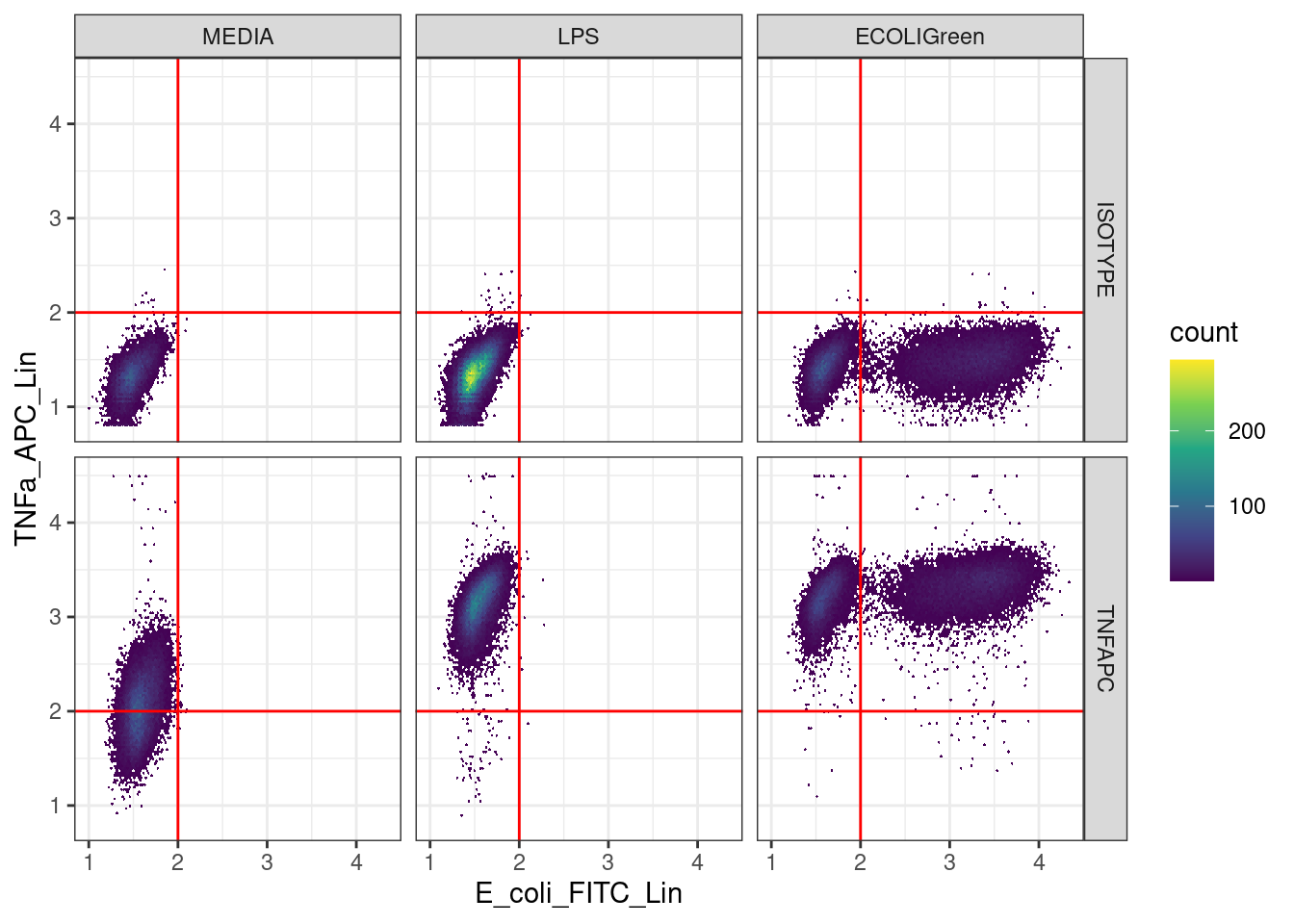
Save the data
We have filtered out the dead cells and debris and added labels to the data to indicate if the cells are positive or negative for TNF-α and E. coli. It would be a good idea to save this data to file so we can start from importing this data in the future rather than having to repeat all of the steps we have done so far.
🎬 Save the data:
write_csv(clean_trans_live, "data-processed/live_labelled.csv")Look after future you!
🎬 This workshop is a template for the analysis of your own data. Go back through your script and check you understand what you have done. Can you identify where you will need to edit? Do you understand what you will need to assess in order to make edits needed for your own data? Examine all of the objects in the environment to check you understand what they are and why they are there.
You’re finished!
🥳 Well Done! 🎉
Independent study following the workshop
The Code file
All the answers (coding and thinking) are in the source code for the workshop. You can view it using the </> Code button at the top of the page. Coding and thinking answers are marked with #---CODING ANSWER--- and #---THINKING ANSWER---
Pages made with R (R Core Team 2024), Quarto (Allaire et al. 2022), knitr (Xie 2024, 2015, 2014), kableExtra (Zhu 2024)