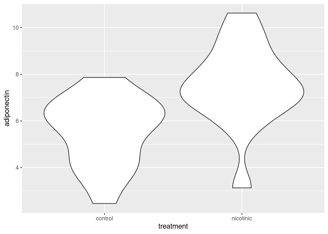
ggplot(data = adip, aes(x = treatment, y = adiponectin)) +
geom_violin()Workshop
Two-sample tests
Introduction
Session overview
In this workshop you will get practice in choosing between, performing, and presenting the results of, two-sample tests and their non-parametric equivalents in R.
Philosophy
Workshops are not a test. It is expected that you often don’t know how to start, make a lot of mistakes and need help. It is expected that you are familiar with independent study content before the workshop. However, you need not remember or understand every detail as the workshop should build and consolidate your understanding. Tips
- don’t worry about making mistakes
- don’t let what you can not do interfere with what you can do
- discussing code with your neighbours will help
- look things up in the independent study material
- look things up in your own code from earlier
- there are no stupid questions
These four symbols are used at the beginning of each instruction so you know where to carry out the instruction.
 Something you need to do on your computer. It may be opening programs or documents or locating a file.
 Something you should do in RStudio. It will often be typing a command or using the menus but might also be creating folders, locating or moving files.
 Something you should do in your browser on the internet. It may be searching for information, going to the VLE or downloading a file.
 A question for you to think about and answer. Record your answers in your script for future reference.
Getting started
 Start RStudio from the Start menu.
 Make an RStudio project for this workshop by clicking on the drop-down menu on top right where it says
 Project: (None) and choosing New Project, then New Directory, then New Project. Navigate to the data-analysis-in-r-1 folder and name the RStudio Project week-7.
 Make new folders called
 data-raw and figures. You can do this on the Files Pane by clicking New Folder and typing into the box that appears.
 Make a new script then save it with a name like
 two-sample-tests.R to carry out the rest of the work.
 Add a comment to the script:
 # Two-sample tests and load the tidyverse (Wickham et al. 2019) package
Exercises
Adiponectin secretion
Adiponectin is exclusively secreted from adipose tissue and modulates a number of metabolic processes. Nicotinic acid can affect adiponectin secretion. 3T3-L1 adipocytes were treated with nicotinic acid or with a control treatment and adiponectin concentration (pg/mL) measured in the medium. The data are in adipocytes.txt. Each row represents an independent sample of adipocytes and the first column gives the concentration of adiponectin and the second column indicates whether they were treated with nicotinic acid or not (the control).
 Save a copy of adipocytes.txt to
 data-raw
 Read in the data and check the structure. I used the name
 adip for the dataframe/tibble.
We have a tibble containing two variables: adiponectin is the response variable and is continuous; treatment is explanatory. treatment is categorical with two levels (groups). The first task is visualise the data to get an overview. For continuous response variables with categorical explanatory variables you could use geom_point(), geom_boxplot() or a variety of other geoms. I often use geom_violin() which allows us to see the distribution - the violin is fatter where there are more data points.
 Do a quick plot of the data:
Summarising the data
Summarising the data for each treatment group is the next sensible step. The most useful summary statistics are the means, standard deviations, sample sizes and standard errors.
 Create a data frame called
 adip_summary that contains the means, standard deviations, sample sizes and standard errors for the control and nicotinic acid treated samples. You may need to read the Summarise section from the Week 4 workshop (Rand 2023)
You should get the following numbers:
| treatment | mean | std | n | se |
|---|---|---|---|---|
| control | 5.546000 | 1.475247 | 15 | 0.3809072 |
| nicotinic | 7.508667 | 1.793898 | 15 | 0.4631824 |
Remember that you can see the contents of a dataframe with any of these:
- type the name of the dataframe in the console: prints the dataframe to console
- click on the dataframe name in the Environment window: opens a spreadsheet like view of the dataframe in the Code window
- typing
View(dataframe)in the console: opens a spreadsheet like view of the dataframe in the Code window
Selecting a test
 Do you think this is a paired-sample test or two-sample test?
Applying, interpreting and reporting
 Create a two-sample model like this:
mod <- lm(data = adip,
          adiponectin ~ treatment)
Examine the model with:
summary(mod)
Call:
lm(formula = adiponectin ~ treatment, data = adip)

Residuals:
    Min      1Q  Median      3Q     Max
-4.3787 -1.0967  0.1927  1.0245  3.1113

Coefficients:
                   Estimate Std. Error t value Pr(>|t|)
(Intercept)          5.5460     0.4240  13.079  1.9e-13 ***
treatmentnicotinic   1.9627     0.5997   3.273  0.00283 **
---
Signif. codes:  0 '***' 0.001 '**' 0.01 '*' 0.05 '.' 0.1 ' ' 1

Residual standard error: 1.642 on 28 degrees of freedom
Multiple R-squared:  0.2767,    Adjusted R-squared:  0.2509
F-statistic: 10.71 on 1 and 28 DF,  p-value: 0.00283
What do you conclude from the test? Write your conclusion in a form suitable for a report.
Check assumptions
The assumptions of the general linear model are that the residuals – the difference between predicted value (i.e., the group mean) and observed values - are normally distributed, and have homogeneous variance. To check these we can examine the mod$residuals variable. You may want to refer to Checking assumptions in the “Single regression” workshop.
 Plot the model residuals against the fitted values.
 What to you conclude?
To examine normality of the model residuals we can plot them as a histogram and do a normality test on them.
 Plot a histogram of the residuals.
 Use the
 shapiro.test() to test the normality of the model residuals
 What to you conclude?
Illustrating
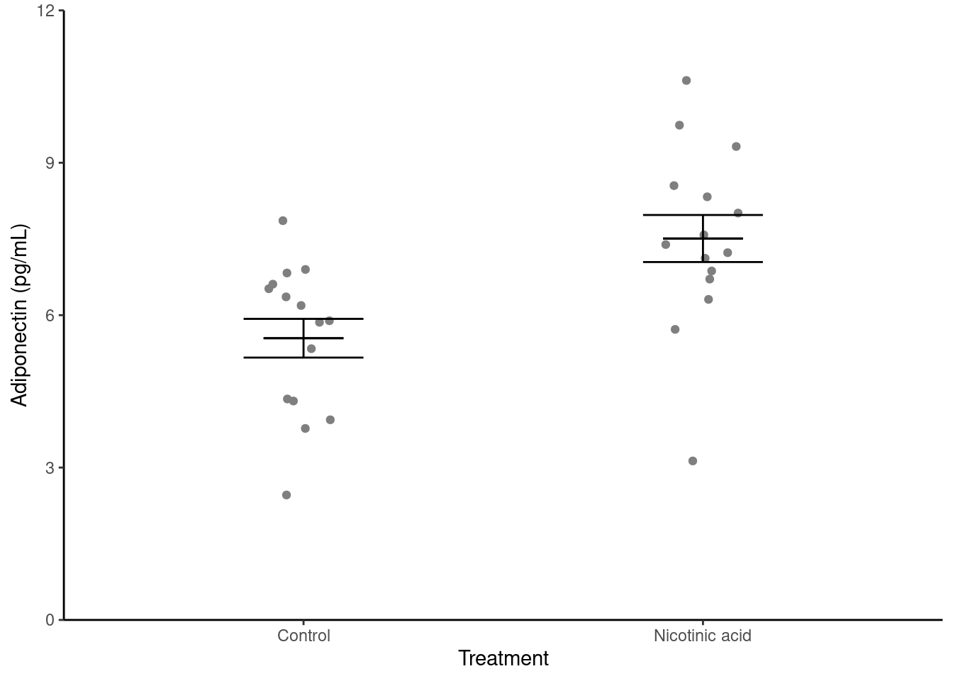
 Create a figure like the one below. You may need to refer to Visualise from the “Summarising data with several variables” workshop (Rand 2023)
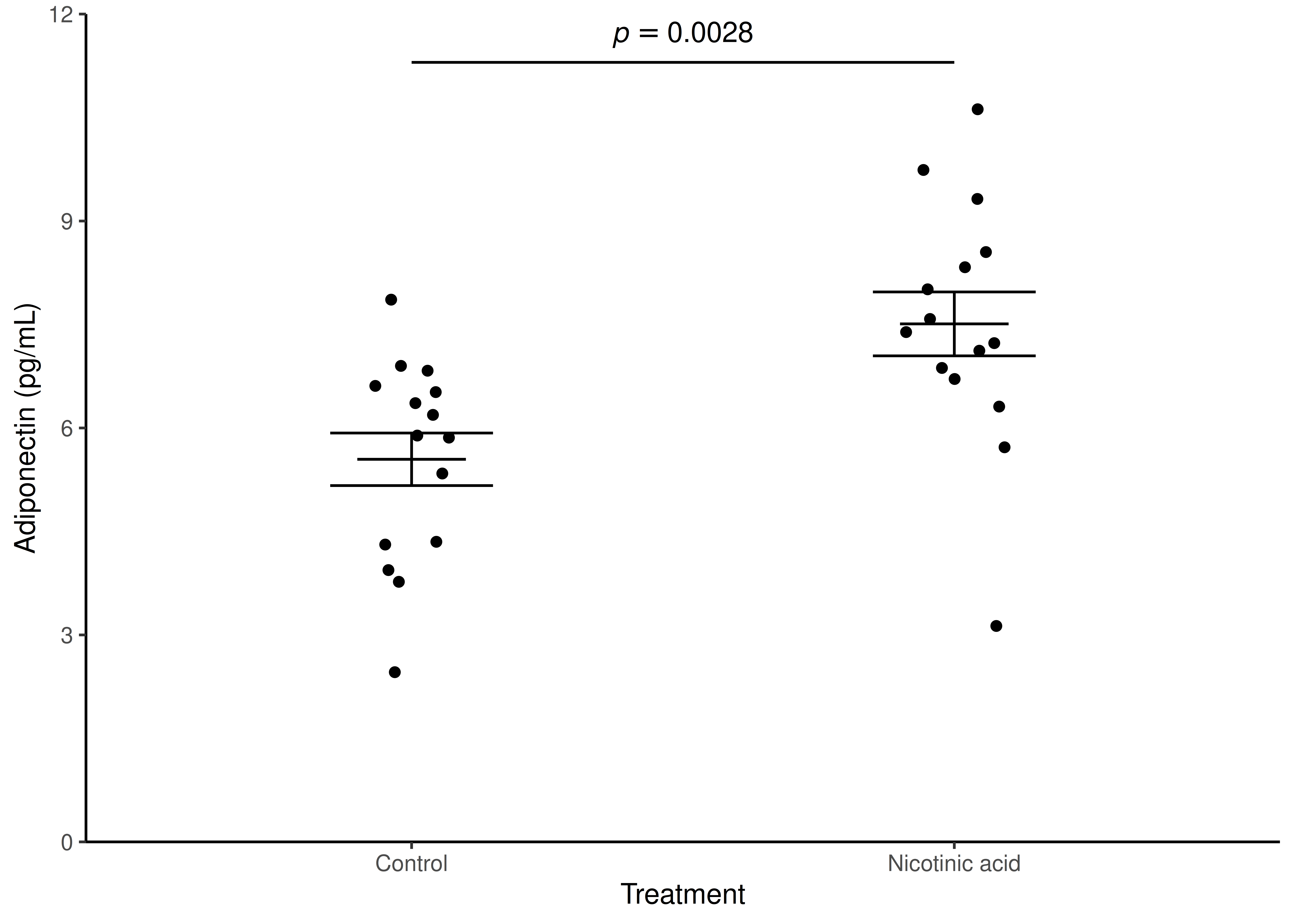
We now need to annotate the figure with the results from the statistical test. This most commonly done with a line linking the means being compared and the p-value. The annotate() function can be used to draw the line and then to add the value. The line is a segment and the p-value is a text.
Annotation - method 1
You can annotate the p-value manually by typing it in to the appropriate annotate() function.
 Add annotation to the figure by adding:
...... +
annotate("segment", x = 1, xend = 2,
         y = 11.3, yend = 11.3,
         colour = "black") +
annotate("text", x = 1.5,  y = 11.7,
         label = "italic(p) == 0.0028",
         parse = TRUE)
.....-
annotate("segment", ...)adds a line to the figure starting at x = 1 and y = 11.3 and ending at x = 2 and y = 11.3 -
annotate("text", ...)adds text to the figure at x = 1.5 and y = 11.7 - the
labelis written in R’s plotmath syntax rather than being a normal string.-
italic(p)renders the letter p in italics -
==is the plotmath symbol for “=”
-
-
parse = TRUEtells ggplot2 to interpret that string as a plotmath expression rather than literally adding “italic(p) == 0.0028”.
However, it is more reproducible to extract the p-value from the model object.
Annotation - method 2
 Extract the p-value from the model object:
- `broom is a package that turns model outputs into more easy to use tidy formats
-
glance(mod)puts information from mod including the p-value into a dataframe -
pull(p.value)extracts the value from p-value column in the dataframe -
round(4)rounds the p-value to 4 decimal places
The segment and text can then be added to the figure.
 Add annotation to the figure by adding:
...... +
  annotate("segment", x = 1, xend = 2,
           y = 11.3, yend = 11.3,
           colour = "black") +
  annotate("text", x = 1.5,  y = 11.7,
           label = glue::glue("italic(p) == { p_value }"),
                              parse = TRUE)) +
.....- The glue package allows us to use R objects in strings so their v values are printed.
- We use curly braces
{}a round the R object so it is understood as an R object and its value is written rather than literally writing “p_value”
 Save your figure to your figures folder. Make sure you script figure saving with
 ggsave().
Grouse Parasites
Grouse livers were dissected and the number of individuals of a parasitic nematode were counted for two estates ‘Gordon’ and ‘Moss’. We want to know if the two estates have different infection rates. The data are in grouse.csv
 Save a copy of grouse.csv to
 data-raw
 Read in the data and check the structure. I used the name
 grouse for the dataframe/tibble.
Selecting
 Using your common sense, do these data look normally distributed?
 What test do you suggest?
Applying, interpreting and reporting
 Summarise the data by finding the median of each group:
 Carry out a two-sample Wilcoxon test (also known as a Mann-Whitney):
wilcox.test(data = grouse, nematodes ~ estate)
    Wilcoxon rank sum exact test

data:  nematodes by estate
W = 78, p-value = 0.03546
alternative hypothesis: true location shift is not equal to 0
What do you conclude from the test? Write your conclusion in a form suitable for a report.
Illustrating
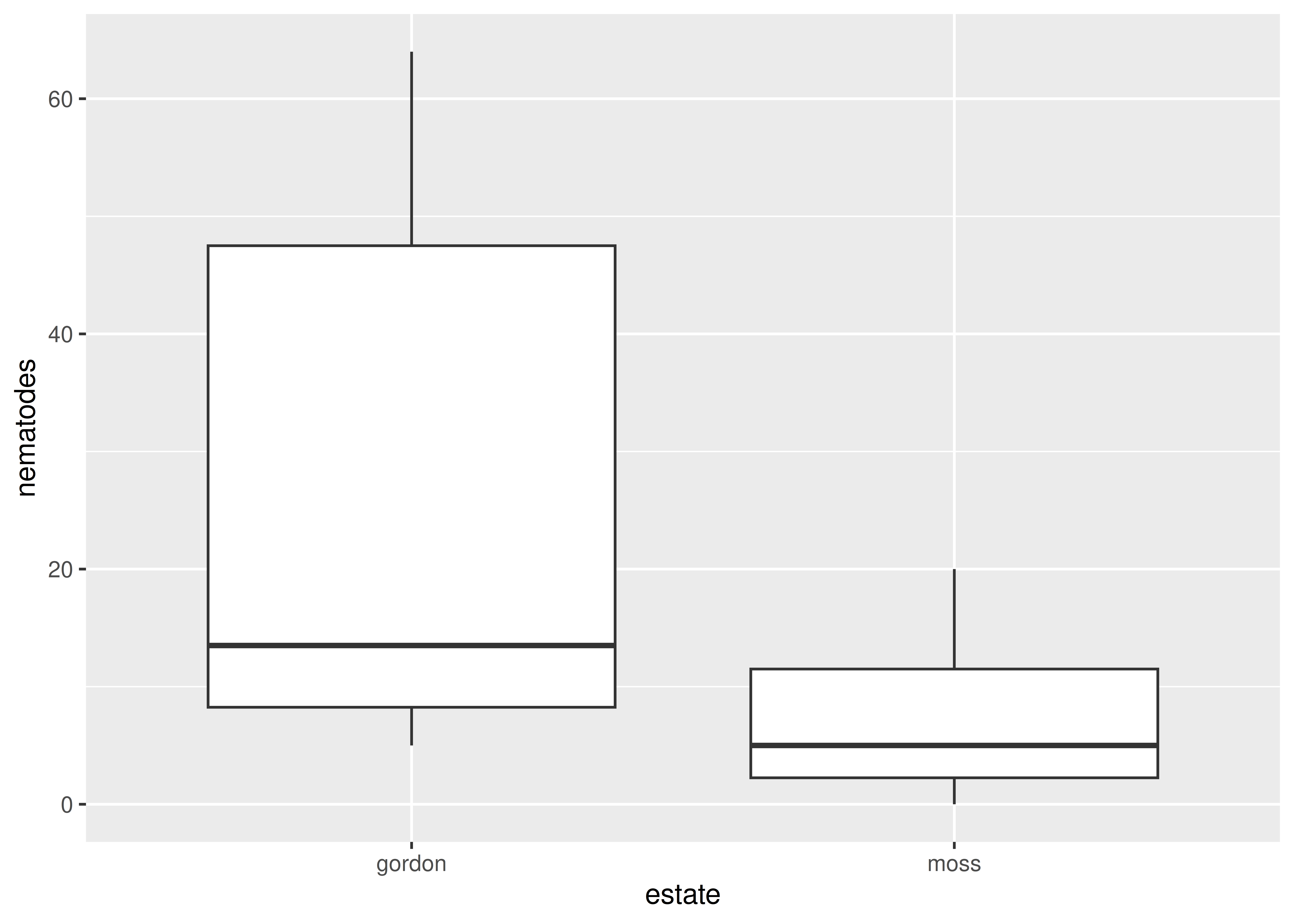
A box plot is a usually good choice for illustrating a two-sample Wilcoxon test because it shows the median and interquartile range.
 We can create a simple boxplot with:
 Annotate and format the figure so it is more suitable for a report and save it to your figures folder.
If you want to use method 2 for annotating the p-value, you can extract the p-value with
p_value <- wilcox.test(data = grouse, nematodes ~ estate) |>
  broom::tidy() |>
  pull(p.value) |>
  round(4)
Gene Expression
Bambara groundnut (Vigna subterranea) is an African legume with good nutritional value which can be influenced by low temperature stress. Researchers are interested in the expression levels of a particular set of 35 genes (probe_id) in response to temperature stress. They measure the expression of the genes at 23 and 18 degrees C (high and low temperature). These samples are not independent because we have two measure from one gene. The data are in expr.xlsx.
Selecting
 What is the null hypothesis?
 Save a copy of expr.xlsx and import the data. I named the dataframe
 bambara
 What is the appropriate parametric test?
Applying, interpreting and reporting
A paired test requires account for the variation between genes.
 Create a paired-sample model like this:
mod <- lm(data = bambara,
          expression ~ temperature + probe_id)
Examine the model with:
summary(mod)
Call:
lm(formula = expression ~ temperature + probe_id, data = bambara)

Residuals:
    Min      1Q  Median      3Q     Max
-0.5345 -0.2094  0.0000  0.2094  0.5345

Coefficients:
                                Estimate Std. Error t value Pr(>|t|)
(Intercept)                      2.00019    0.28773   6.952 5.15e-08 ***
temperaturelowert               -0.30728    0.09591  -3.204  0.00294 **
probe_idGma.12117.1.S1_at        0.11320    0.40122   0.282  0.77955
probe_idGma.12565.1.A1_at        1.31450    0.40122   3.276  0.00243 **
probe_idGma.12641.1.A1_at        0.41440    0.40122   1.033  0.30896
probe_idGma.12911.1.A1_s_at      0.21940    0.40122   0.547  0.58806
probe_idGma.13045.1.S1_at        0.02165    0.40122   0.054  0.95728
probe_idGma.1679.1.A1_at         0.15610    0.40122   0.389  0.69965
probe_idGma.17385.1.S1_at        0.35280    0.40122   0.879  0.38540
probe_idGma.2266.1.S1_s_at      -0.27105    0.40122  -0.676  0.50388
probe_idGma.2555.1.S1_s_at      -0.74210    0.40122  -1.850  0.07308 .
probe_idGma.4452.1.A1_s_at      -0.39600    0.40122  -0.987  0.33062
probe_idGma.5163.2.S1_at         0.69635    0.40122   1.736  0.09169 .
probe_idGma.6423.1.S1_at         0.09230    0.40122   0.230  0.81943
probe_idGma.8525.1.S1_s_at       0.87865    0.40122   2.190  0.03549 *
probe_idGmaAffx.19961.1.S1_at    0.38790    0.40122   0.967  0.34047
probe_idGmaAffx.24949.1.S1_at    0.17475    0.40122   0.436  0.66592
probe_idGmaAffx.30443.1.S1_at    0.36625    0.40122   0.913  0.36775
probe_idGmaAffx.33657.1.S1_at   -0.37655    0.40122  -0.939  0.35460
probe_idGmaAffx.36315.1.S1_at    1.80255    0.40122   4.493 7.73e-05 ***
probe_idGmaAffx.37672.1.A1_at    0.60275    0.40122   1.502  0.14225
probe_idGmaAffx.39830.1.S1_at    0.11055    0.40122   0.276  0.78457
probe_idGmaAffx.44319.1.S1_at    0.45780    0.40122   1.141  0.26183
probe_idGmaAffx.52122.1.S1_at    1.17505    0.40122   2.929  0.00604 **
probe_idGmaAffx.55864.1.S1_at   -0.40805    0.40122  -1.017  0.31632
probe_idGmaAffx.5705.1.S1_at     0.81750    0.40122   2.038  0.04944 *
probe_idGmaAffx.59856.1.S1_at   -0.22190    0.40122  -0.553  0.58384
probe_idGmaAffx.67021.2.S1_at    0.22690    0.40122   0.566  0.57543
probe_idGmaAffx.68483.1.S1_at    0.81930    0.40122   2.042  0.04897 *
probe_idGmaAffx.7166.1.S1_at    -1.01450    0.40122  -2.529  0.01626 *
probe_idGmaAffx.77709.1.S1_at    0.72625    0.40122   1.810  0.07913 .
probe_idGmaAffx.77888.1.S1_at    0.17170    0.40122   0.428  0.67139
probe_idGmaAffx.81915.1.S1_at    0.64390    0.40122   1.605  0.11777
probe_idGmaAffx.8717.1.S1_at     0.93150    0.40122   2.322  0.02638 *
probe_idGmaAffx.93493.1.S1_s_at  0.37840    0.40122   0.943  0.35227
probe_idGmaAffx.9536.1.S1_at    -0.61725    0.40122  -1.538  0.13320
---
Signif. codes:  0 '***' 0.001 '**' 0.01 '*' 0.05 '.' 0.1 ' ' 1

Residual standard error: 0.4012 on 34 degrees of freedom
Multiple R-squared:  0.8238,    Adjusted R-squared:  0.6424
F-statistic: 4.542 on 35 and 34 DF,  p-value: 1.273e-05
The “(Intercept) Estimate” will be the average of the higher temperature expression because h come before l in the alphabet. The “temperaturelowert” is how much the expression changes on average going from higher to lower temperatures. You can ignore the rest of the output.
 If you prefer, you can use the
 anova() function on the model object:
anova(mod)Analysis of Variance Table
Response: expression
Df Sum Sq Mean Sq F value Pr(>F)
temperature 1 1.6524 1.65240 10.2649 0.002943 **
probe_id 34 23.9354 0.70398 4.3732 2.079e-05 ***
Residuals 34 5.4732 0.16098
---
Signif. codes: 0 '***' 0.001 '**' 0.01 '*' 0.05 '.' 0.1 ' ' 1This presents you with less information. The p-value for the effect of temperate on gene expression will always be the same as in the larger table.
 State your conclusion from the test in a form suitable for including in a report. Make sure you give the direction of any significant effect.
Look after future you!
The code required to summarise, test, and plot data for a two-independent-samples test AND for a one-way ANOVA is exactly the same except for the names of the dataframe, variables and the axis labels and limits. Take some time to comment it your code so that you can make use of it next week.
You’re finished!
🥳 Well Done! 🎉
Independent study following the workshop
The Code file
This contains all the code needed in the workshop even where it is not visible on the webpage.
The workshop.qmd file is the file I use to compile the practical. Qmd stands for Quarto markdown. It allows code and ordinary text to be interweaved to produce well-formatted reports including webpages. View the source code for this workshop using the </> Code button at the top of the page. Coding and thinking answers are marked with #---CODING ANSWER--- and #---THINKING ANSWER---
Pages made with R (R Core Team 2024), Quarto (Allaire et al. 2022), knitr (Xie 2024, 2015, 2014), kableExtra (Zhu 2024)
