ggplot(plant, aes(x = day, y = mass)) +
  geom_point()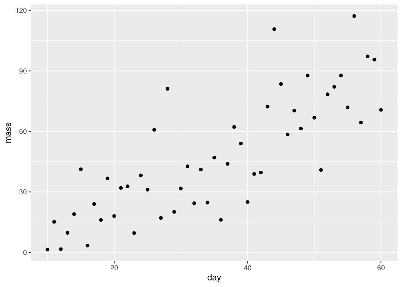
Introduction to statistical models: Single linear regression
In this session you will carry out, interpret and report a single linear regression.
Workshops are not a test. It is expected that you often don’t know how to start, make a lot of mistakes and need help. It is expected that you are familiar with independent study content before the workshop. However, you need not remember or understand every detail as the workshop should build and consolidate your understanding. Tips
These four symbols are used at the beginning of each instruction so you know where to carry out the instruction.
 Something you need to do on your computer. It may be opening programs or documents or locating a file.
 Something you should do in RStudio. It will often be typing a command or using the menus but might also be creating folders, locating or moving files.
 Something you should do in your browser on the internet. It may be searching for information, going to the VLE or downloading a file.
 A question for you to think about and answer. Record your answers in your script for future reference.
Start RStudio from the Start menu.
Make an RStudio project for this workshop by clicking on the drop-down menu on top right where it says Project: (None) and choosing New Project, then New Directory, then New Project. Navigate to the data-analysis-in-r-2 folder and name the RStudio Project week-2.
Make new folders called data-raw and figures. You can do this on the Files Pane by clicking New Folder and typing into the box that appears.
Make a new script then save it with a name like single-linear-regression.R to carry out the rest of the work.
Add a comment to the script: # Introduction to statistical models: Single linear-regression and load the tidyverse (Wickham et al. 2019) package
The data in plant.xlsx is a set of observations of plant growth over two months. The researchers planted the seeds and harvested, dried and weighed a plant each day from day 10 so all the data points are independent of each other.
Save a copy of plant.xlsx to your data-raw folder and import it.
What type of variables do you have? Which is the response and which is the explanatory? What is the null hypothesis?
Do a quick plot of the data:
ggplot(plant, aes(x = day, y = mass)) +
geom_point()
What are the assumptions of linear regression? Do these seem to be met?
We now carry out a regression assigning the result of the lm() procedure to a variable and examining it with summary().
Call:
lm(formula = mass ~ day, data = plant)

Residuals:
    Min      1Q  Median      3Q     Max
-32.810 -11.253  -0.408   9.075  48.869

Coefficients:
            Estimate Std. Error t value Pr(>|t|)
(Intercept)  -8.6834     6.4729  -1.342    0.186
day           1.6026     0.1705   9.401  1.5e-12 ***
---
Signif. codes:  0 '***' 0.001 '**' 0.01 '*' 0.05 '.' 0.1 ' ' 1

Residual standard error: 17.92 on 49 degrees of freedom
Multiple R-squared:  0.6433,    Adjusted R-squared:  0.636
F-statistic: 88.37 on 1 and 49 DF,  p-value: 1.503e-12
The Estimates in the Coefficients table give the intercept (first line) and the slope (second line) of the best fitting straight line. The p-values on the same line are tests of whether that coefficient is different from zero.
The F value and p-value in the last line are a test of whether the model as a whole explains a significant amount of variation in the dependent variable. For a single linear regression this is exactly equivalent to the test of the slope against zero.
What is the equation of the line? What do you conclude from the analysis?
Does the line go through (0,0)?
What percentage of variation is explained by the line?
It might be useful to assign the slope and the intercept to variables in case we need them later. The can be accessed in the mod$coefficients variable:
mod$coefficients(Intercept) day
-8.683379 1.602606 Assign mod$coefficients[1] to b0 and mod$coefficients[1] to b1:
I also rounded the values to two decimal places.
We need to examine the residuals. Very conveniently, the object which is created by lm() contains a variable called $residuals. Also conveniently, the R’s plot() function can used on the output objects of lm(). The assumptions of the GLM demand that each y is drawn from a normal distribution for each x and these normal distributions have the same variance. Therefore, we plot the residuals against the fitted values to see if the variance is the same for all the values of x. The fitted - or predicted - values are the values on the line of best fit. Each residual is the difference between the fitted values and the observed value.
Plot the model residuals against the fitted values like this:
plot(mod, which = 1)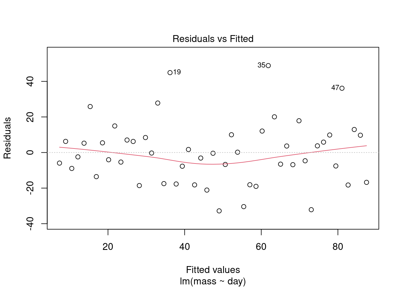
What to you conclude?
To examine normality of the model residuals we can plot them as a histogram and do a normality test on them.
Plot a histogram of the residuals:
ggplot(mapping = aes(x = mod$residuals)) +
  geom_histogram(bins = 10)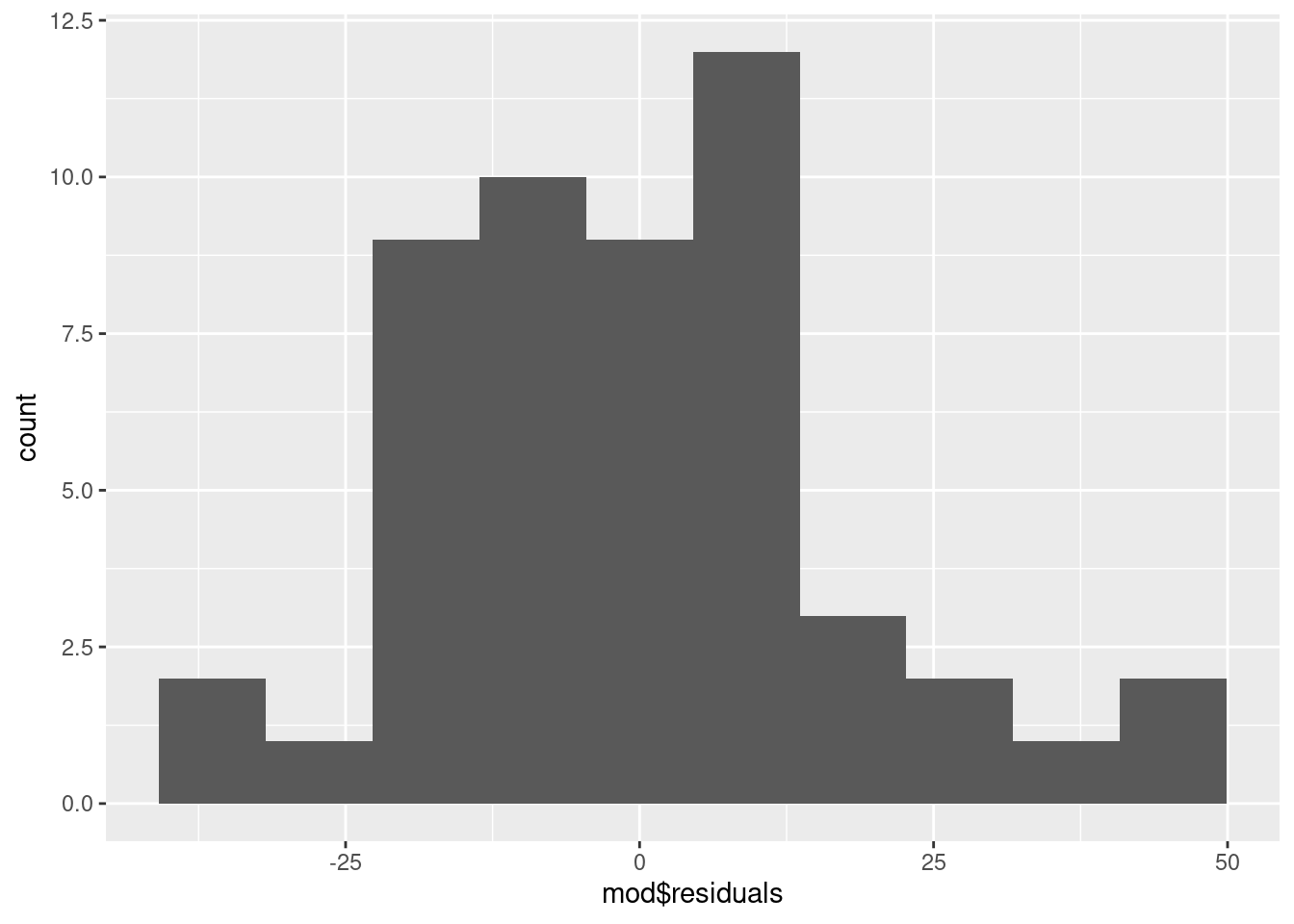
Use the shapiro.test() to test the normality of the model residuals
shapiro.test(mod$residuals)
    Shapiro-Wilk normality test

data:  mod$residuals
W = 0.96377, p-value = 0.1208
Usually, when we are doing statistical tests we would like the the test to be significant because it means we have evidence of a biological effect. However, when doing normality tests we hope it will not be significant. A non-significant result means that there is no significant difference between the distribution of the residuals and a normal distribution and that indicates the assumptions are met.
What to you conclude?
We want a figure with the points and the statistical model, i.e., the best fitting straight line.
Create a scatter plot using geom_point()
ggplot(plant, aes(x = day, y = mass)) +
  geom_point() +
  theme_classic()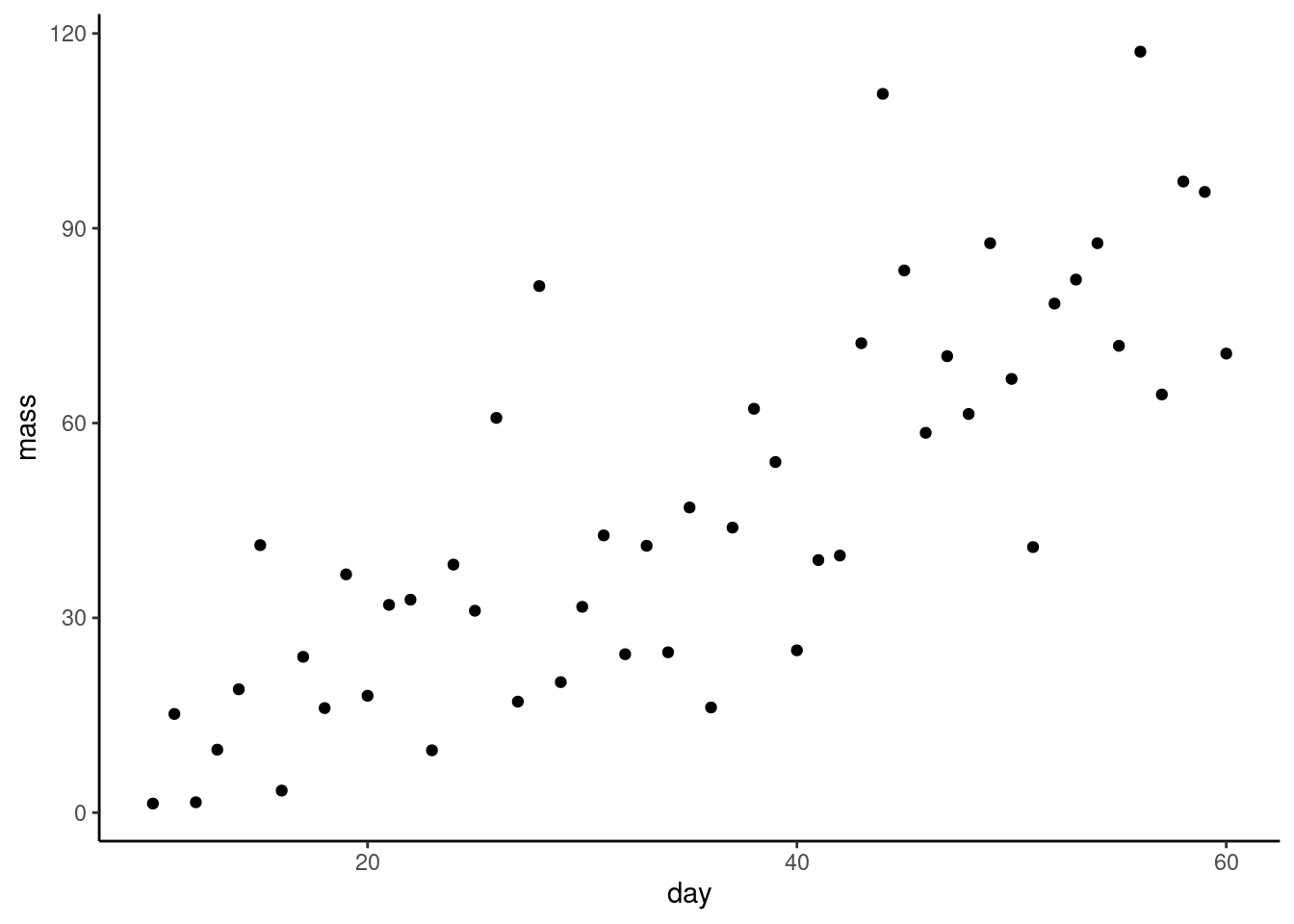
The geom_smooth() function will add a variety of fitted lines to a plot. We want a straight line so we need to specify method = "lm":
ggplot(plant, aes(x = day, y = mass)) +
  geom_point() +
  geom_smooth(method = "lm",
              se = FALSE,
              colour = "black") +
  theme_classic()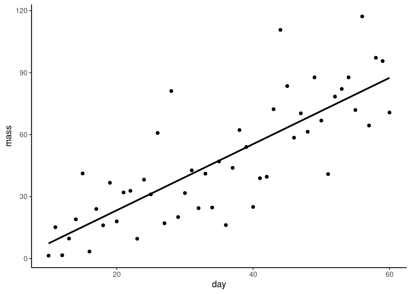
What do the se and colour arguments do? Try changing them.
Let’s add the equation of the line to the figure using annotate():
ggplot(plant, aes(x = day, y = mass)) +
  geom_point() +
  geom_smooth(method = "lm",
              se = FALSE,
              colour = "black") +
  annotate("text", x = 20, y = 110,
           label = "mass = 1.61 * day - 8.68") +
  theme_classic()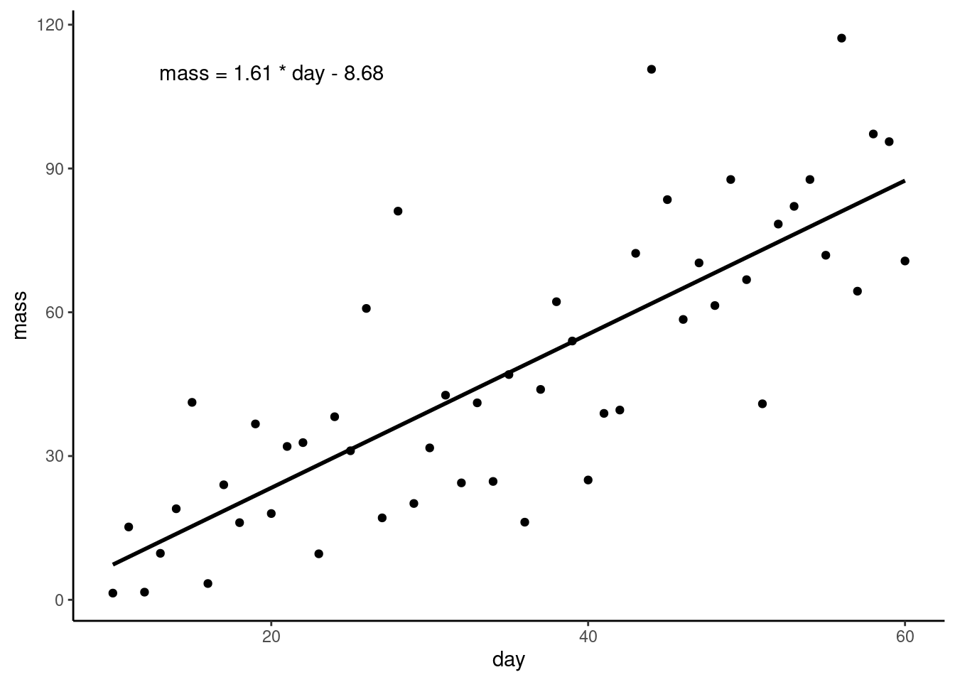
We have to tell annotate() what type of geom we want - text in this case, - where to put it, and the text we want to appear.
Instead of hardcoding the equation, we can use the values of b0 and b1 that we assigned earlier. This is a neat trick that makes or work more reproducible. If the data were updated, we would not need to change the equation in the figure.
ggplot(plant, aes(x = day, y = mass)) +
  geom_point() +
  geom_smooth(method = "lm",
              se = FALSE,
              colour = "black") +
  annotate("text", x = 20, y = 110,
           label = glue::glue("mass = { b1 } * day {if (b0<0) \"-\" else \"+\"} { abs(b0) }") ) +
  theme_classic()
glue::glue() function allows us to use variables in the text - the variables go inside curly braces{ b1 } and { abs(b0) } are the variables we assigned earlier and they will be replaced with their values in the text.if (b0<0) \"-\" else \"+\" part is a conditional that adds a minus sign if the intercept is negative and a plus sign if it is positive. The abs(b0) part makes sure we only show the absolute value of the intercept. Improve the axes. You may need to refer back Changing the axes from the Week 7 workshop in BABS1 (Rand 2023)
Save your figure to your figures folder. Make sure you script figure saving with ggsave().
Future you will submit scripts for the assessment and these need to be organised, well-formatted, concise and well-commented so others can understand what you did and why.
You might need to:
You will find it useful to change some options in RStudio to make your life easier. Revisit Changing some defaults to make life easier.
If you need to make additional notes that do not belong in the script, you can add them a text file called README.txt that future you – and anyone else will know exactly what to do with!
You’re finished!
All the answers (coding and thinking) are in the source code for the workshop. You can view it using the </> Code button at the top of the page. Coding and thinking answers are marked with #---CODING ANSWER--- and #---THINKING ANSWER---
Pages made with R (R Core Team 2024), Quarto (Allaire et al. 2022), knitr (Xie 2024, 2015, 2014), kableExtra (Zhu 2024)