18 Association: Correlation and Contingency
Draft
You are reading a live document. This page is a draft but is mainly complete should be readable.
18.1 Overview
Up to this point, we have focused on methods that examine how one variable affects another. Regression allowed us to model a relationship where one variable was explicitly treated as explanatory and the other as a response. Similarly, ANOVA and two-sample tests compared groups to see if a categorical explanatory variable influenced a numeric response.
In this chapter, we shift our focus to situations where no causal relationship is assumed. Instead of asking whether one variable predicts another, we ask whether two variables are associated - whether they tend to change together.
We will cover:
- Pearson’s correlation, which measures how strongly two continuous variables change together in a linear way.
- Spearman’s correlation, a non-parametric alternative
- Chi-square tests for contingency tables, which assess whether two categorical variables are related.
Unlike regression, these methods do not imply that one variable influences the other - they simply measure the strength of an association. This allows us to explore patterns in data when no clear explanatory-response relationship exists.
18.1.1 Correlation
When working with two continuous variables, we may be interested in understanding how they are associated without assuming a cause-and-effect relationship. Unlike regression, where one variable is treated as explanatory and the other as a response, correlation simply measures the strength and direction of their association.
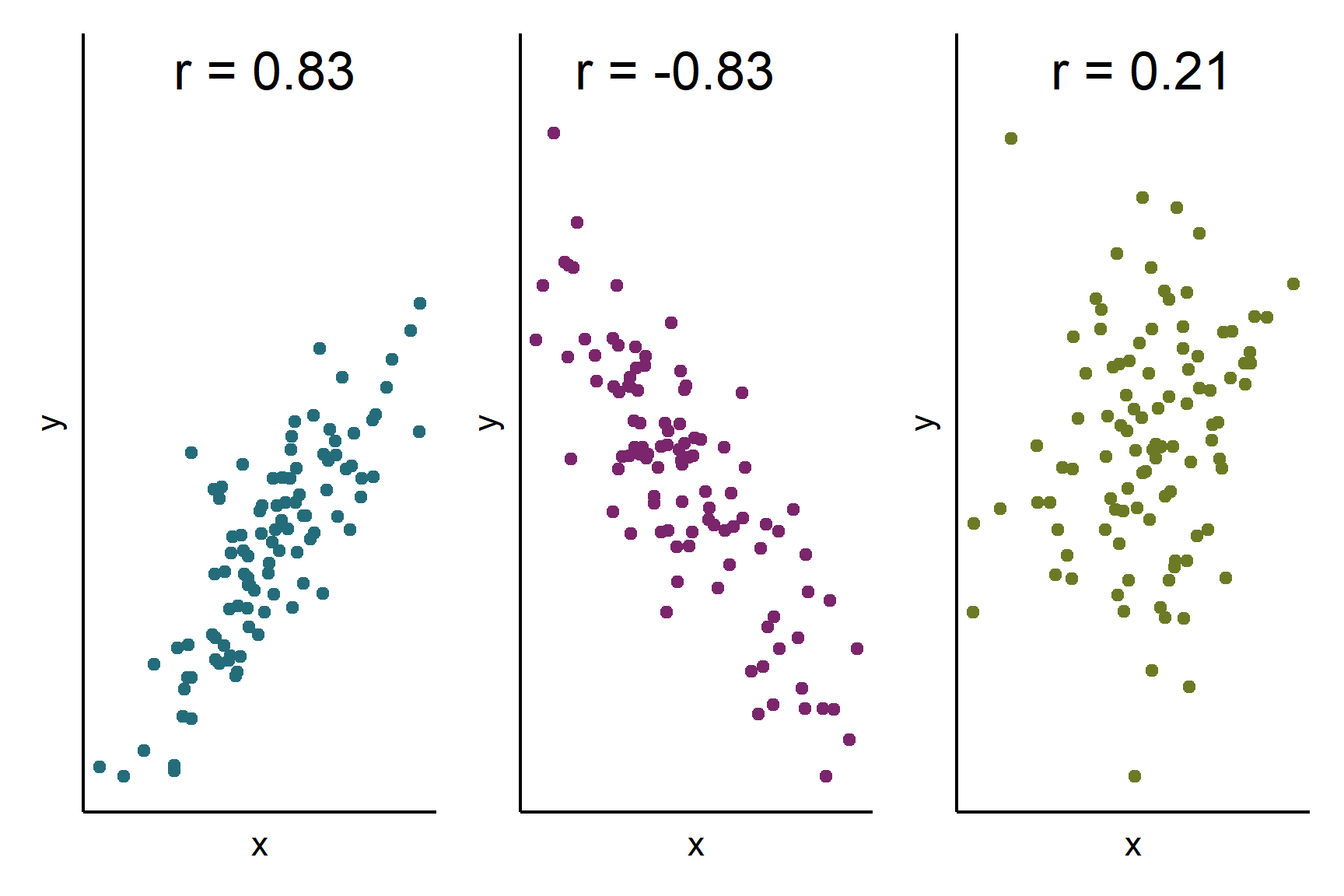
The correlation coefficient quantifies this relationship on a scale from -1 to 1. A coefficient of 1 indicates a perfect positive association, meaning that higher values in one variable are always linked to higher values in the other. Conversely, a coefficient of -1 represents a perfect negative association, where higher values in one variable are consistently associated with lower values in the other. Most real-world correlations fall somewhere between these extremes, with values closer to 0 suggesting little to no linear relationship (Figure 18.1).
By calculating the correlation coefficient, we can assess how strongly two variables move together, helping us uncover patterns in data without implying causation.
18.2 Correlation Examples
We estimate the population correlation coefficient, \(\rho\) (pronounced rho), with the sample correlation coefficient, \(r\) and test whether it is significantly different from zero because a correlation coefficient of 0 means association.
Pearson’s correlation coefficient, is a parametric measure which assumes the variables are normally distributed and that any correlation is linear.
Spearman’s rank correlation coefficient, is a non-parametric measure which does not assume the variables are normally distributed or a strict linear association. It is also less sensitive to outliers.
We use cor.test() in R for both types of correlation.
18.2.1 Contingency Chi-squared
two categorical variables
neither is an explanatory variable, i.e., there is not a causal relationship between the two variables
we count the number of observations in each caetory of each variable
you want to know if there is an association between the two variables
another way of describing this is that we test whether the proportion of observations falling in to each category of one variable is the same for each category of the other variable.
we use a chi-squared test to test whether the observed counts are significantly different from the expected counts if there was no association between the variables.
18.2.2 Reporting
the significance of effect - whether the association is significant different from zero
-
the direction of effect
- correlation whether \(r\) is positive or negative
- which categories have higher than expected values
the magnitude of effect
We do not put a line of best fit on a scatter plot accompanying a correlation because such a line implies a causal relationship.
We will explore all of these ideas with an examples.
18.3 🎬 Your turn!
If you want to code along you will need to start a new RStudio Project (see Section 8.1.2), add a data-raw folder and open a new script. You will also need to load the tidyverse package (Wickham et al. 2019).
18.4 Correlation
High quality images of the internal structure of wheat seeds were taken with a soft X-ray technique. Seven measurements determined from the images:
- Area
- Perimeter
- Compactness
- Kernel length
- Kernel width
- Asymmetry coefficient
- Length of kernel groove
Research were interested in the correlation between compactness and kernel width
The data are in seeds-dataset.xlsx.
18.4.1 Import and explore
The data are in an excel file so we will need the readxl (Wickham and Bryan 2025) package.
Load the package:
Find out the names of the sheets in the excel file:
excel_sheets("data-raw/seeds-dataset.xlsx")
## [1] "seeds_dataset"
There is only one sheet called seeds_dataset.
Import the data:
seeds <- read_excel("data-raw/seeds-dataset.xlsx",
                    sheet = "seeds_dataset")
Note that we could have omitted the sheet argument because there is only one sheet in the Excel file. However, it is good practice to be explicit.
| area | perimeter | compactness | kernal_length | kernel_width | asymmetry_coef | groove_length |
|---|---|---|---|---|---|---|
| 15.26 | 14.84 | 0.8710 | 5.763 | 3.312 | 2.2210 | 5.220 |
| 14.88 | 14.57 | 0.8811 | 5.554 | 3.333 | 1.0180 | 4.956 |
| 14.29 | 14.09 | 0.9050 | 5.291 | 3.337 | 2.6990 | 4.825 |
| 13.84 | 13.94 | 0.8955 | 5.324 | 3.379 | 2.2590 | 4.805 |
| 16.14 | 14.99 | 0.9034 | 5.658 | 3.562 | 1.3550 | 5.175 |
| 14.38 | 14.21 | 0.8951 | 5.386 | 3.312 | 2.4620 | 4.956 |
| 14.69 | 14.49 | 0.8799 | 5.563 | 3.259 | 3.5860 | 5.219 |
| 14.11 | 14.10 | 0.8911 | 5.420 | 3.302 | 2.7000 | 5.000 |
| 16.63 | 15.46 | 0.8747 | 6.053 | 3.465 | 2.0400 | 5.877 |
| 16.44 | 15.25 | 0.8880 | 5.884 | 3.505 | 1.9690 | 5.533 |
| 15.26 | 14.85 | 0.8696 | 5.714 | 3.242 | 4.5430 | 5.314 |
| 14.03 | 14.16 | 0.8796 | 5.438 | 3.201 | 1.7170 | 5.001 |
| 13.89 | 14.02 | 0.8880 | 5.439 | 3.199 | 3.9860 | 4.738 |
| 13.78 | 14.06 | 0.8759 | 5.479 | 3.156 | 3.1360 | 4.872 |
| 13.74 | 14.05 | 0.8744 | 5.482 | 3.114 | 2.9320 | 4.825 |
| 14.59 | 14.28 | 0.8993 | 5.351 | 3.333 | 4.1850 | 4.781 |
| 13.99 | 13.83 | 0.9183 | 5.119 | 3.383 | 5.2340 | 4.781 |
| 15.69 | 14.75 | 0.9058 | 5.527 | 3.514 | 1.5990 | 5.046 |
| 14.70 | 14.21 | 0.9153 | 5.205 | 3.466 | 1.7670 | 4.649 |
| 12.72 | 13.57 | 0.8686 | 5.226 | 3.049 | 4.1020 | 4.914 |
| 14.16 | 14.40 | 0.8584 | 5.658 | 3.129 | 3.0720 | 5.176 |
| 14.11 | 14.26 | 0.8722 | 5.520 | 3.168 | 2.6880 | 5.219 |
| 15.88 | 14.90 | 0.8988 | 5.618 | 3.507 | 0.7651 | 5.091 |
| 12.08 | 13.23 | 0.8664 | 5.099 | 2.936 | 1.4150 | 4.961 |
| 15.01 | 14.76 | 0.8657 | 5.789 | 3.245 | 1.7910 | 5.001 |
| 16.19 | 15.16 | 0.8849 | 5.833 | 3.421 | 0.9030 | 5.307 |
| 13.02 | 13.76 | 0.8641 | 5.395 | 3.026 | 3.3730 | 4.825 |
| 12.74 | 13.67 | 0.8564 | 5.395 | 2.956 | 2.5040 | 4.869 |
| 14.11 | 14.18 | 0.8820 | 5.541 | 3.221 | 2.7540 | 5.038 |
| 13.45 | 14.02 | 0.8604 | 5.516 | 3.065 | 3.5310 | 5.097 |
| 13.16 | 13.82 | 0.8662 | 5.454 | 2.975 | 0.8551 | 5.056 |
| 15.49 | 14.94 | 0.8724 | 5.757 | 3.371 | 3.4120 | 5.228 |
| 14.09 | 14.41 | 0.8529 | 5.717 | 3.186 | 3.9200 | 5.299 |
| 13.94 | 14.17 | 0.8728 | 5.585 | 3.150 | 2.1240 | 5.012 |
| 15.05 | 14.68 | 0.8779 | 5.712 | 3.328 | 2.1290 | 5.360 |
| 16.12 | 15.00 | 0.9000 | 5.709 | 3.485 | 2.2700 | 5.443 |
| 16.20 | 15.27 | 0.8734 | 5.826 | 3.464 | 2.8230 | 5.527 |
| 17.08 | 15.38 | 0.9079 | 5.832 | 3.683 | 2.9560 | 5.484 |
| 14.80 | 14.52 | 0.8823 | 5.656 | 3.288 | 3.1120 | 5.309 |
| 14.28 | 14.17 | 0.8944 | 5.397 | 3.298 | 6.6850 | 5.001 |
| 13.54 | 13.85 | 0.8871 | 5.348 | 3.156 | 2.5870 | 5.178 |
| 13.50 | 13.85 | 0.8852 | 5.351 | 3.158 | 2.2490 | 5.176 |
| 13.16 | 13.55 | 0.9009 | 5.138 | 3.201 | 2.4610 | 4.783 |
| 15.50 | 14.86 | 0.8820 | 5.877 | 3.396 | 4.7110 | 5.528 |
| 15.11 | 14.54 | 0.8986 | 5.579 | 3.462 | 3.1280 | 5.180 |
| 13.80 | 14.04 | 0.8794 | 5.376 | 3.155 | 1.5600 | 4.961 |
| 15.36 | 14.76 | 0.8861 | 5.701 | 3.393 | 1.3670 | 5.132 |
| 14.99 | 14.56 | 0.8883 | 5.570 | 3.377 | 2.9580 | 5.175 |
| 14.79 | 14.52 | 0.8819 | 5.545 | 3.291 | 2.7040 | 5.111 |
| 14.86 | 14.67 | 0.8676 | 5.678 | 3.258 | 2.1290 | 5.351 |
| 14.43 | 14.40 | 0.8751 | 5.585 | 3.272 | 3.9750 | 5.144 |
| 15.78 | 14.91 | 0.8923 | 5.674 | 3.434 | 5.5930 | 5.136 |
| 14.49 | 14.61 | 0.8538 | 5.715 | 3.113 | 4.1160 | 5.396 |
| 14.33 | 14.28 | 0.8831 | 5.504 | 3.199 | 3.3280 | 5.224 |
| 14.52 | 14.60 | 0.8557 | 5.741 | 3.113 | 1.4810 | 5.487 |
| 15.03 | 14.77 | 0.8658 | 5.702 | 3.212 | 1.9330 | 5.439 |
| 14.46 | 14.35 | 0.8818 | 5.388 | 3.377 | 2.8020 | 5.044 |
| 14.92 | 14.43 | 0.9006 | 5.384 | 3.412 | 1.1420 | 5.088 |
| 15.38 | 14.77 | 0.8857 | 5.662 | 3.419 | 1.9990 | 5.222 |
| 12.11 | 13.47 | 0.8392 | 5.159 | 3.032 | 1.5020 | 4.519 |
| 11.42 | 12.86 | 0.8683 | 5.008 | 2.850 | 2.7000 | 4.607 |
| 11.23 | 12.63 | 0.8840 | 4.902 | 2.879 | 2.2690 | 4.703 |
| 12.36 | 13.19 | 0.8923 | 5.076 | 3.042 | 3.2200 | 4.605 |
| 13.22 | 13.84 | 0.8680 | 5.395 | 3.070 | 4.1570 | 5.088 |
| 12.78 | 13.57 | 0.8716 | 5.262 | 3.026 | 1.1760 | 4.782 |
| 12.88 | 13.50 | 0.8879 | 5.139 | 3.119 | 2.3520 | 4.607 |
| 14.34 | 14.37 | 0.8726 | 5.630 | 3.190 | 1.3130 | 5.150 |
| 14.01 | 14.29 | 0.8625 | 5.609 | 3.158 | 2.2170 | 5.132 |
| 14.37 | 14.39 | 0.8726 | 5.569 | 3.153 | 1.4640 | 5.300 |
| 12.73 | 13.75 | 0.8458 | 5.412 | 2.882 | 3.5330 | 5.067 |
These data are formatted usefully for analysis using correlation and plotting. Each row is a different seed and the columns are the variables we are interested. This means that the first values in each column are related - they are all from the same seed
In the first instance, it is sensible to create a rough plot of our data (See Figure 18.2). Plotting data early helps us in multiple ways:
- it helps identify whether there extreme values
- it allows us to see if the association is roughly linear
- it tells us whether any association positive or negative
Scatter plots (geom_point()) are a good choice for exploratory plotting with data like these.
ggplot(data = seeds,
       aes(x = compactness, y = kernel_width)) +
  geom_point()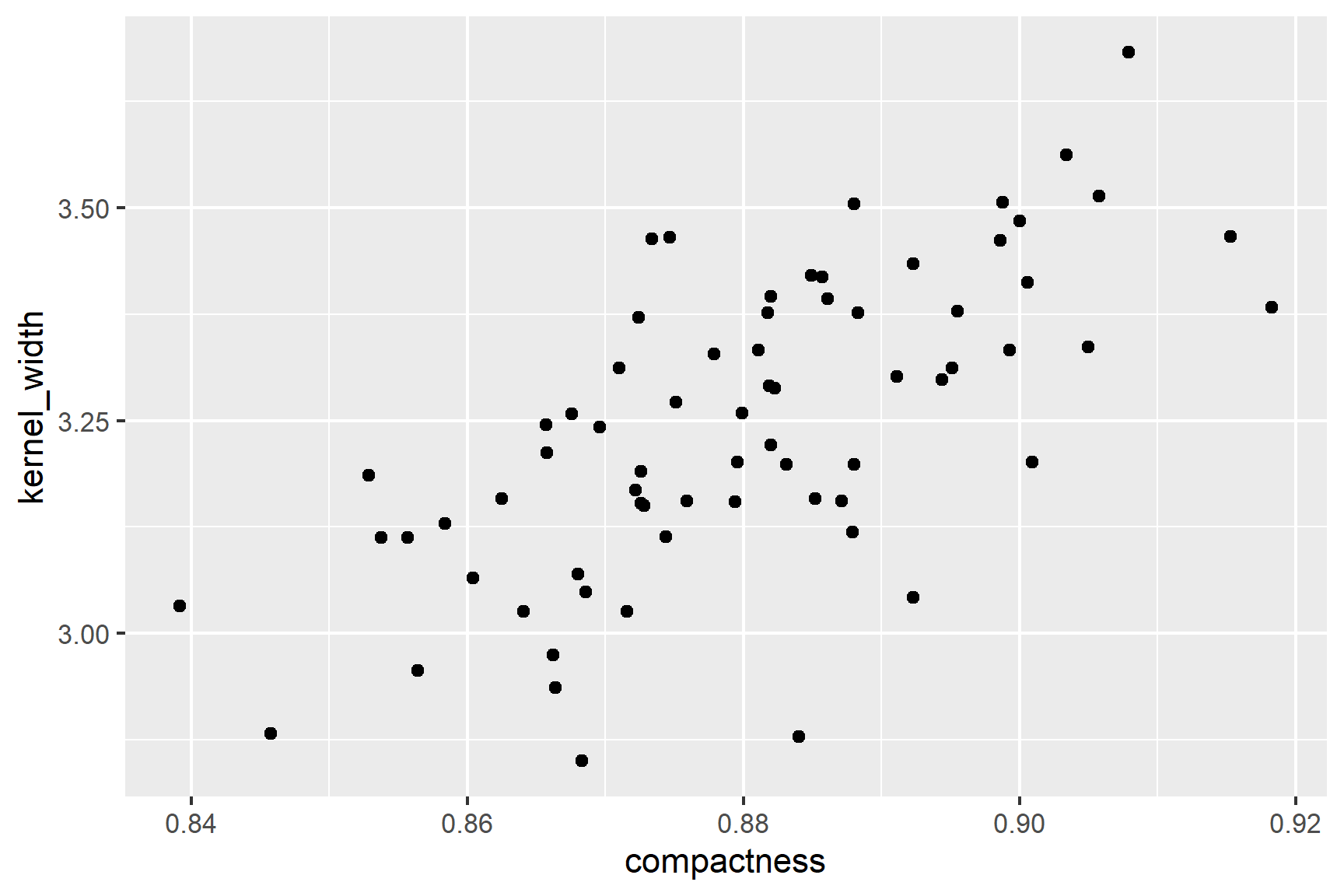
The figure suggests that there is a positive correlation between compactness and kernel_width and that correlation is roughly linear.
18.4.2 Check assumptions
We can see from Figure 18.2 that the relationship between compactness and kernel_width is roughly linear. This is a good sign for using Pearson’s correlation coefficient.
Our next check is to use common sense: both variables are continuous and we would expect them to be normally distributed. We can then plot histograms to examine the distributions (See Figure 18.3).
ggplot(data = seeds, aes(x = compactness)) +
  geom_histogram(bins = 12)

ggplot(data = seeds, aes(x = kernel_width)) +
  geom_histogram(bins = 12)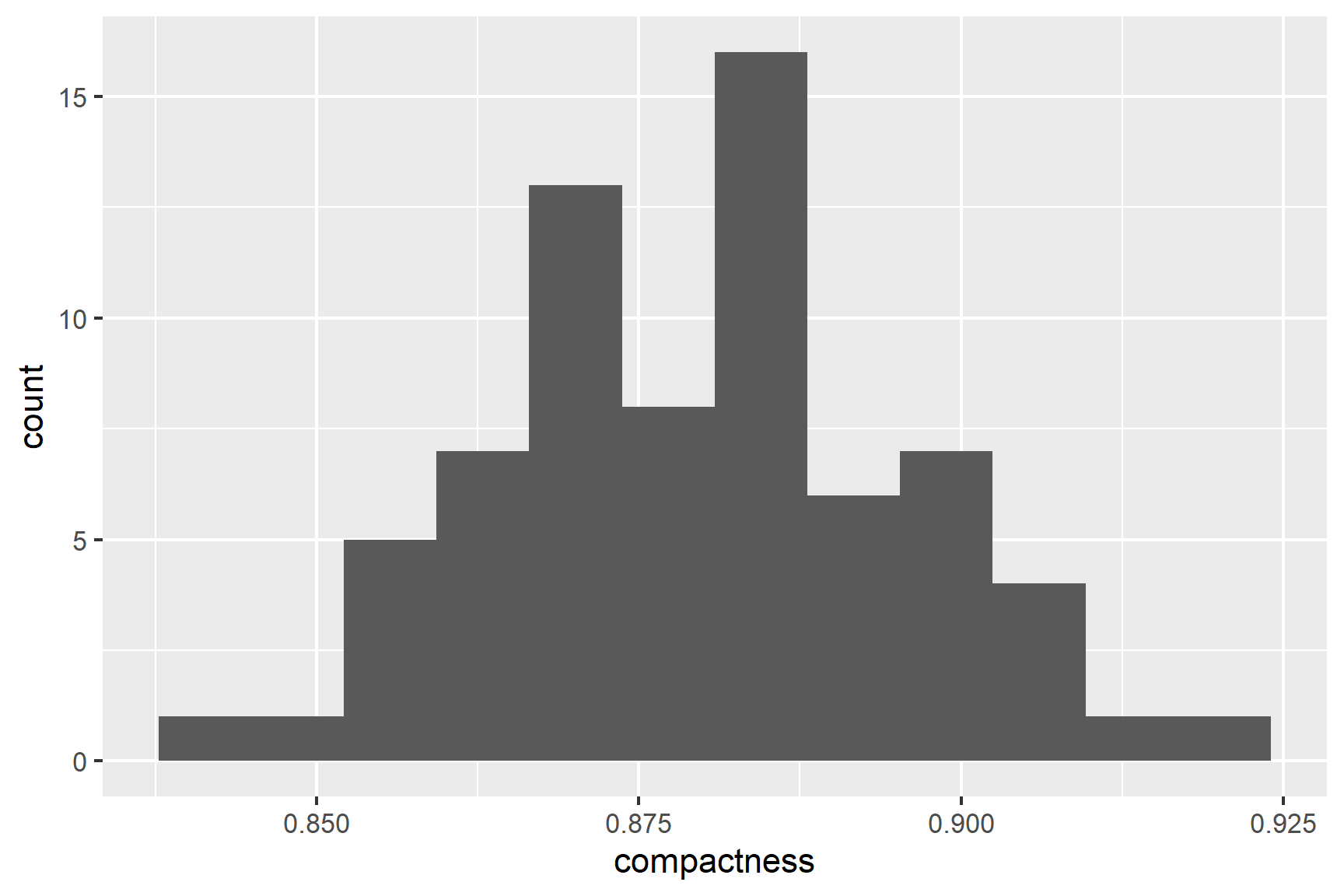
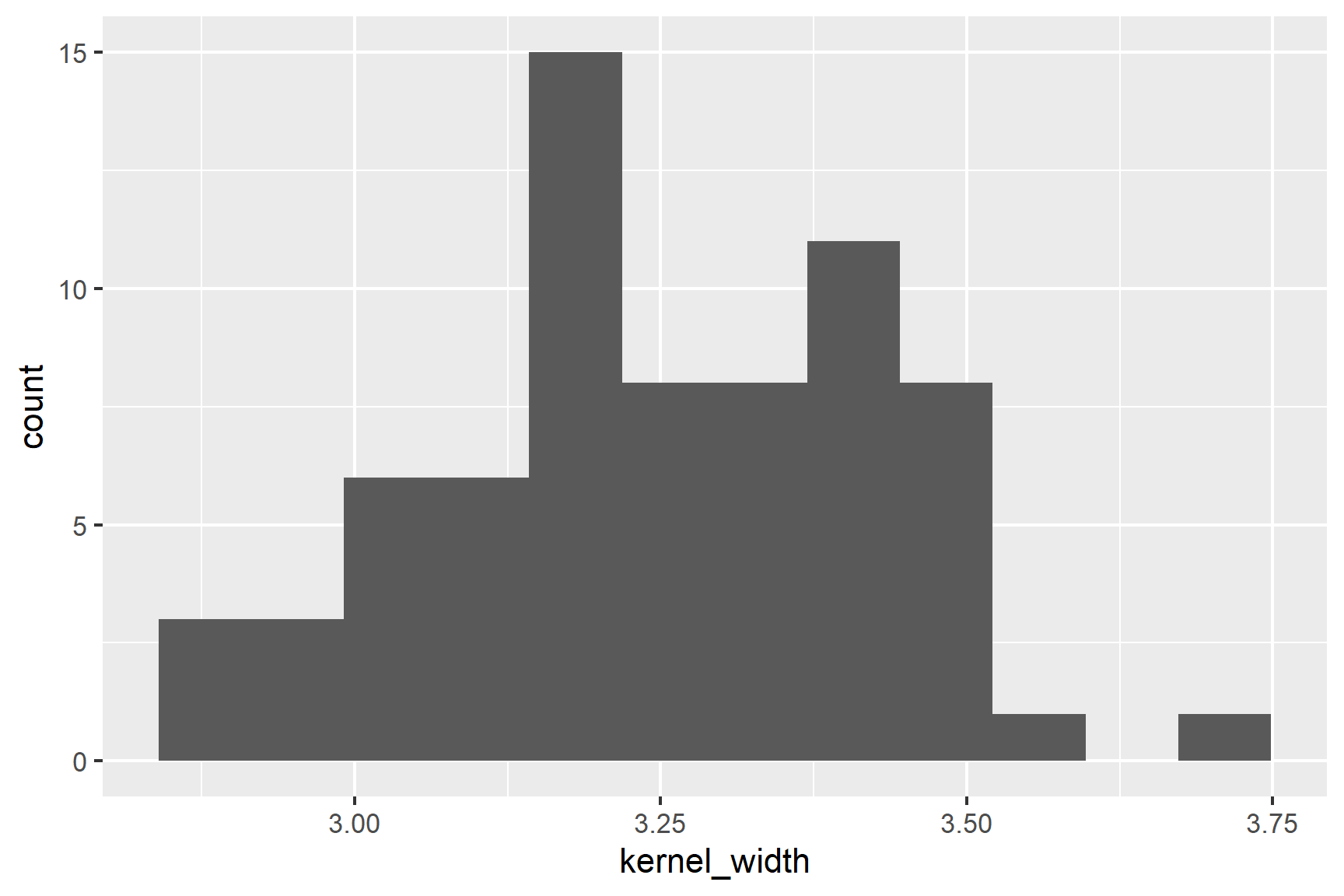
The distributions of the two variables are slightly skewed but do not seem too different from a normal distribution.
Finally, we can use the Shapiro-Wilk test to test for normality.
shapiro.test(seeds$compactness)
##
##  Shapiro-Wilk normality test
##
## data:  seeds$compactness
## W = 0.99, p-value = 1shapiro.test(seeds$kernel_width)
##
## Shapiro-Wilk normality test
##
## data: seeds$kernel_width
## W = 0.99, p-value = 0.8The p-values are greater than 0.05 so these tests of the normality assumption are not significant. Note that “not significant” means not significantly different from a normal distribution. It does not mean definitely normally distributed.
It is not unreasonable to continue with the Pearson’s correlation coefficient. However, later we will also use the Spearman’s rank correlation coefficient, a non-parametric method which has fewer assumptions. Spearman’s rank correlation is a more conservative approach.
18.4.3 Do a Pearson’s correlation test with cor.test()
We can carry out a Pearson’s correlation test with cor.test() like this:
cor.test(data = seeds, ~ compactness + kernel_width)
##
##  Pearson's product-moment correlation
##
## data:  compactness and kernel_width
## t = 7.4, df = 68, p-value = 0.0000000003
## alternative hypothesis: true correlation is not equal to 0
## 95 percent confidence interval:
##  0.5118 0.7795
## sample estimates:
##    cor
## 0.6666
A variable is not being explained in this case so we do not need to include a response variable. Pearson’s is the default test so we do not need to specify it.
What do all these results mean?
The last line gives the correlation coefficient, \(r\), that has been estimated from the data. Here, \(r\) = 0.67 which is a moderate positive correlation.
The fifth line tells you what test has been done: alternative hypothesis: true correlation is not equal to 0. That is \(H_0\) is that \(\rho = 0\)
The forth line gives the test result: t = 7.3738, df = 68, p-value = 2.998e-10
The \(p\)-value is very much less than 0.05 so we can reject the null hypothesis and conclude there is a significant positive correlation between compactness and kernel_width.
18.4.4 Report
There was a significant positive correlation (\(r\) = 0.67) between compactness and kernel width (Pearson’s: t = 7.374; df = 68; p-value < 0.0001). See Figure 18.4.
Code
ggplot(data = seeds,
       aes(x = compactness, y = kernel_width)) +
  geom_point() +
  scale_y_continuous(name = "Diameter (mm)") +
    scale_x_continuous(name = "Compactness") +
  annotate("text", x = 0.85,  y = 3.6,
           label = expression(italic(r)~"= 0.67; "~italic(p)~"< 0.001")) +
  theme_classic()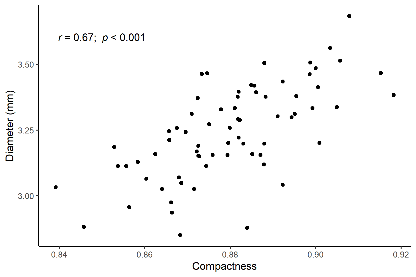
18.4.5 Spearman’s rank correlation coefficient
Researchers are studying how systolic blood pressure (SBP) is associated with kidney function in patients. Chronic high blood pressure can damage the kidneys over time, leading to reduced function, which can be measured by estimated glomerular filtration rate (eGFR). SBP is measured in mmHg and represents the force of blood against artery walls when the heart beats. eGFR is estimated from from blood creatine levels in mL/min/1.73m². Lower values indicate impaired kidney filtration.
The data are in blood-pressure-kidney-function.csv.
18.4.6 Import and explore
Import the data from a csv file:
bp_kidney <- read_csv("data-raw/blood-pressure-kidney-function.csv")| SBP | eGFR |
|---|---|
| 112 | 48.0 |
| 160 | 38.8 |
| 116 | 50.3 |
| 130 | 33.5 |
| 148 | 37.8 |
| 127 | 34.0 |
| 113 | 53.9 |
| 169 | 2.9 |
| 123 | 35.6 |
| 118 | 50.8 |
| 162 | 28.7 |
| 111 | 54.8 |
These data are formatted usefully for analysis using correlation and plotting. We will create a rough plot of our data (See Figure 18.5).
Scatter plots (geom_point()) are a good choice for exploratory plotting with data like these.
ggplot(data = bp_kidney,
       aes(x = SBP, y = eGFR)) +
  geom_point()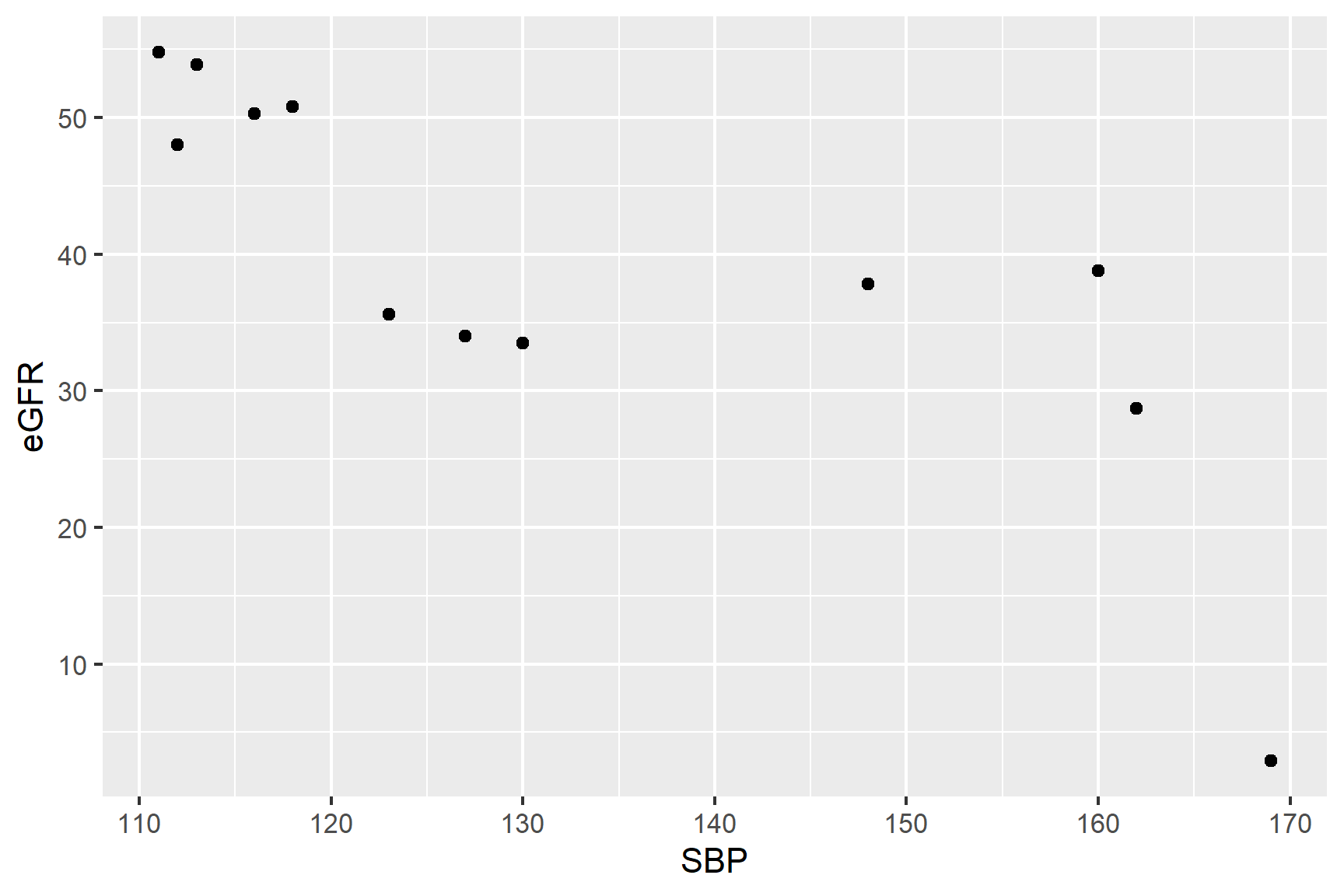
The figure suggests that there is a negative association between SBP and eGFR but it is not clear if the association is linear.
Spearman’s rank correlation coefficient which does not assume a strict linear association so maybe a better choice. In addition, we might expect eGFR values to be to be skewed since indicators of disease often show step changes in values.
18.4.7 Do a Spearman’s rank correlation test with cor.test()
We can carry out a Spearman’s rank correlation test with cor.test() like this:
cor.test(data = bp_kidney, ~ SBP + eGFR, method = "spearman")
##
##  Spearman's rank correlation rho
##
## data:  SBP and eGFR
## S = 526, p-value = 0.001
## alternative hypothesis: true rho is not equal to 0
## sample estimates:
##     rho
## -0.8392
A variable is not being explained in this case so we do not need to include a response variable. Pearson’s is the default test so we need to specify method = "spearman".
What do all these results mean?
The last line gives the correlation coefficient, \(r\), that has been estimated from the data. Here, \(r\) = -0.8 which is fairly strong negative correlation.
The fifth line tells you what test has been done: alternative hypothesis: true rho is not equal to 0. That is \(H_0\) is that \(\rho = 0\)
The forth line gives the test result: S = 526, p-value = 0.001192
The \(p\)-value is very much less than 0.05 so we can reject the null hypothesis and conclude there is a significant negative correlation between SBP and eGFR.
18.4.8 Report
. SBP is measured in mmHg and represents the force of blood against artery walls when the heart beats. eGFR is measured in
There was a significant positive correlation (\(r\) = -0.8) between systolic blood pressure and estimated glomerular filtration rate (Spearman’s rank correlation: S = 526; n = 12; p-value = 0.0012). See Figure 18.6.
Code
ggplot(data = bp_kidney,
       aes(x = SBP, y = eGFR)) +
  geom_point() +
  scale_y_continuous(name = "Estimated GFR (mL/min/1.73m²)",
                     limits = c(0, 60),
                     expand = c(0 , 0)) +
  scale_x_continuous(name = "Systolic blood pressure (mmHg)") +
  annotate("text", x = 120,  y = 10,
           label = expression(italic(r)~"= -0.8; "~italic(p)~"= 0.0012")) +
  theme_classic()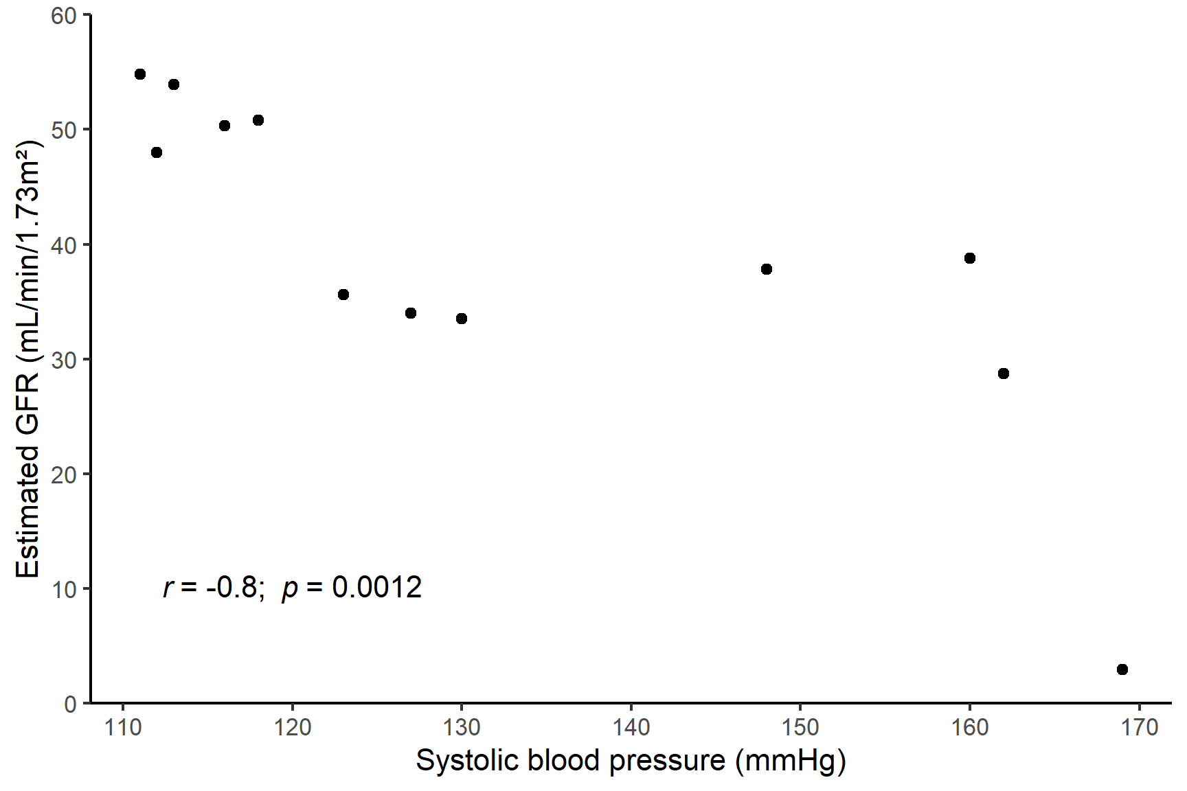
18.5 Contingency Chi-squared test
Researchers were interested in whether different pig breeds had the same food preferences. They offered individuals of three breads, Welsh, Tamworth and Essex a choice of three foods: cabbage, sugar beet and swede and recorded the number of individuals that chose each food. The data are shown in Table 18.1.
| welsh | tamworth | essex | |
|---|---|---|---|
| cabbage | 11 | 19 | 22 |
| sugarbeet | 21 | 16 | 8 |
| swede | 7 | 12 | 11 |
We don’t know what proportion of food are expected to be preferred but do expect it to be same for each breed if there is no association between breed and food preference. The null hypothesis is that the proportion of foods taken by each breed is the same.
For a contingency chi squared test, the inbuilt chi-squared test can be used but we need to to structure our data as a 3 x 3 table. The matrix() function is useful here and we can label the rows and columns to help us interpret the results.
Put the data into a matrix:
The byrow and nrow arguments allow us to lay out the data in the matrix as we need. To name the rows and columns we can use the dimnames() function. We need to create a “list” object to hold the names of the rows and columns and then assign this to the matrix object. The names of rows are columns are called the “dimension names” in a matrix.
Make a list for the two vectors of names:
The vectors can be of different lengths in a list which would be important if we had four breeds and only two foods, for example.
Now assign the list to the dimension names in the matrix:
dimnames(food_pref) <- vars

food_pref
##            breed
## food        welsh tamworth essex
##   cabbage      11       19    22
##   sugarbeet    21       16     8
##   swede         7       12    11
The data are now in a form that can be used in the chisq.test() function:
chisq.test(food_pref)
##
##  Pearson's Chi-squared test
##
## data:  food_pref
## X-squared = 11, df = 4, p-value = 0.03
The test is significant since the p-value is less than 0.05. We have evidence of a preference for particular foods by different breeds. But in what way? We need to know the “direction of the effect” i.e., Who likes what?
The chisq.test() function has a residuals argument that can be used to calculate the residuals. These are the differences between the observed and expected values. The expected values are the values that would be expected if there was no association between the rows and columns. The residuals are standardised.
chisq.test(food_pref)$residuals
##            breed
## food         welsh tamworth   essex
##   cabbage   -1.243 -0.05564  1.2722
##   sugarbeet  1.932 -0.16015 -1.7126
##   swede     -0.729  0.26940  0.4225
Where the residuals are positive, the observed value is greater than the expected value and where they are negative, the observed value is less than the expected value. Our results show the Welsh pigs much prefer sugarbeet and strongly dislike cabbage. The Essex pigs prefer cabbage and dislike sugarbeet and the Essex pigs slightly prefer swede but have less strong likes and dislikes.
The degrees of freedom are: (rows - 1)(cols - 1) = 2 * 2 = 4.
18.5.1 Report
Different pig breeds showed a significant preference for the different food types (\(\chi^2\) = 10.64; df = 4; p = 0.031) with Essex much preferring cabbage and disliking sugarbeet, Welsh showing a strong preference for sugarbeet and a dislike of cabbage and Tamworth showing no clear preference.
18.6 Summary
Unlike regression, correlation and chi-square contingency tests assess association between variable without implying causality.
Pearson’s Correlation measures the linear association between two continuous variables (range: -1 to 1). Assumes normality.
Scatter plots help identify the strength and direction of relationships and should not include a best-fit line.
Before using Pearson’s correlation, we check the normality assumptions using histograms and the Shapiro-Wilk test.
Spearman’s rannk Correlation is a non-parametric alternative that does not require normality and is less sensitive to outliers.
Chi-Square Contingency tests allow us to test for an association between categorical variables.
We report the statistical significance, the direction of the association and the magnitude of the association.
In R we use
cor.test()is used for correlation tests andchisq.test()for chi-squared contingency tests